Country Bay Music Festival
Loud And Live
Graphic Design, Art Direction, Creative Direction
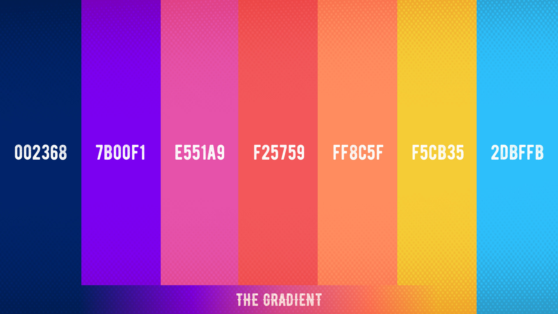
When I was approached to help develop the creative and strategy for Country Bay Music Festival I was very excited, but having worked on multiple festivals before, I knew it would become an intense undertaking. This was a first-year event, fully proprietary, with original custom creative (from the ground up). It involved multiple rounds of creative and approvals before landing in the current look-and-feel.
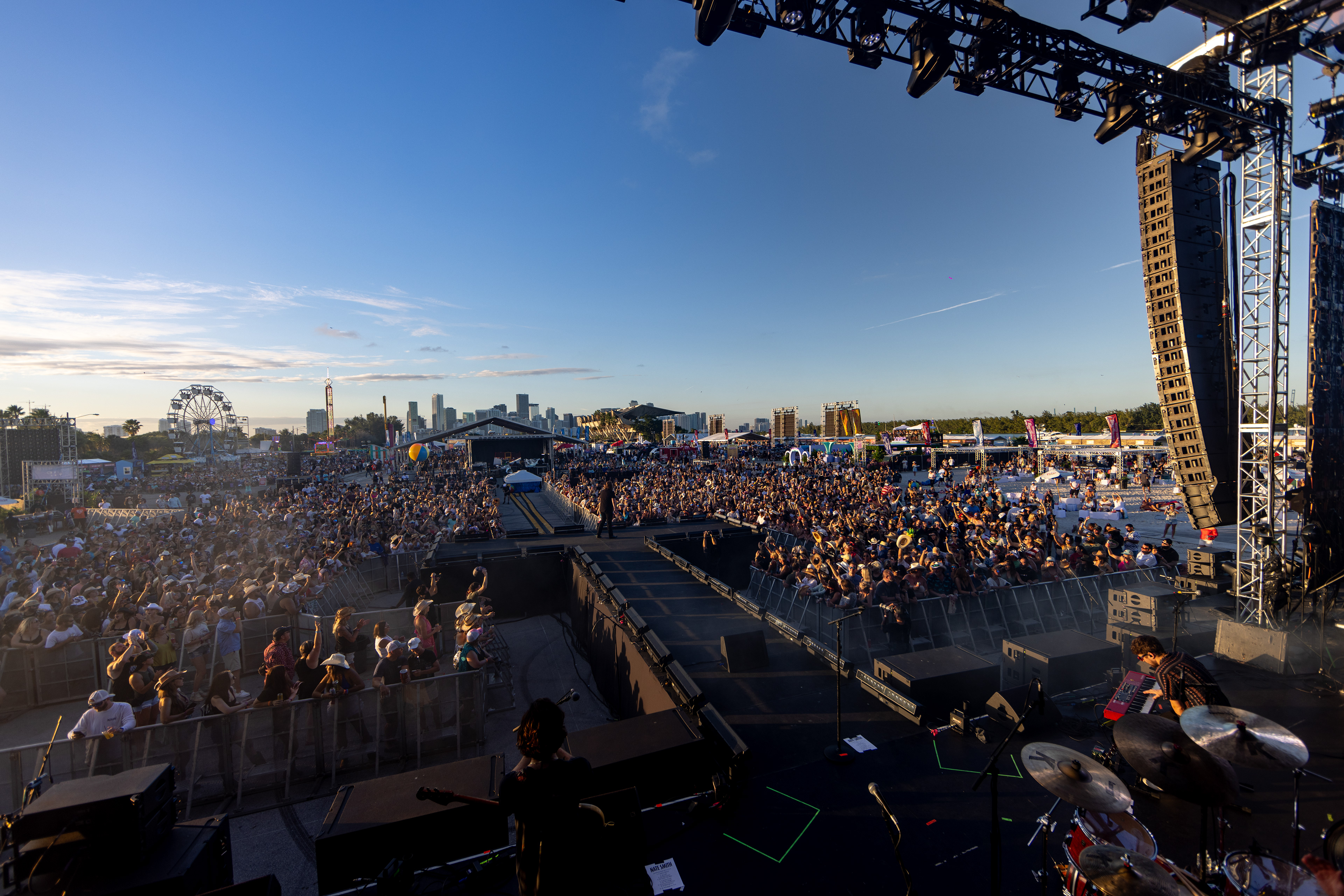
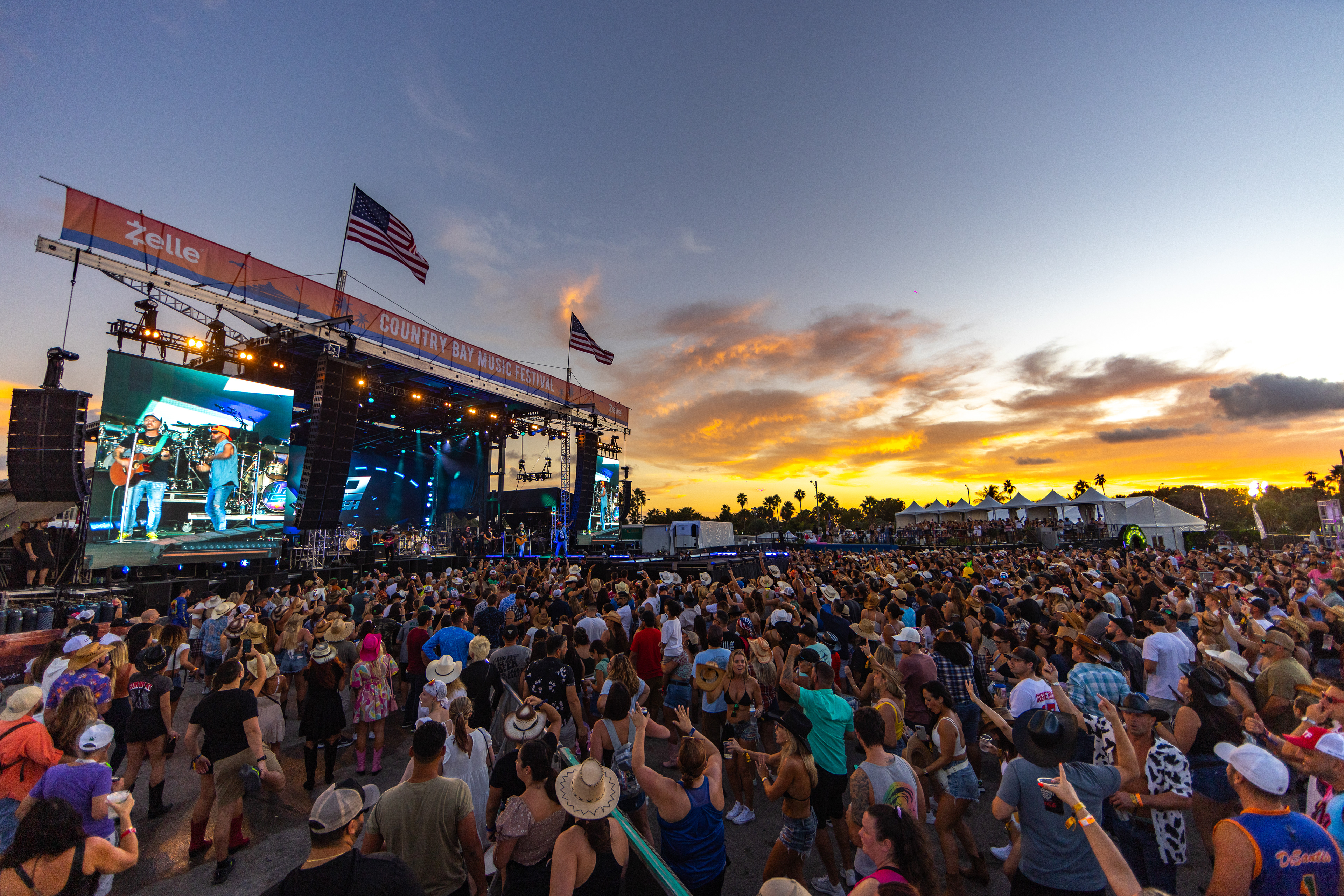
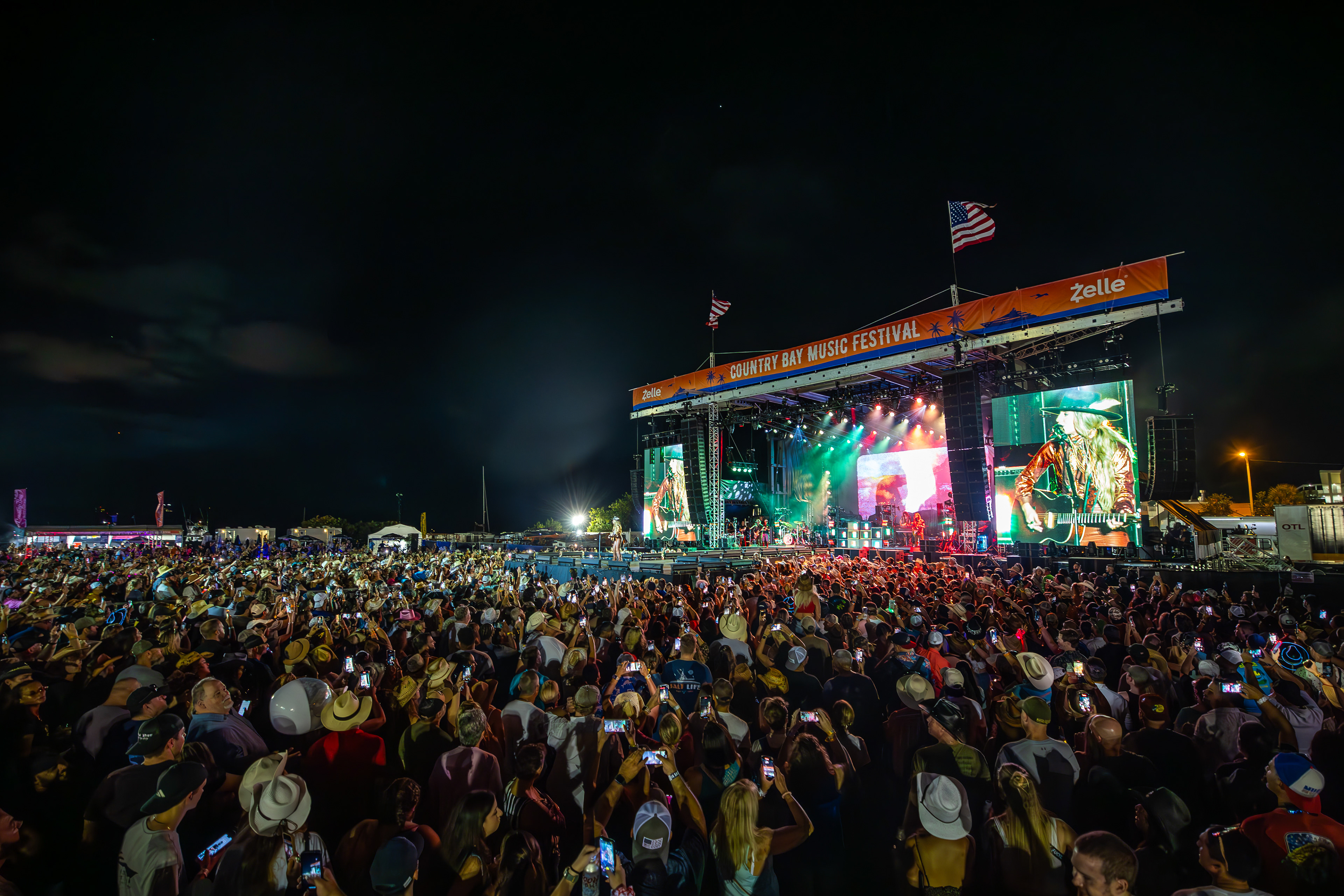
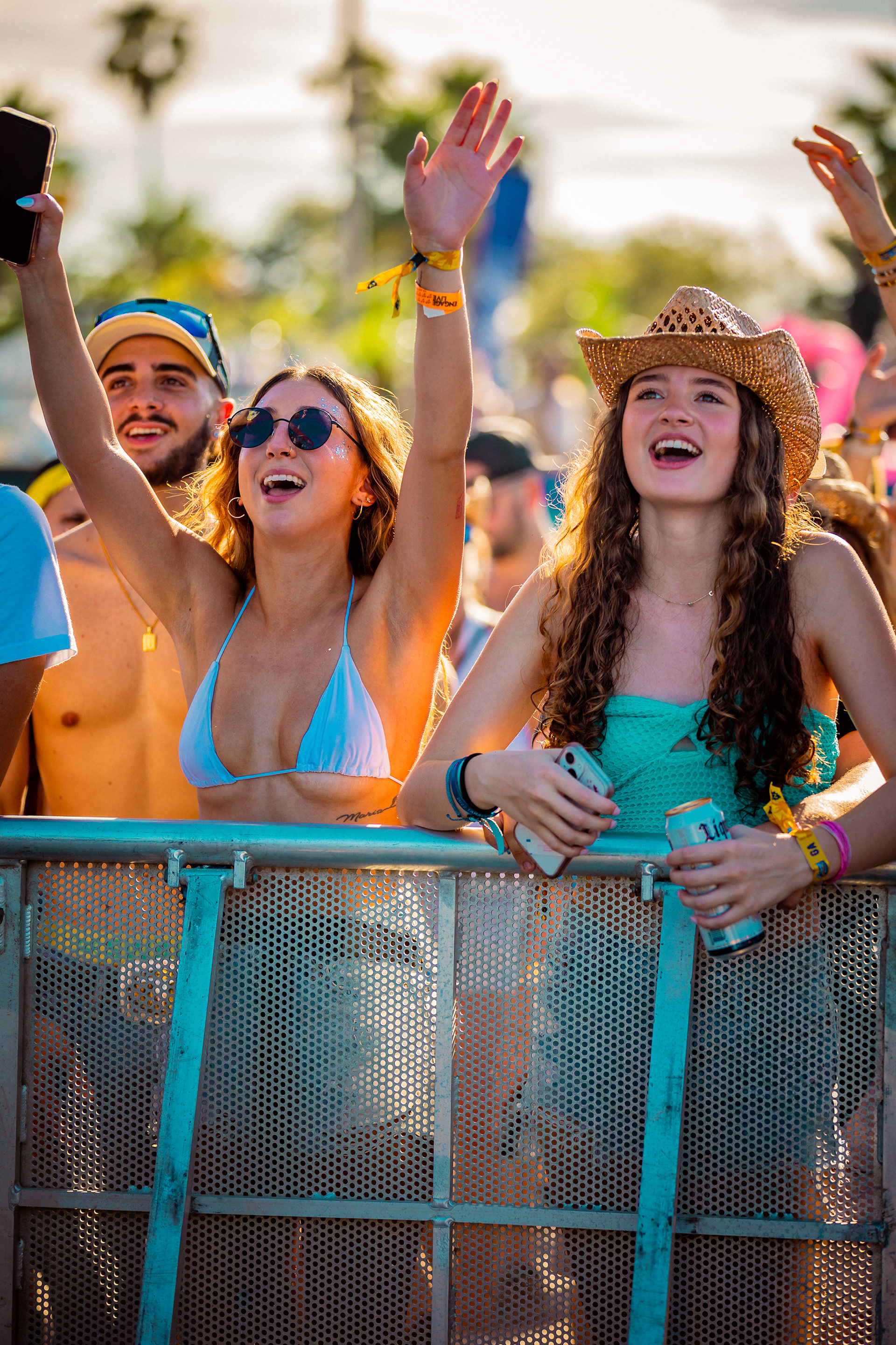
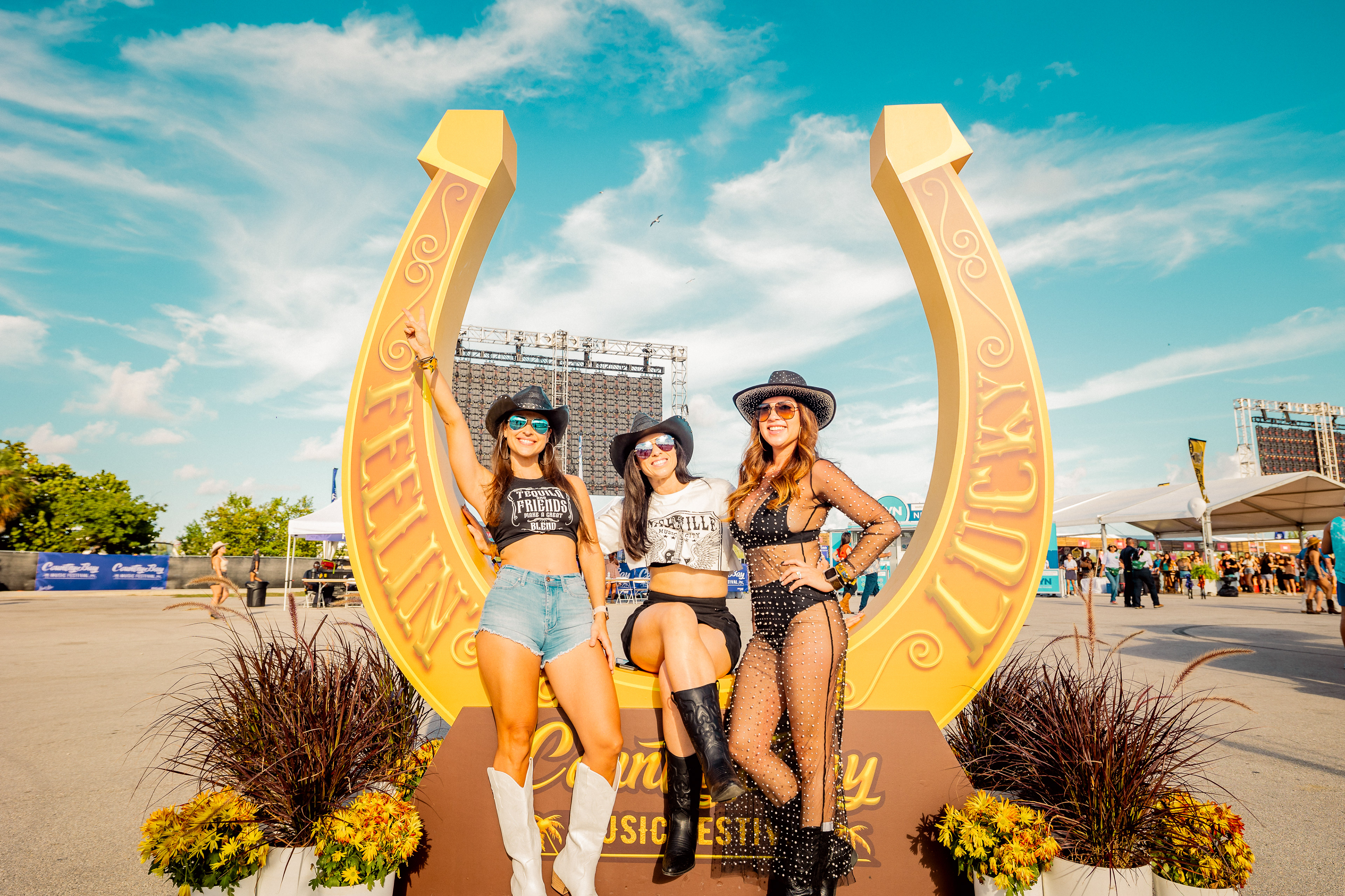
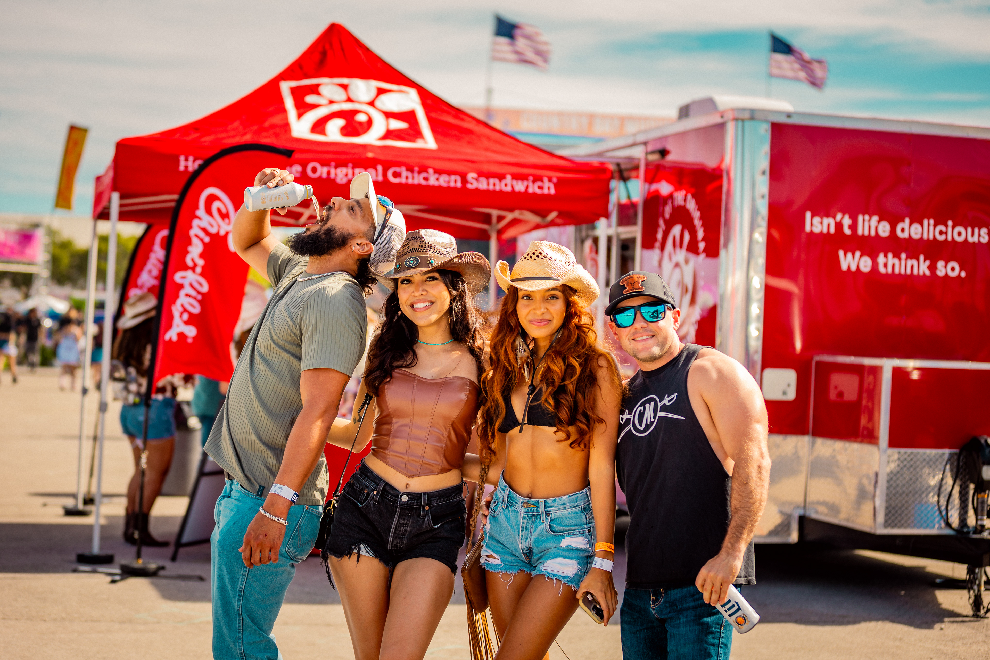
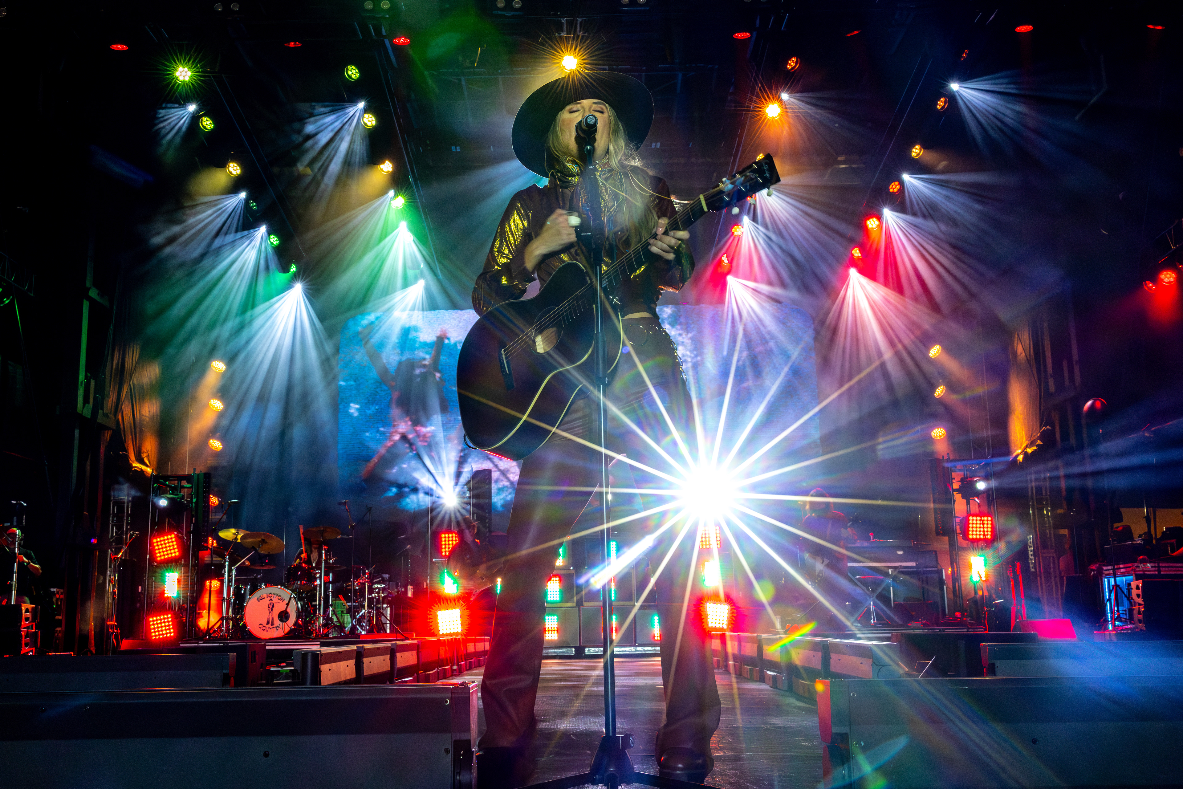
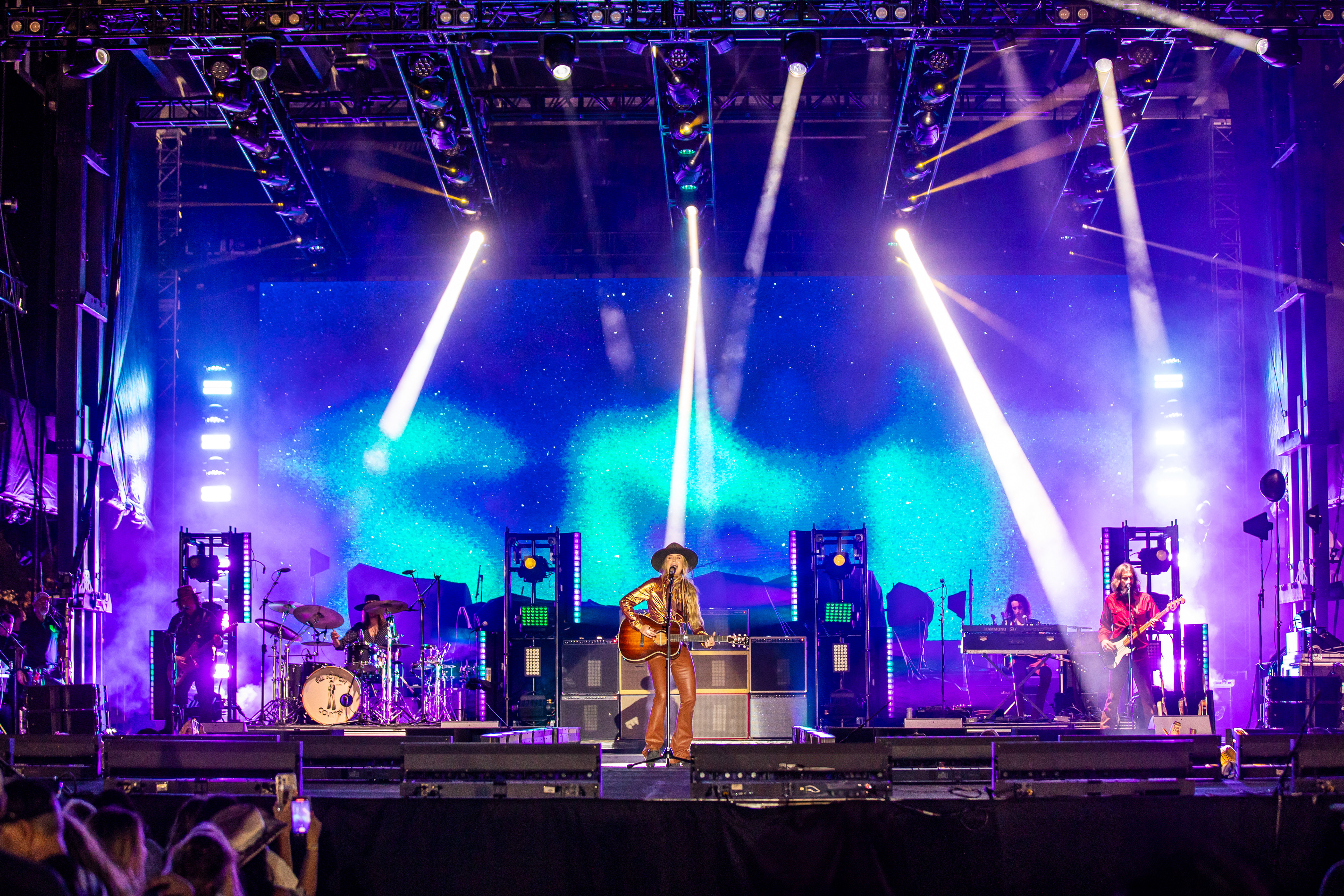
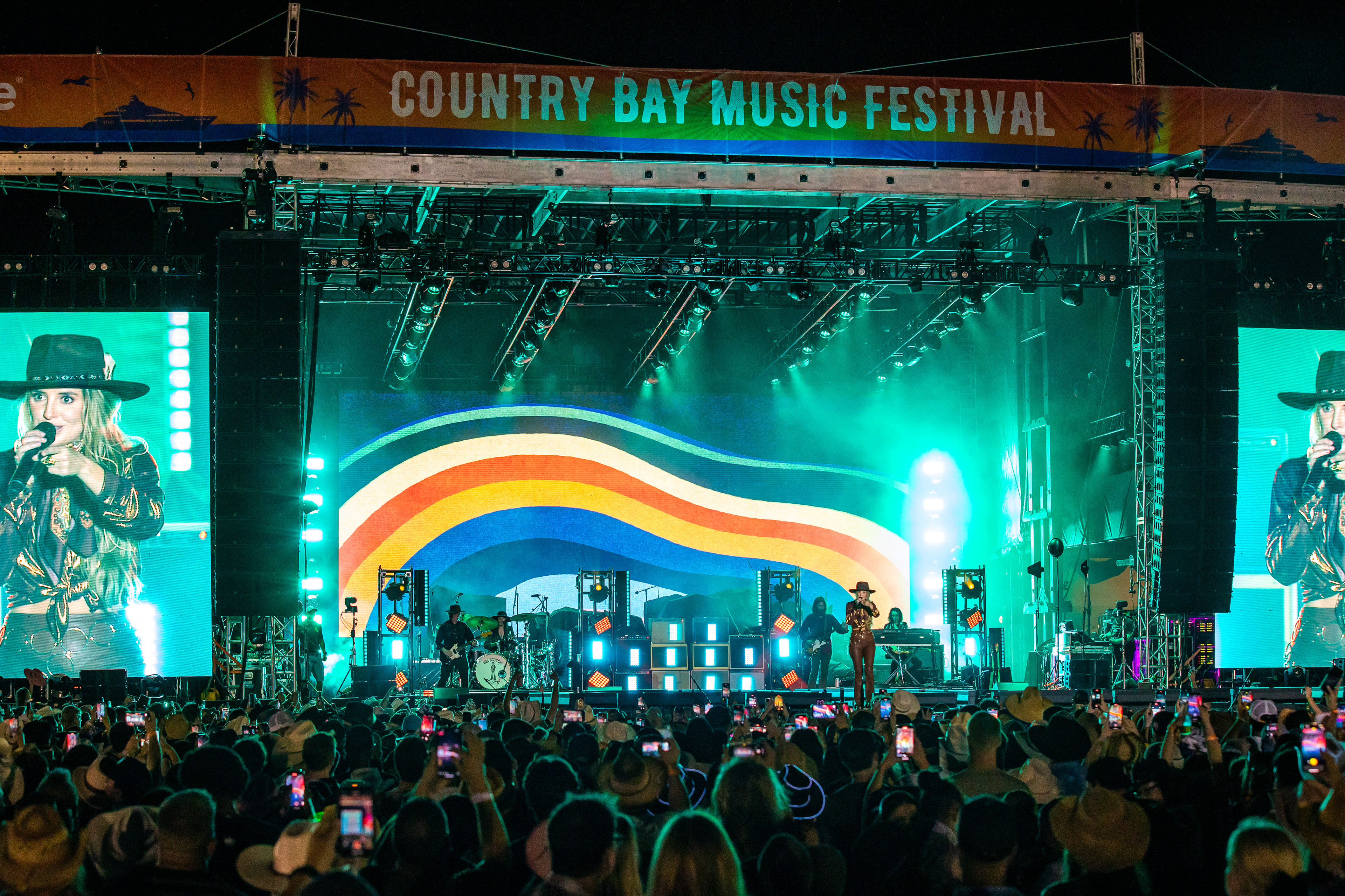
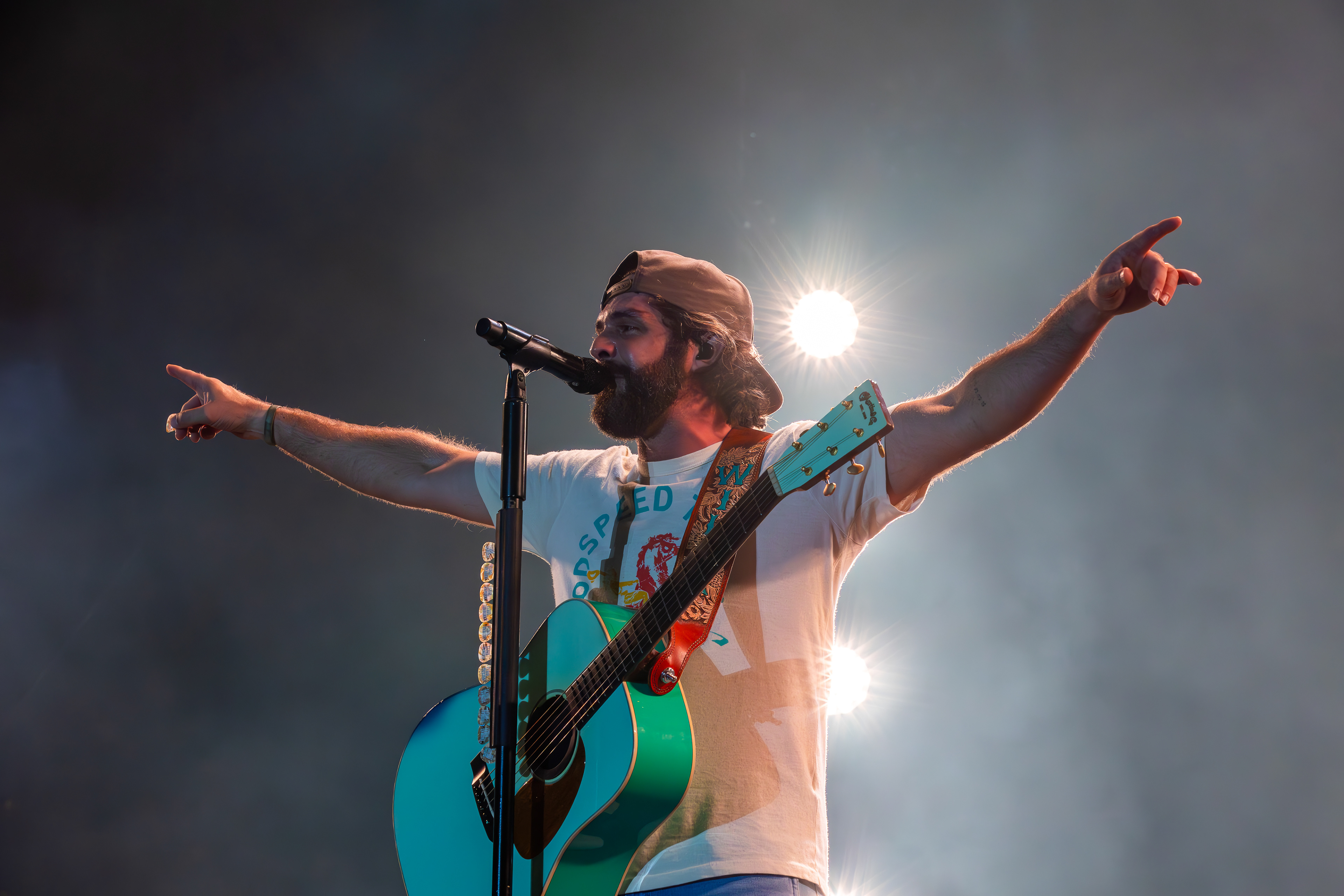
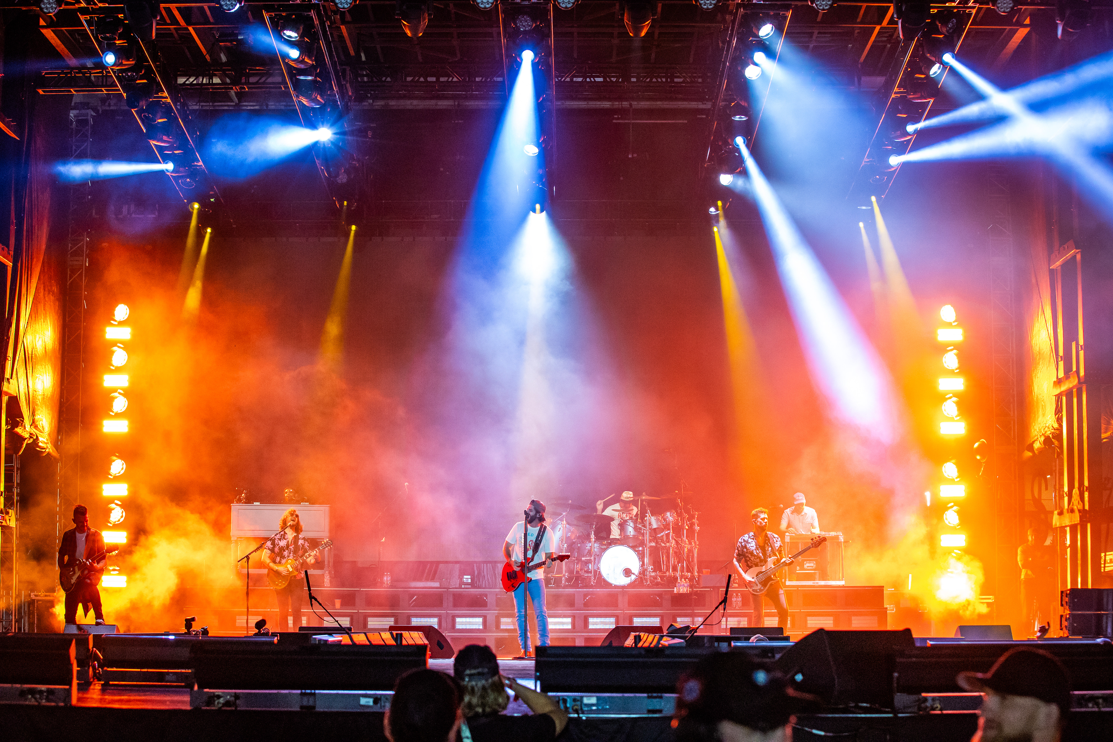
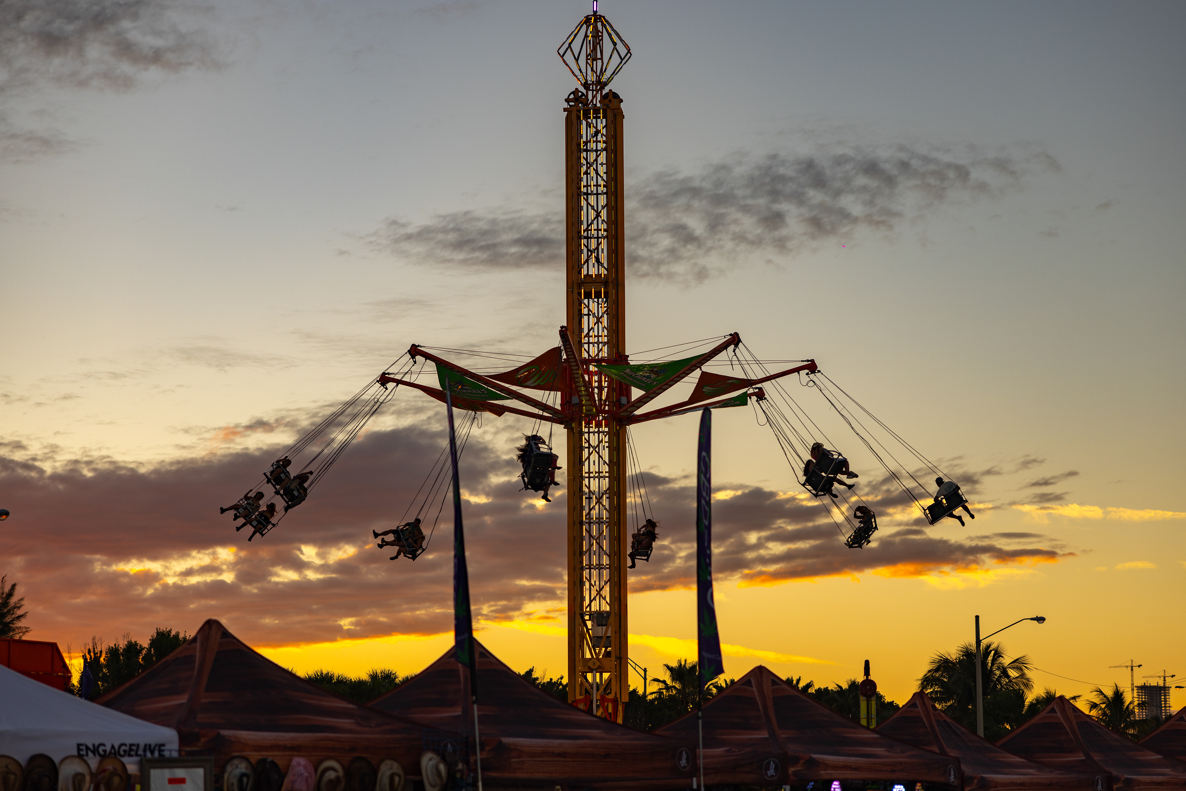
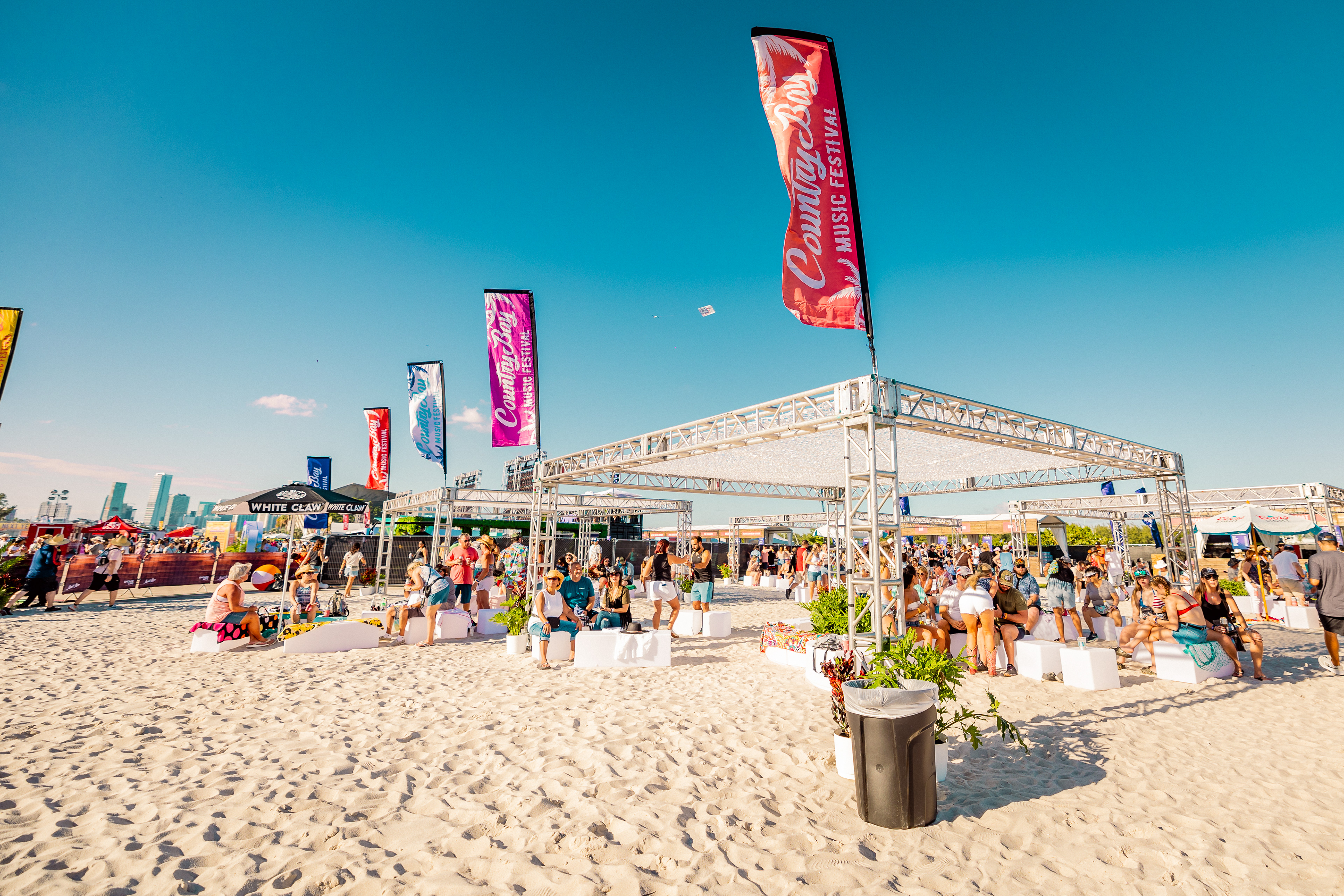
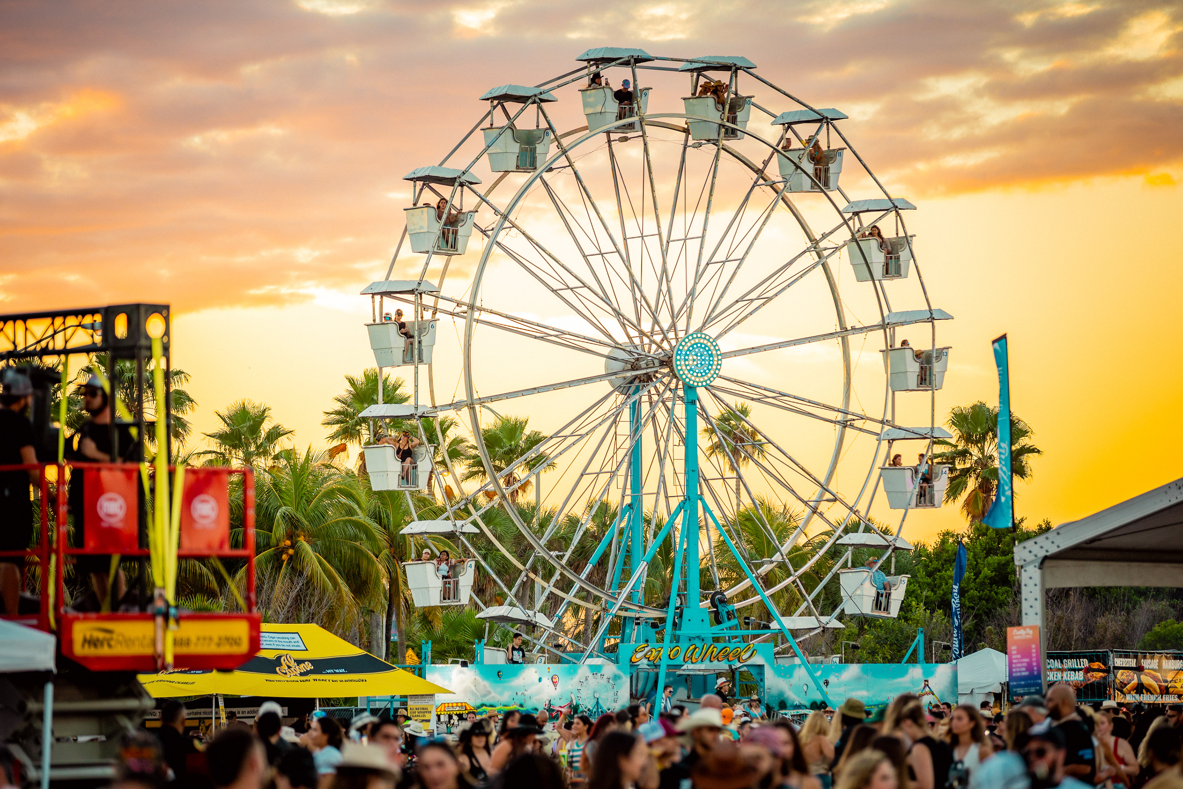
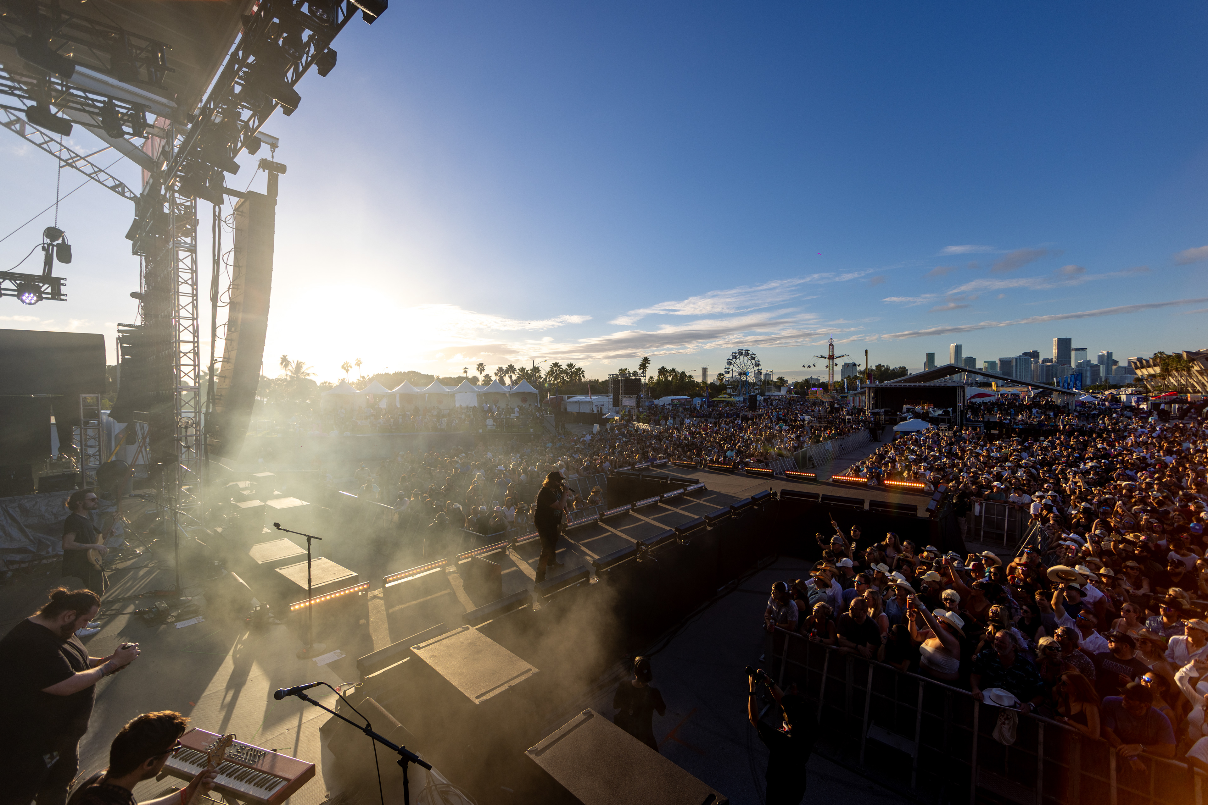
The event was a resounding success, selling over one million dollars in ticket sales on the first day of launch. We went from a relatively unknown event to a major player in the country festival scene with thousands in attendance both days of the event. Some of country music's biggest names were in attendance including Thomas Rhett, Sam Hunt, and Lainey Wilson.
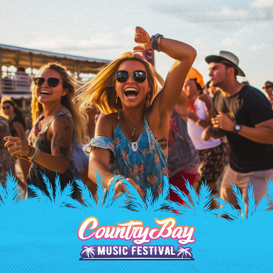
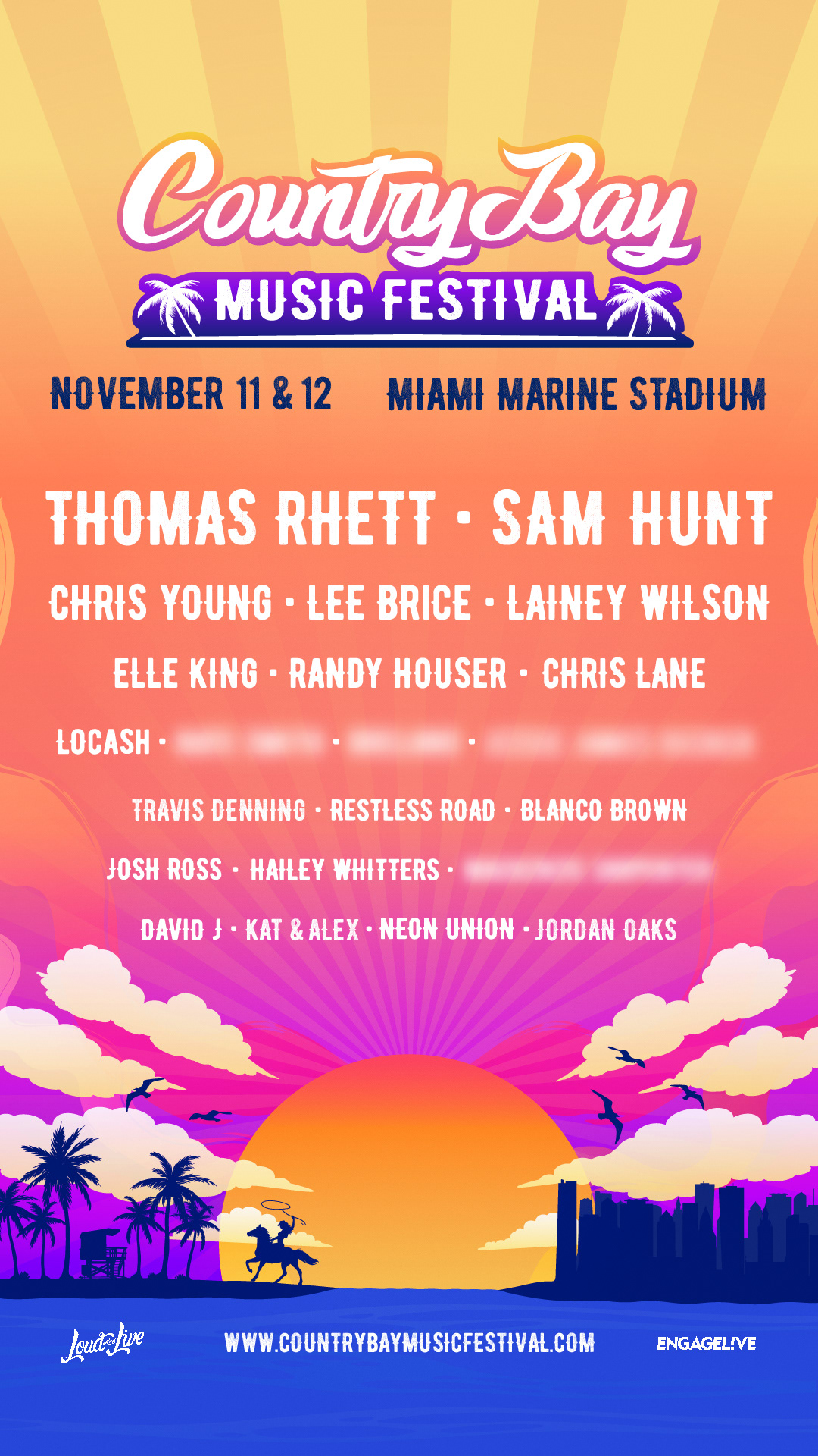
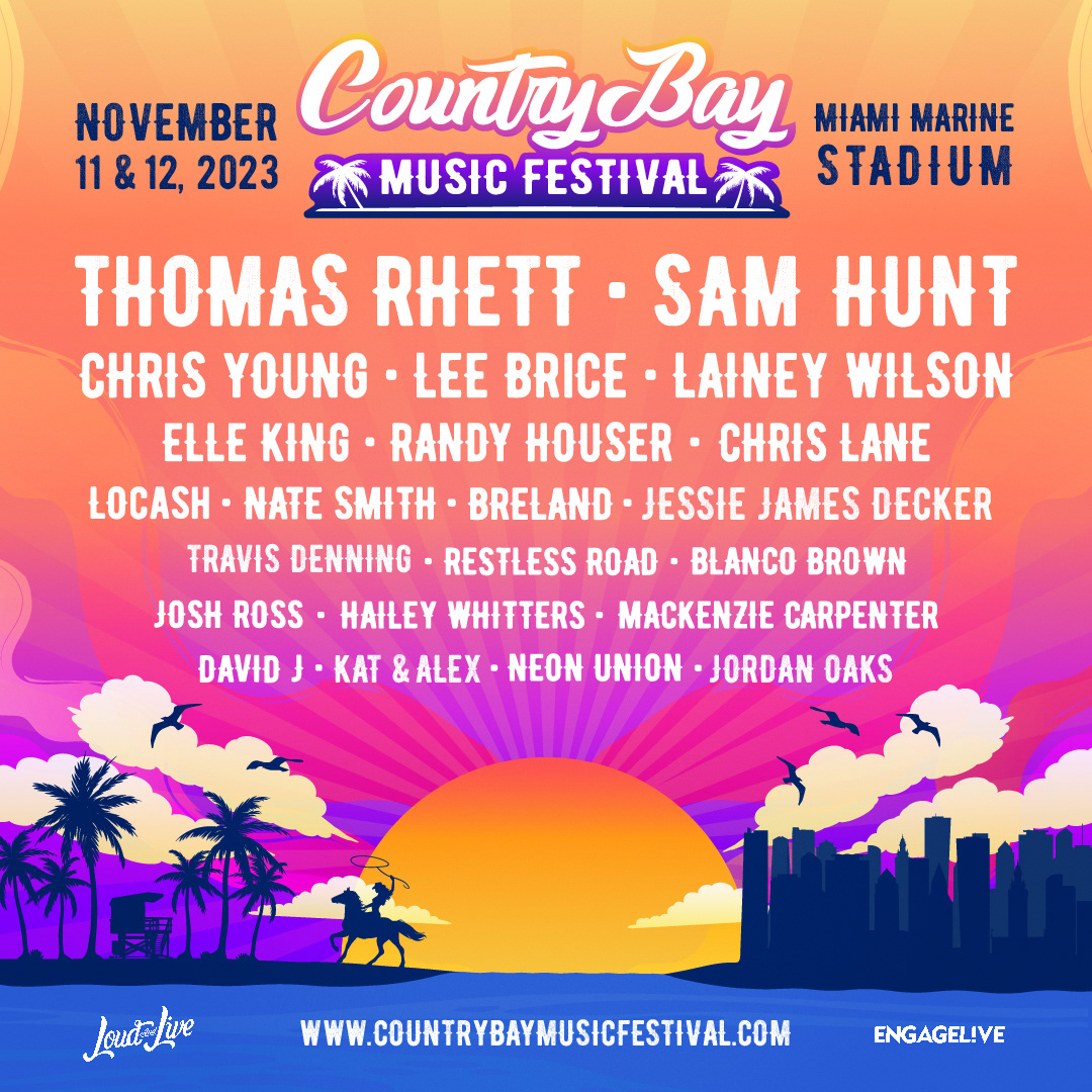
After developing the creative concept and art direction for the festival, it was time to produce the lineup flyer. The lineup flier was a particular challenge. It's often the most iconic piece of graphic imagery , as it's often the first thing people see. Whether you get served an ad, or get it DM'd by an excited friend, the lineup is THE draw (especially when it comes to first-time events). There is no trust, no one has ever been before, nor knows what the event looks like. When the lineup is the only thing you have to convince people to come to your event, the graphics are equally as important as the names on flier.
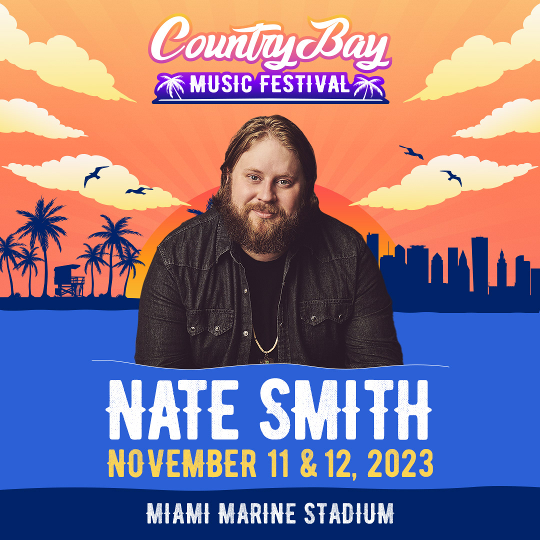
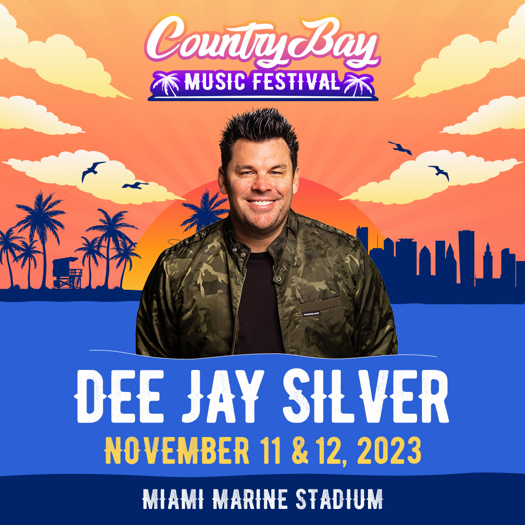
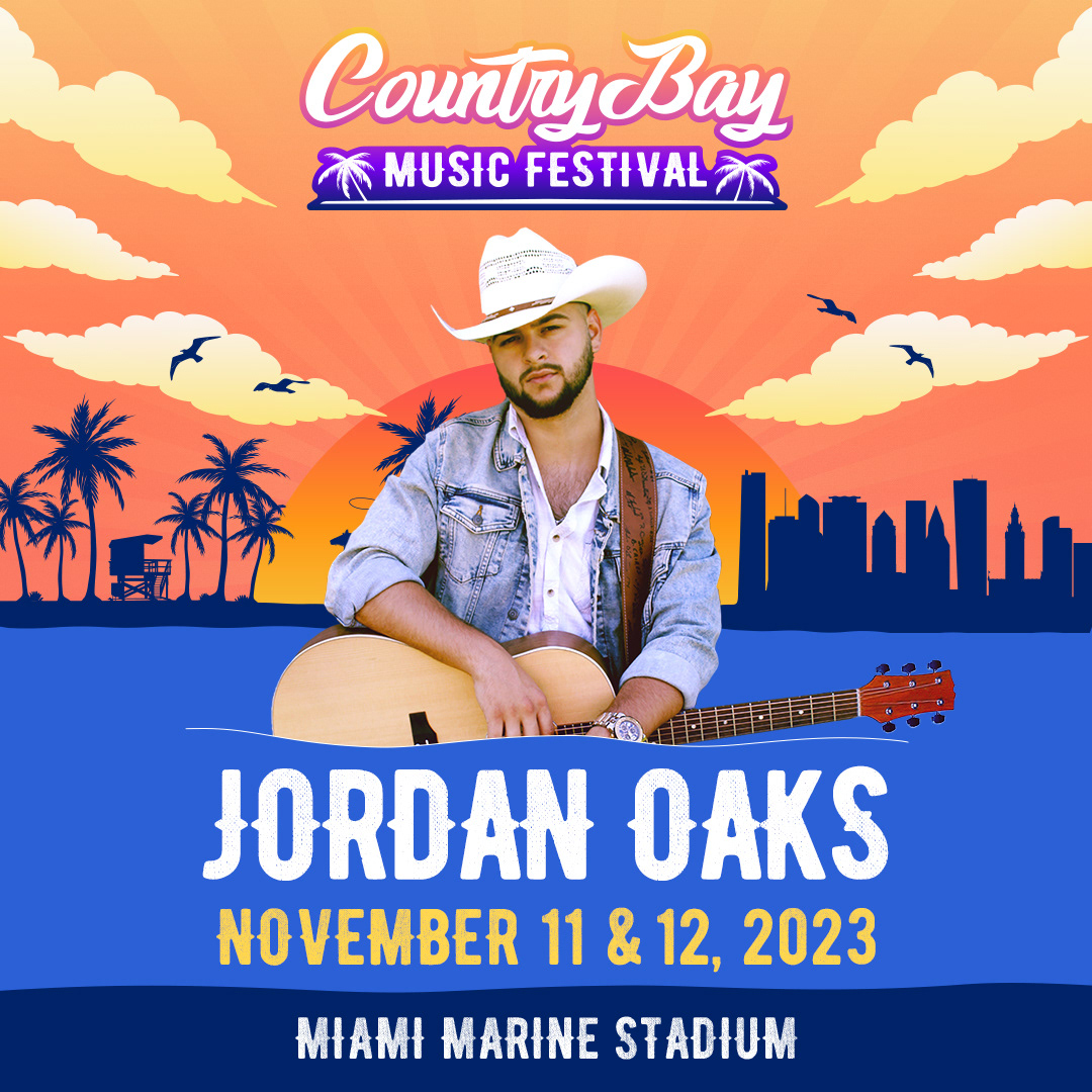
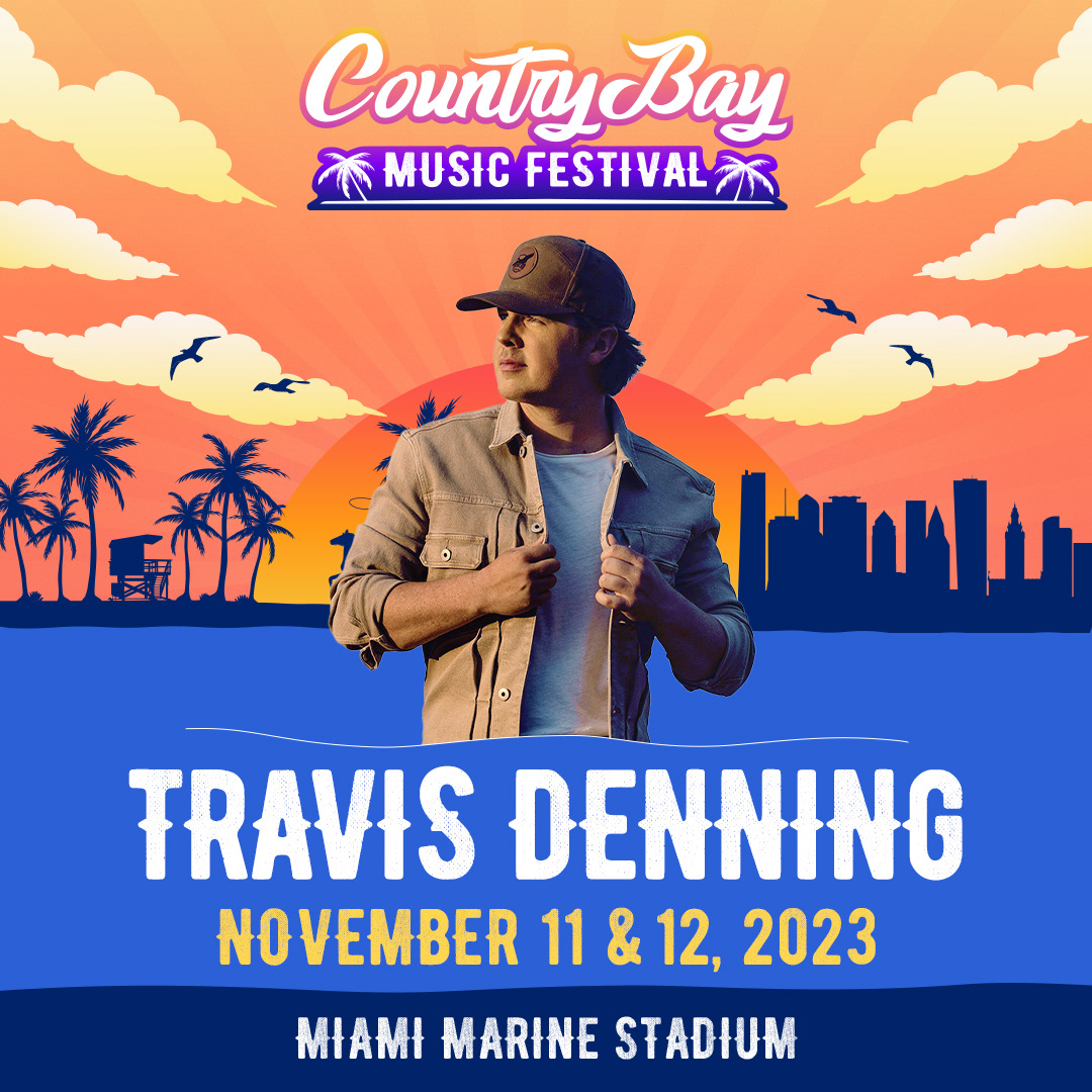
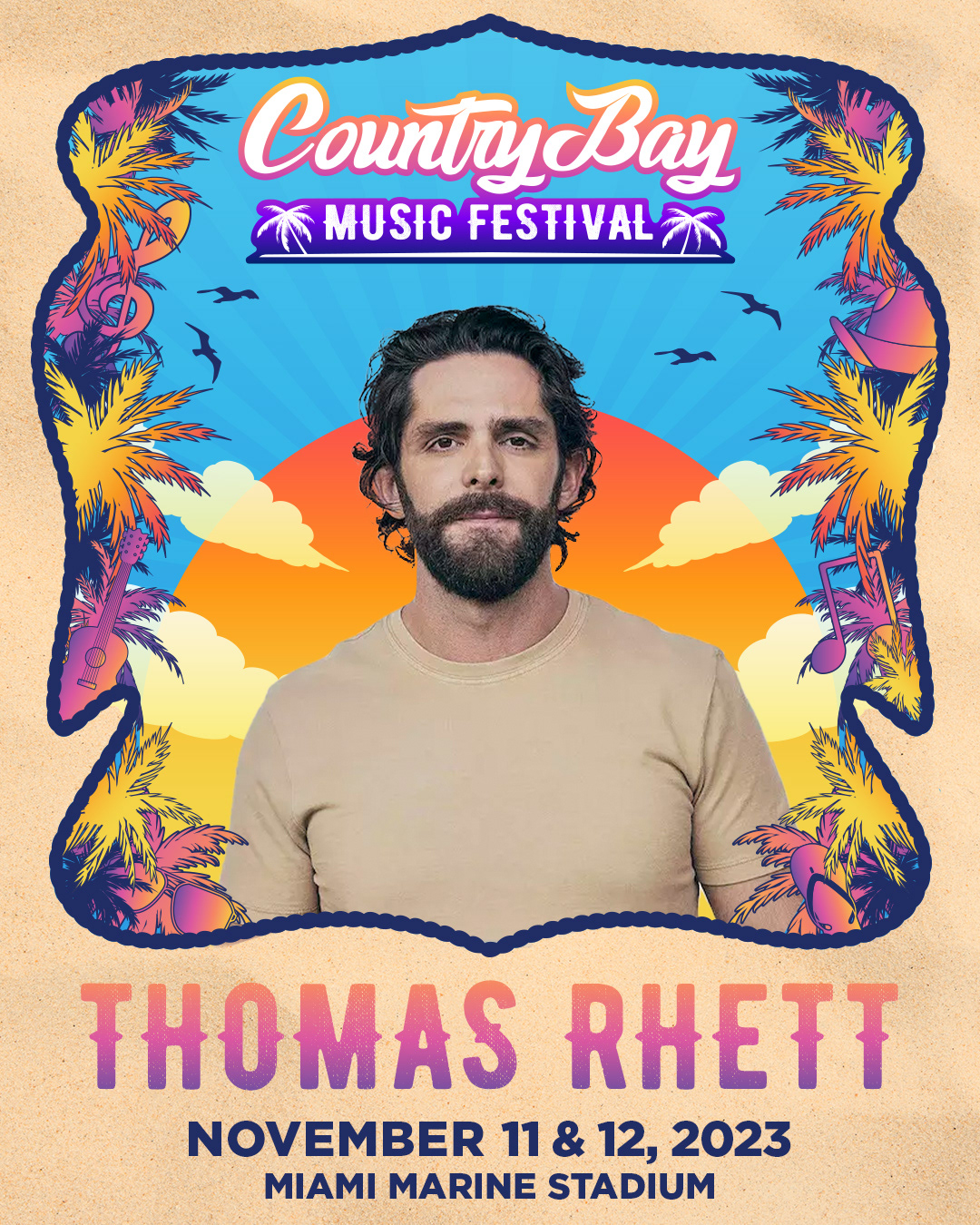
After the lineup flyer, it was time to create the singular artist flyers. The purpose of these was purely promotional. Recognizable names with recognizable faces. They could be posted individually on social, or plastered all over a wall downtown. We created a few variations. Ultimately the ones you see above are the end result, but the one pictured here is my favorite. It's the perfect mix of modern, and vintage. I wanted to channel the old Art Nouveau posters from the 70's while adding a country flare.
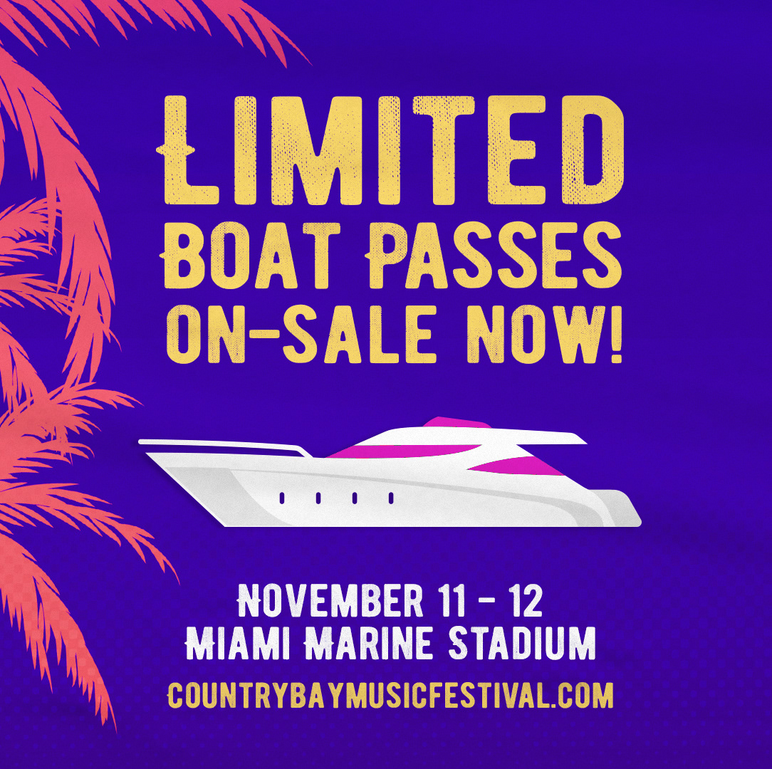
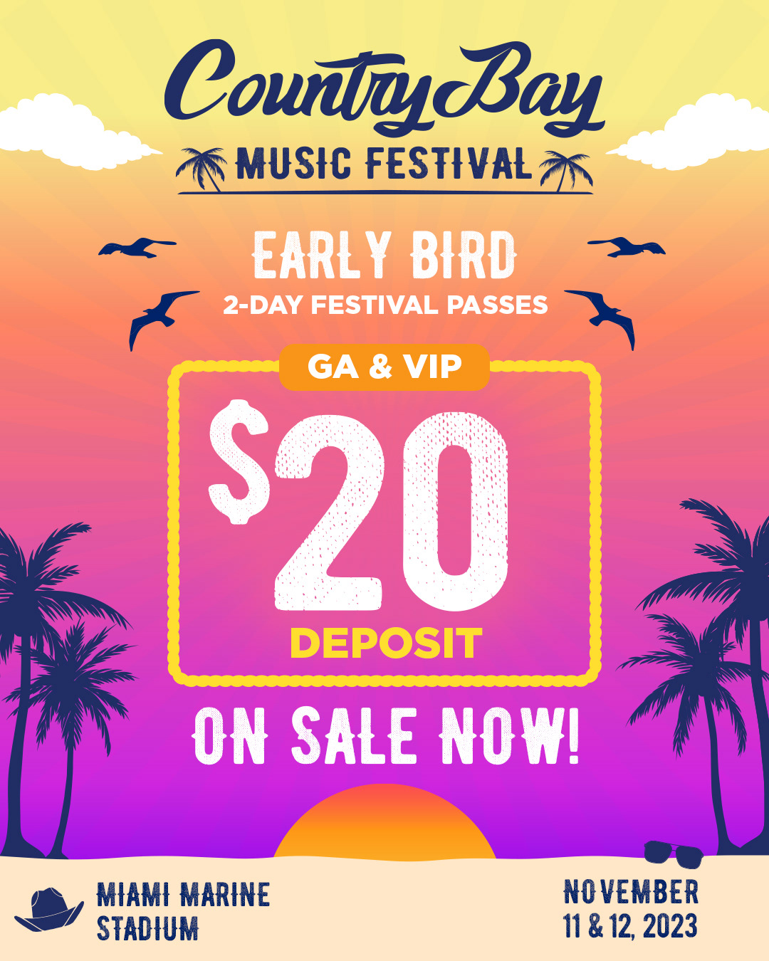
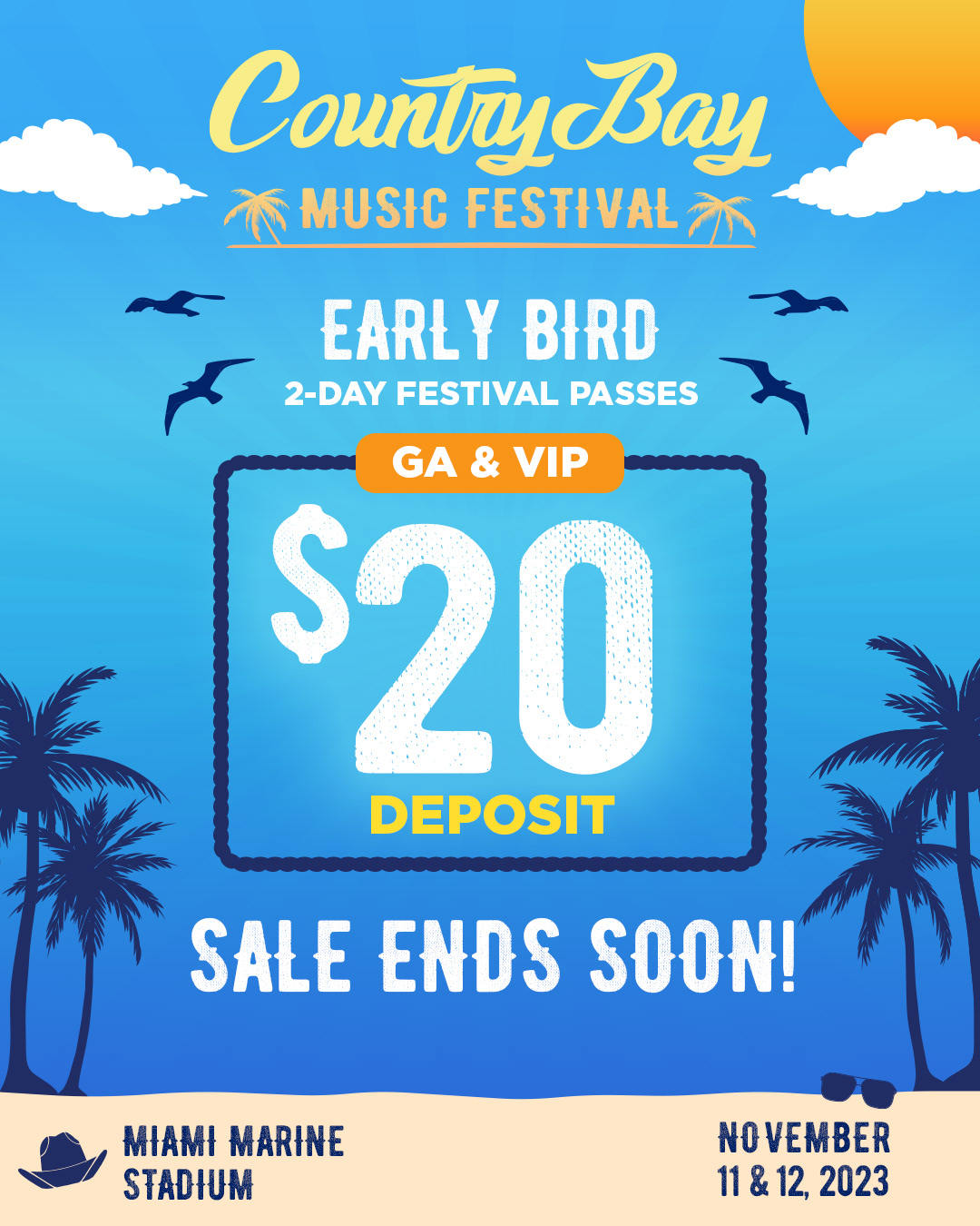
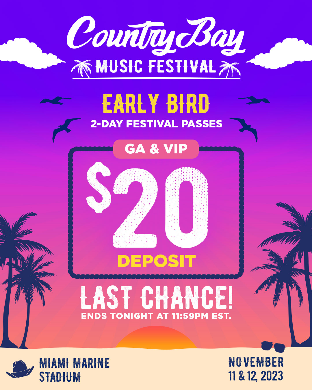
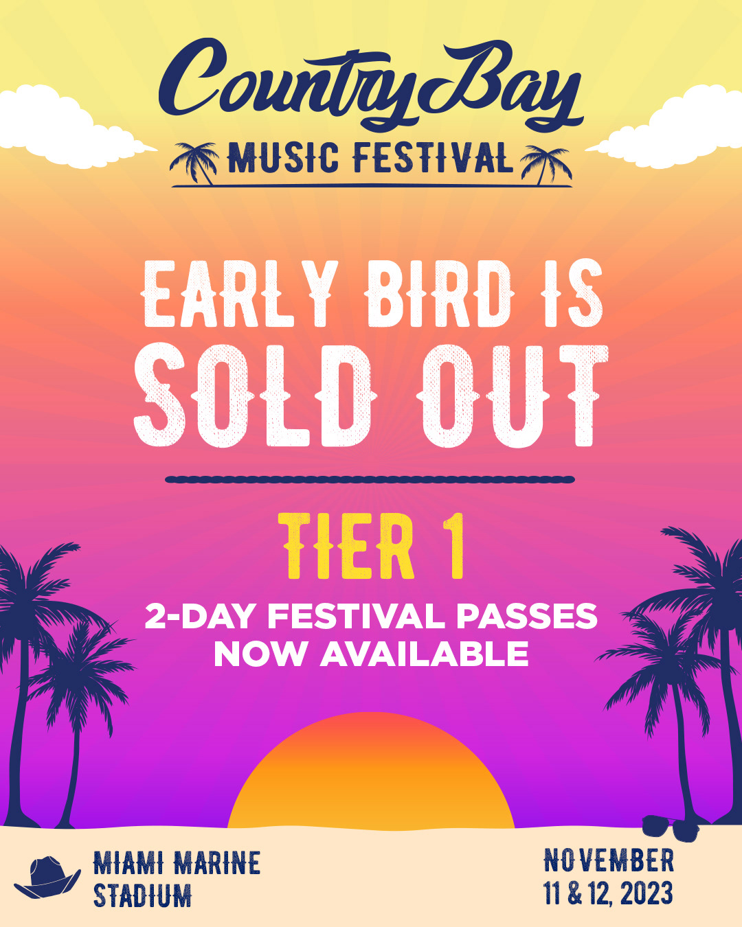
Below are examples of the ticket sales and pricing graphics created for the festival. Since the festival takes place on beach, why not go 'sunrise - sunset'? I decided a good motif would be to use the creative elements to create different scenes representing the different phases of the on-sale for early bird. On sale (sunrise), Sale ends soon (mid day), Last chance (sunset), and then cycle back through for Tier 1 and tier 2.
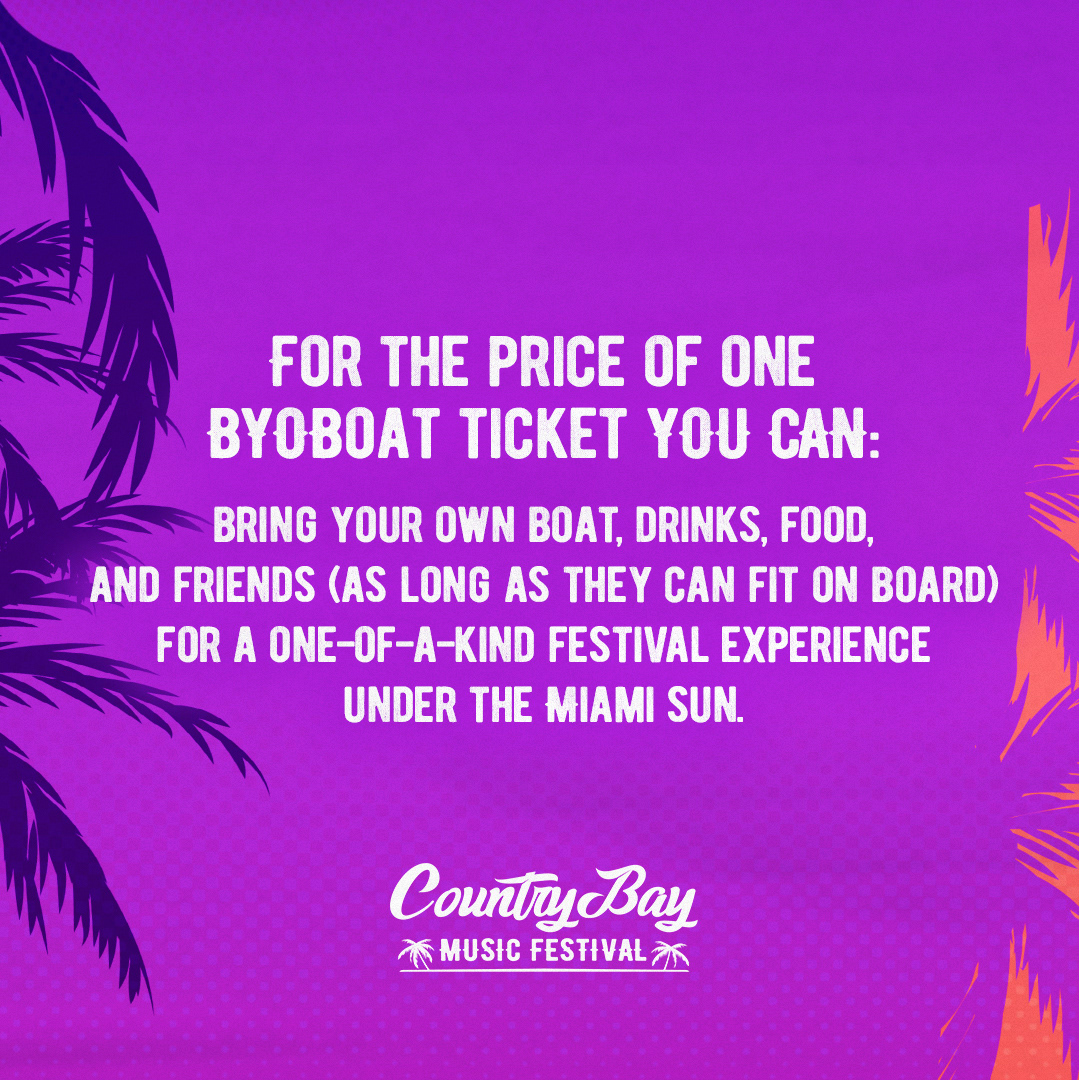
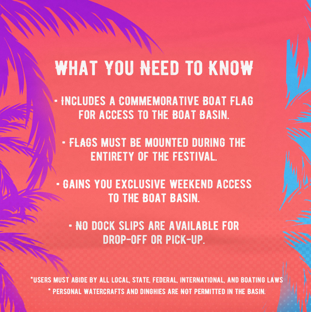
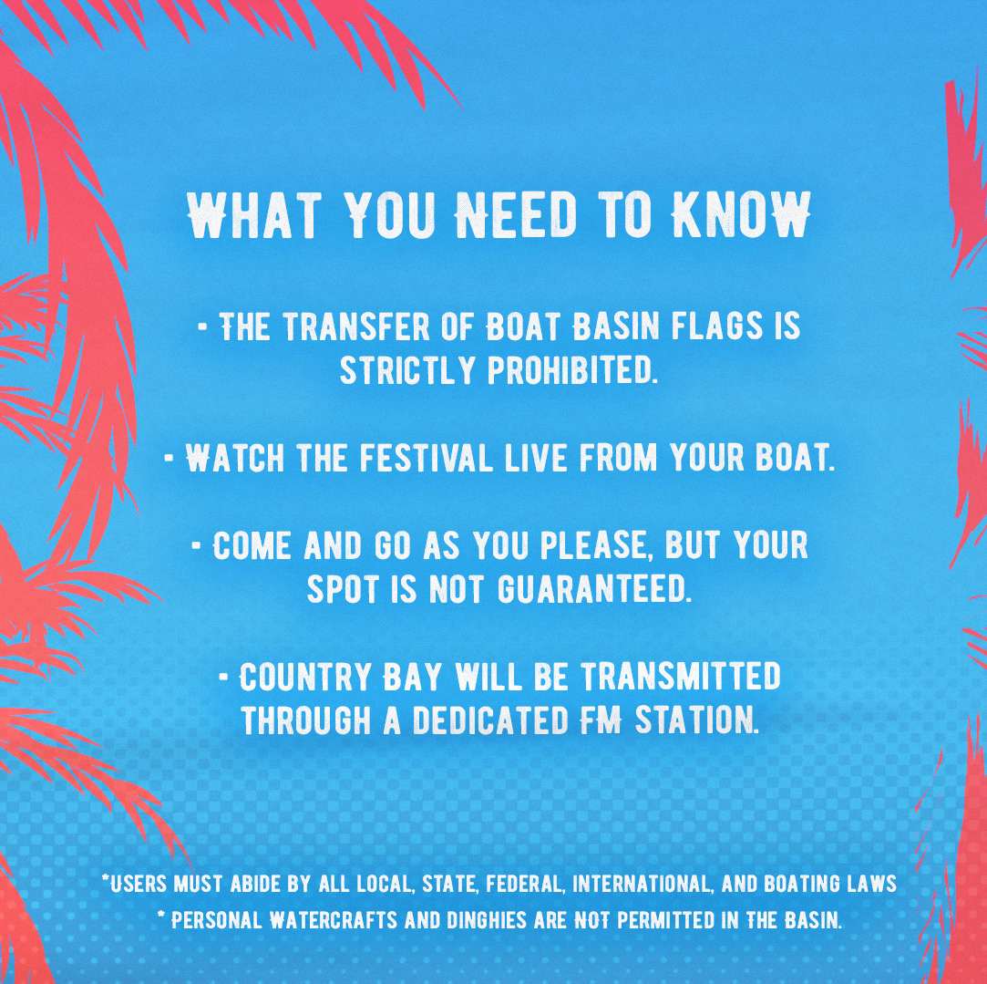
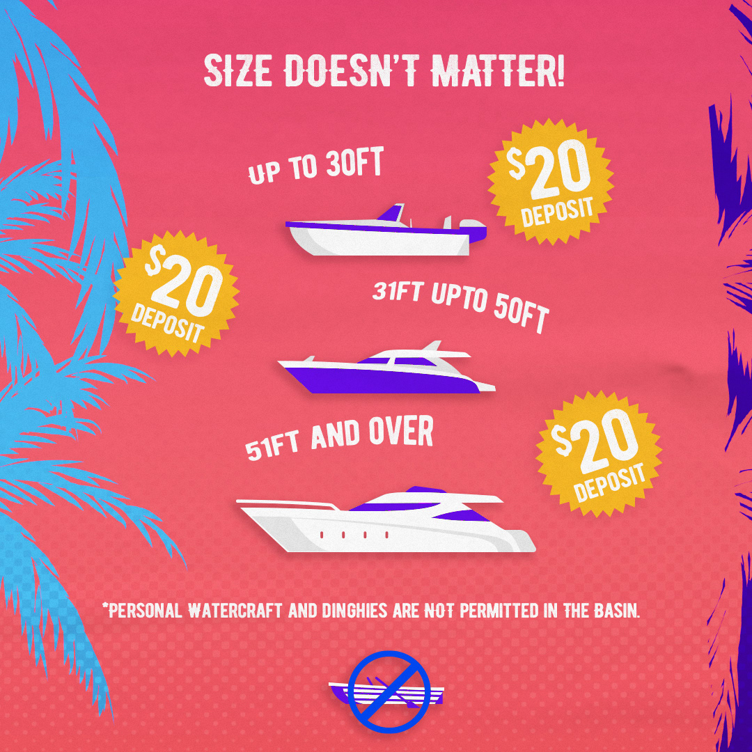
Below is an example of how we used social media and instagram carousels to publish need-to-know information about the festival and answer FAQ's.
