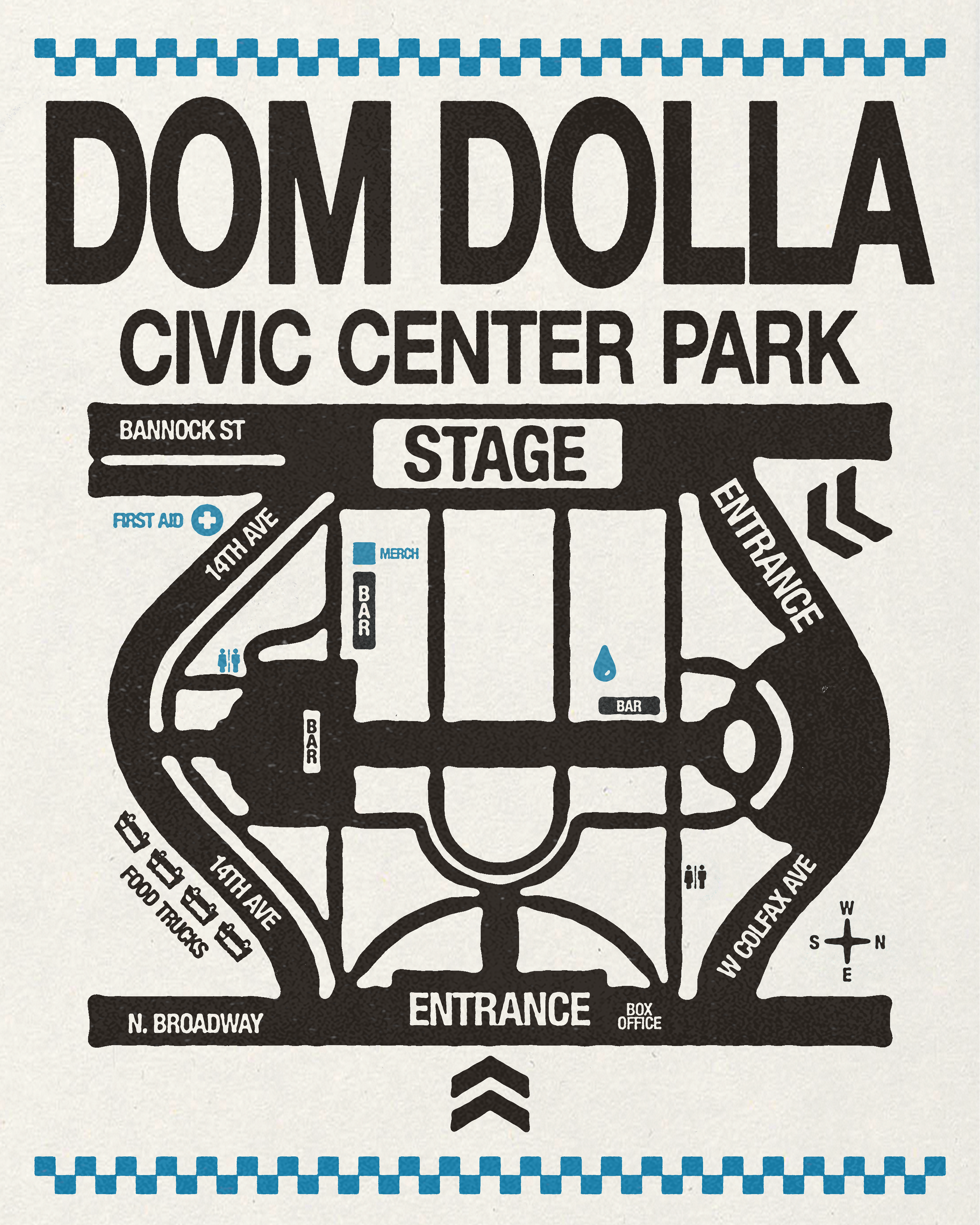
For Dom Dolla’s 2025 Tour I had the opportunity to design access passes that balanced function with brand expression, working with existing creative elements to create a cohesive theme. I focused on clear hierarchy, legibility, and durability for live-event use, while incorporating Dom’s visual language to create credentials that felt intentional, collectible, and on-brand. The result was a cohesive access system that supported backstage operations while elevating the overall event experience.
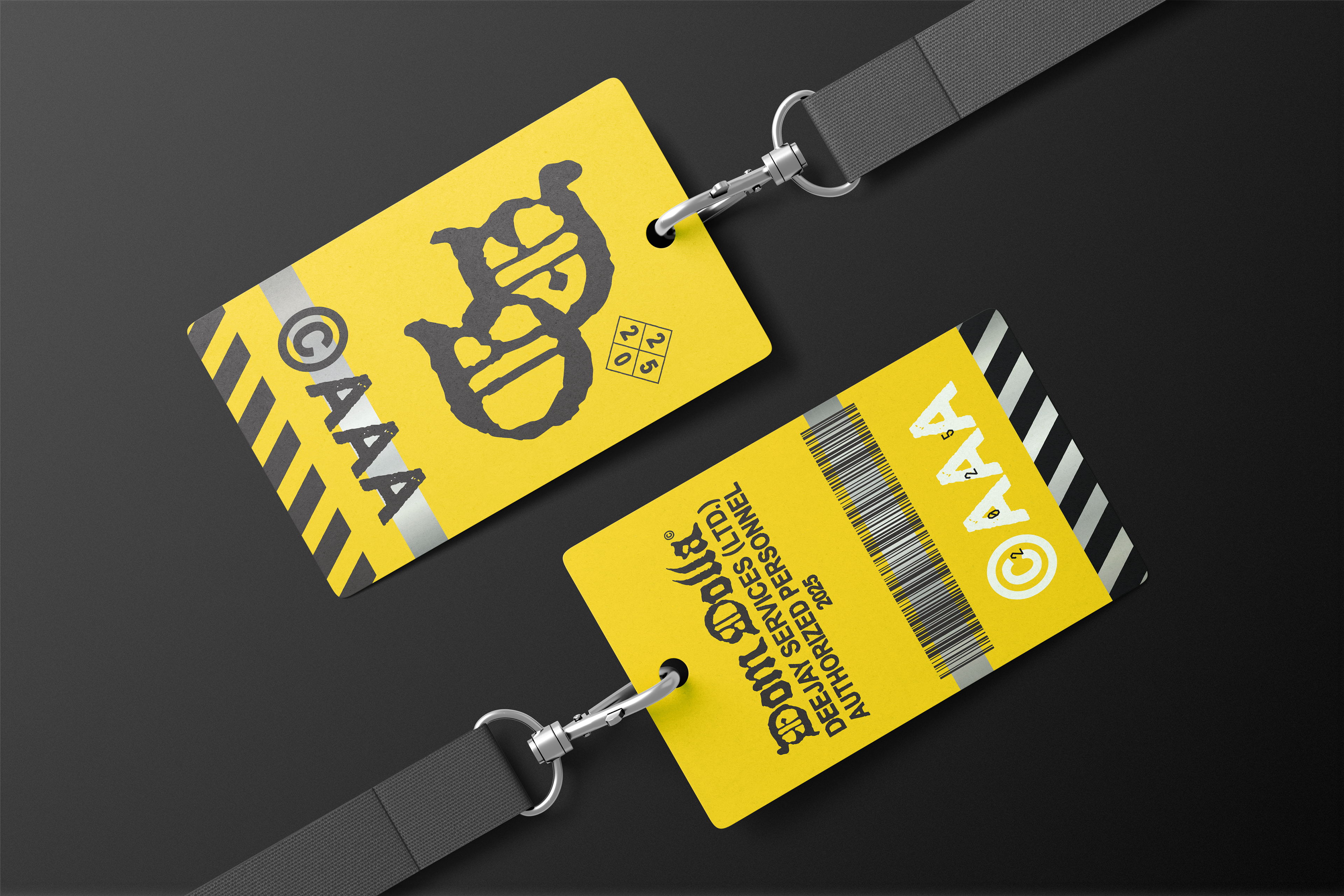
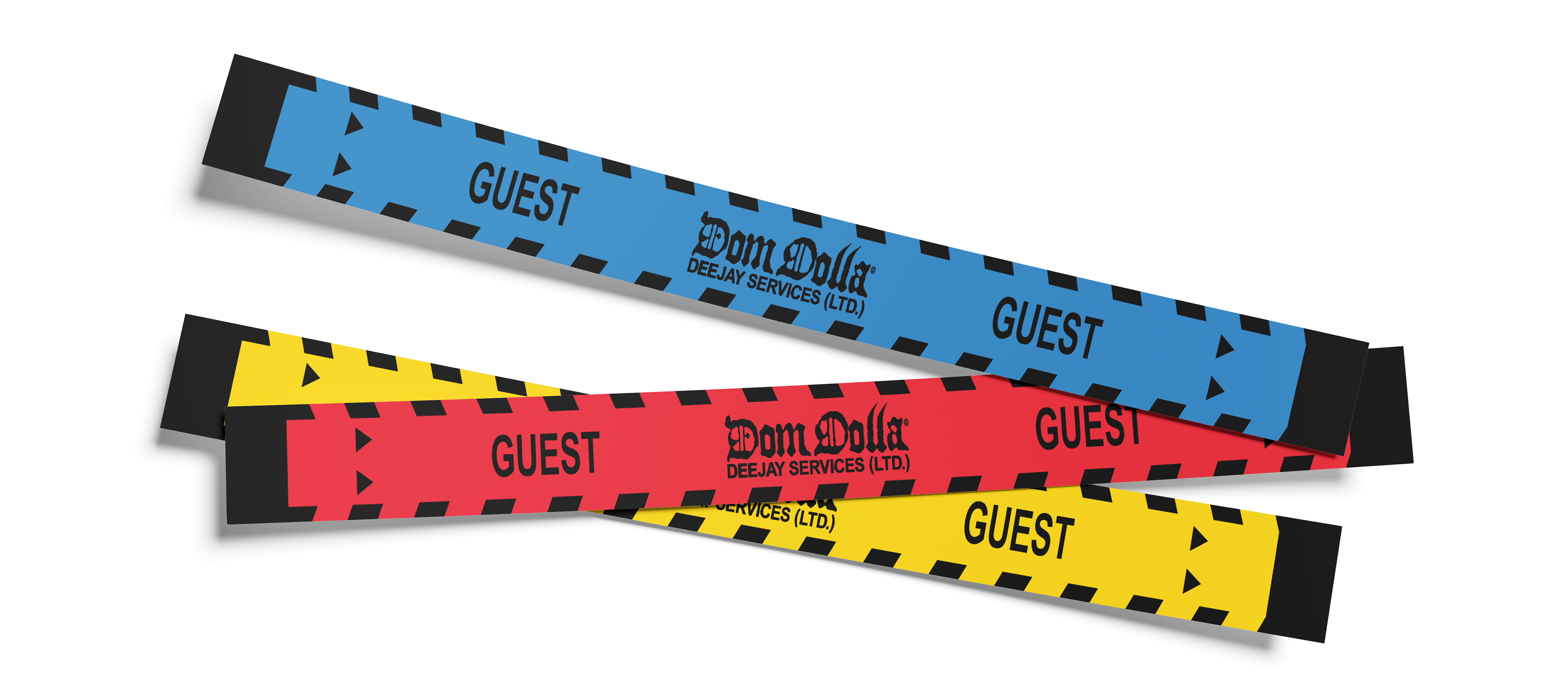
For Dom Dolla’s AAA credentials, I introduced a system of solid color-block bands to clearly differentiate access levels while keeping the design minimal and instantly readable. The use of bold, uninterrupted color allowed credentials to be identified at a glance in fast-moving, low-light event environments, while staying aligned with Dom’s stripped-back, graphic visual language. The result was a functional, no-nonsense access system that felt deliberate, cohesive, and on-brand.
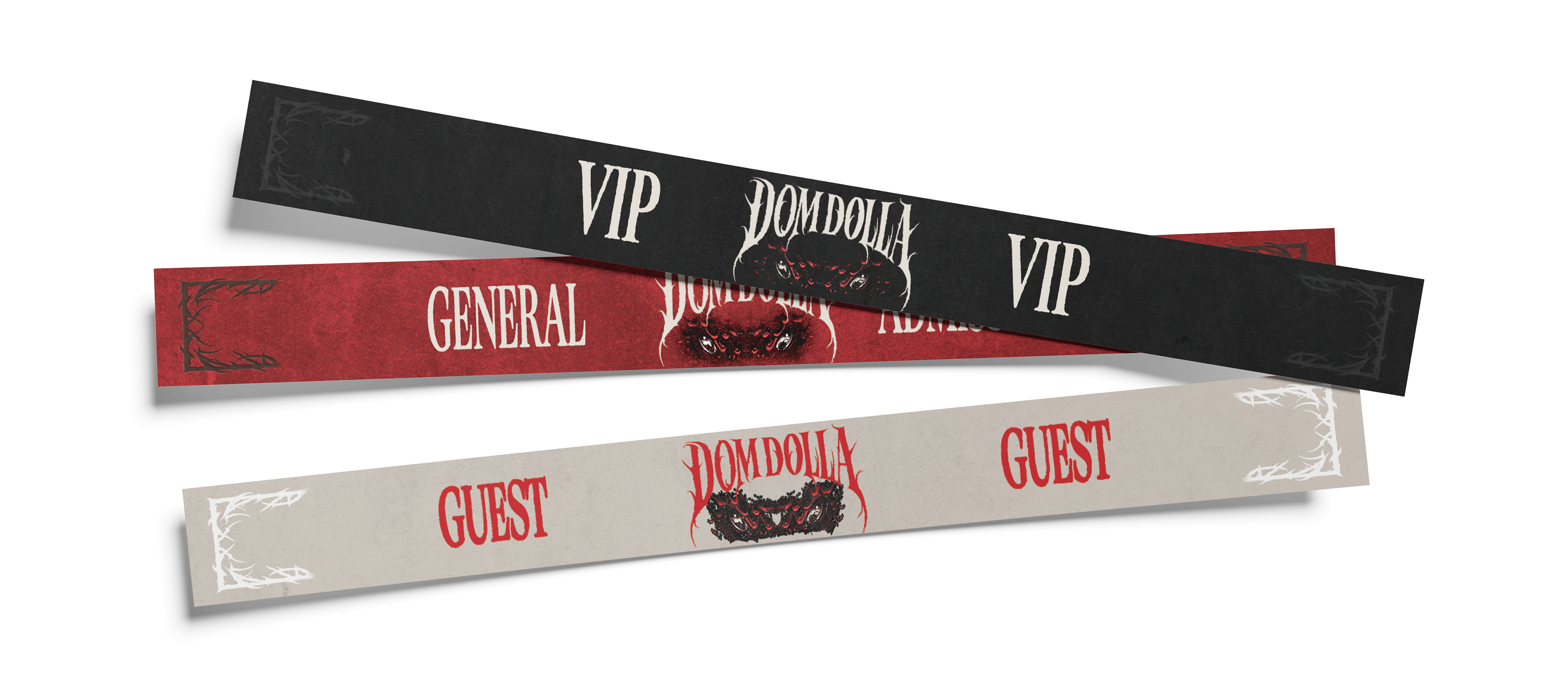
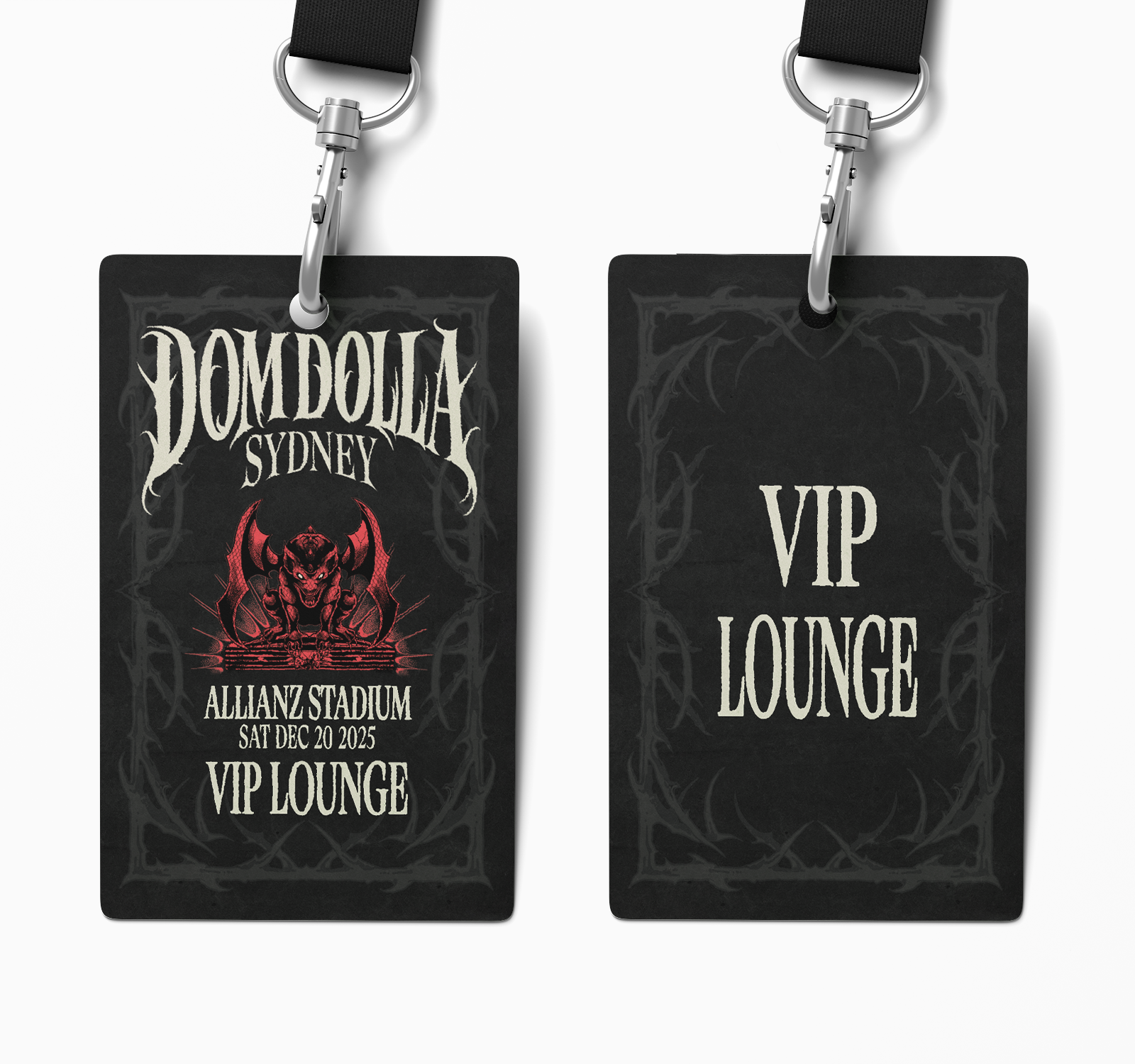
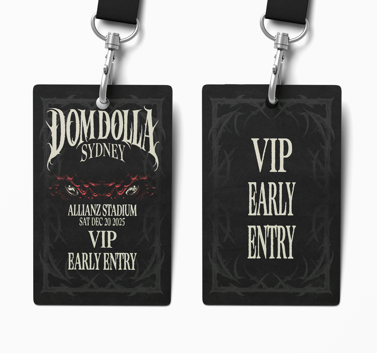
For Dom Dolla’s Sydney event wristbands, I designed a three-color access system—red, white, and black—to clearly distinguish VIP, Guest, and GA tiers while maintaining a cohesive visual identity. The design prioritized instant legibility and on-site functionality, using color as the primary differentiator without sacrificing brand consistency. The result was a streamlined access solution that balanced operational clarity with a polished, on-brand aesthetic.
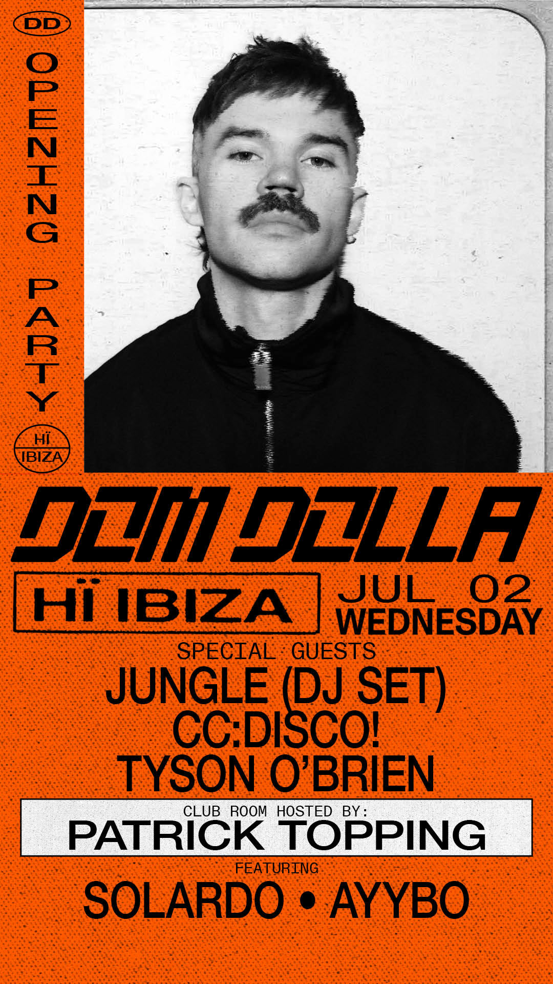
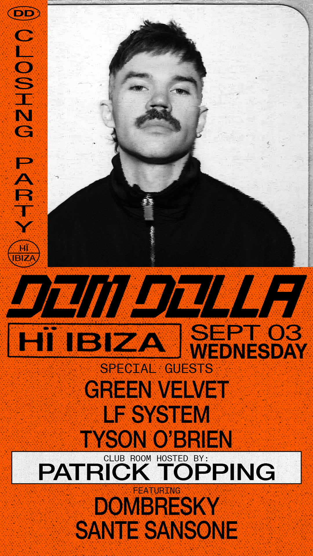
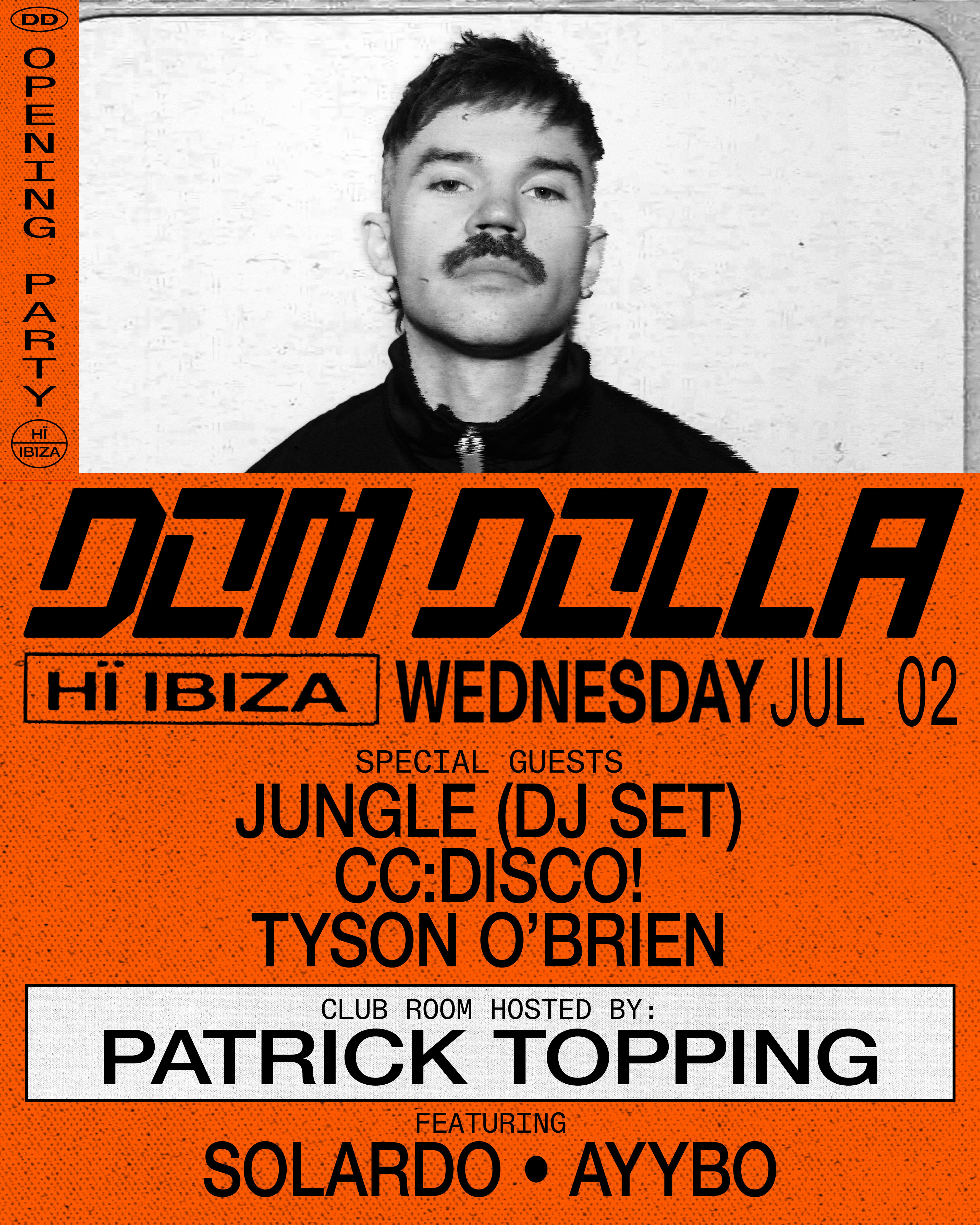
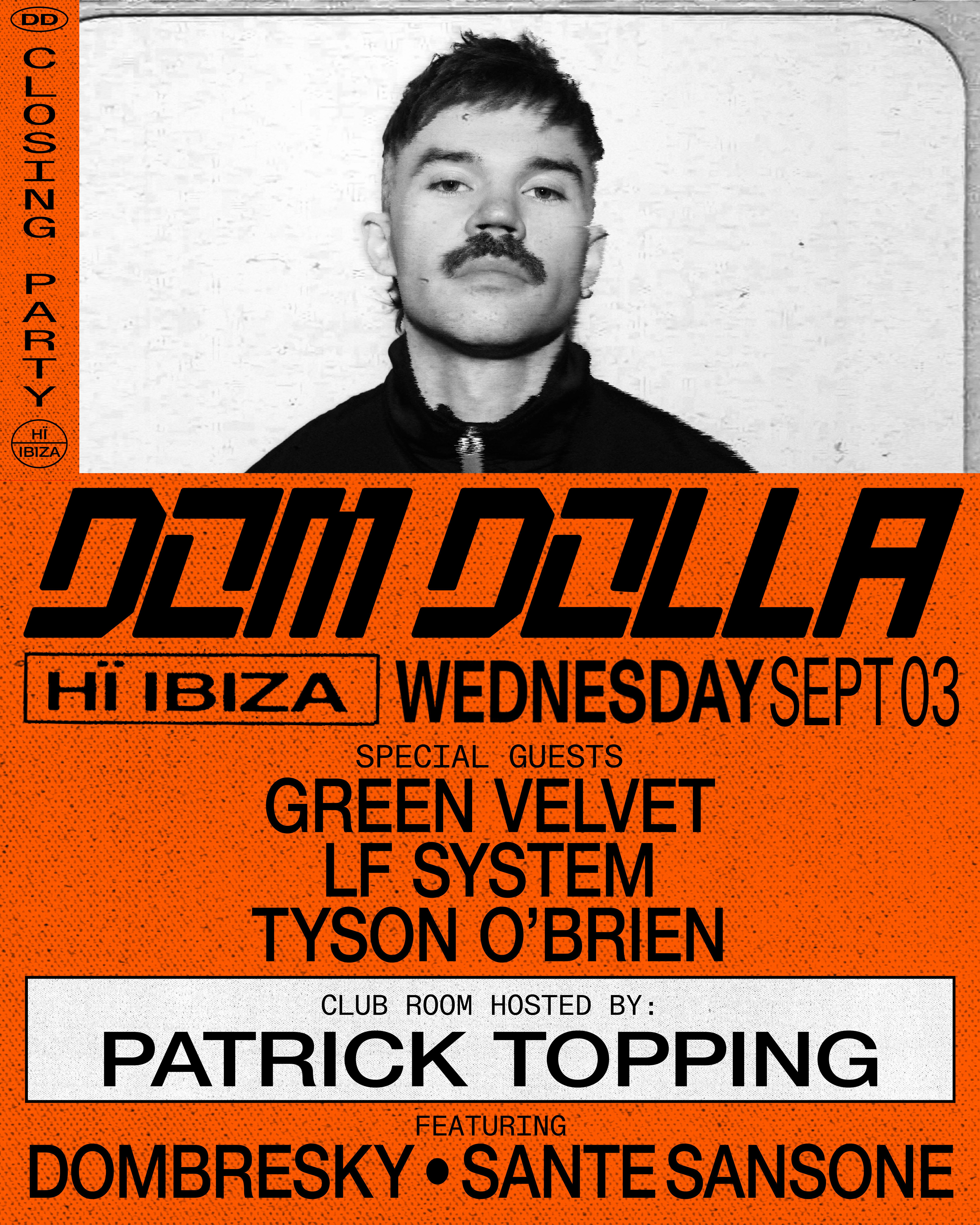
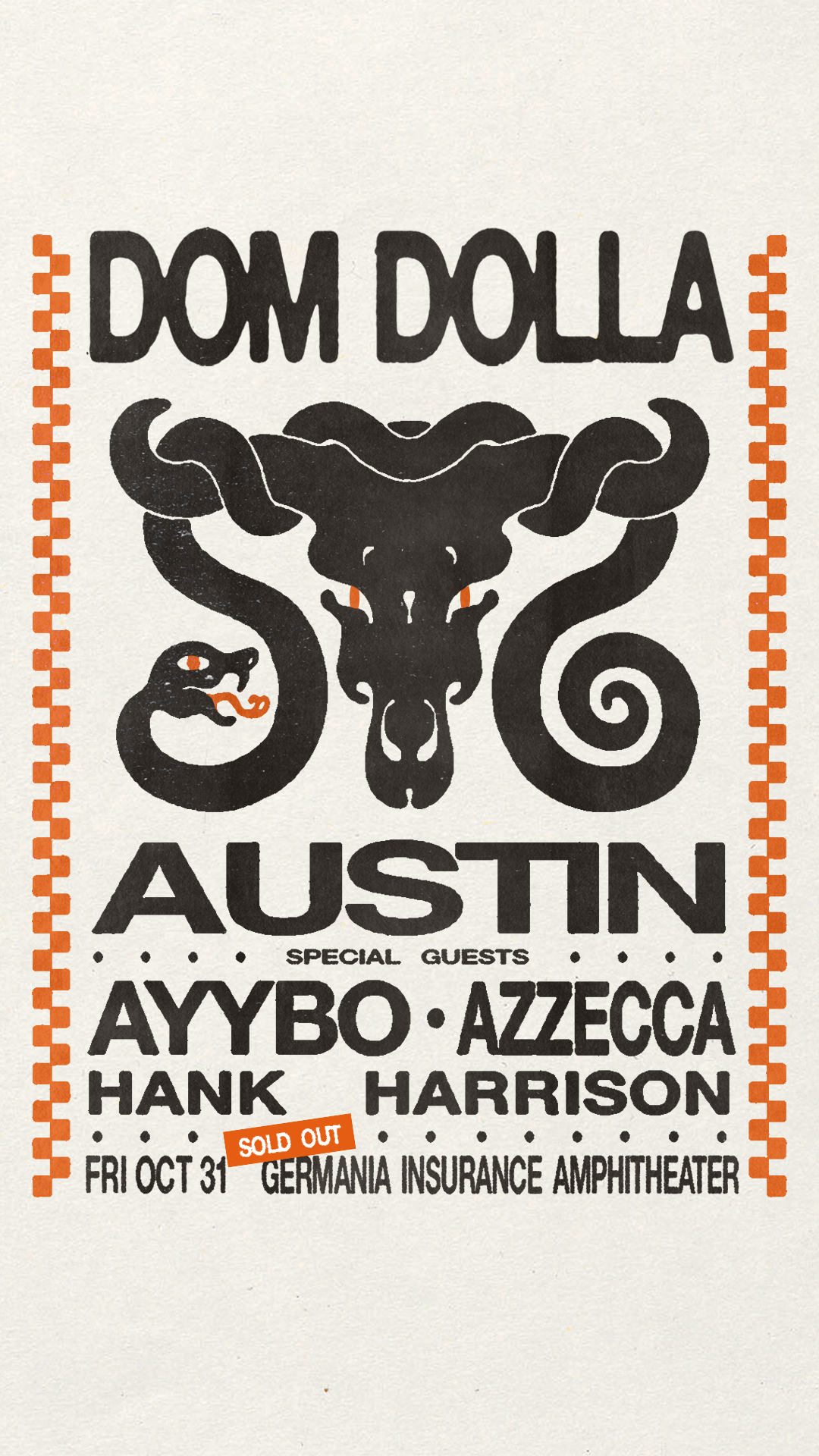
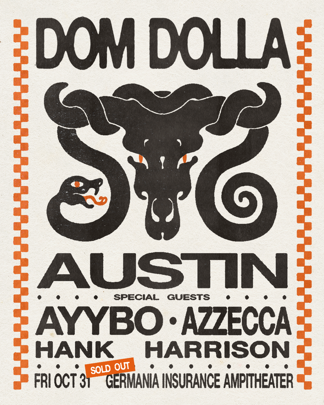
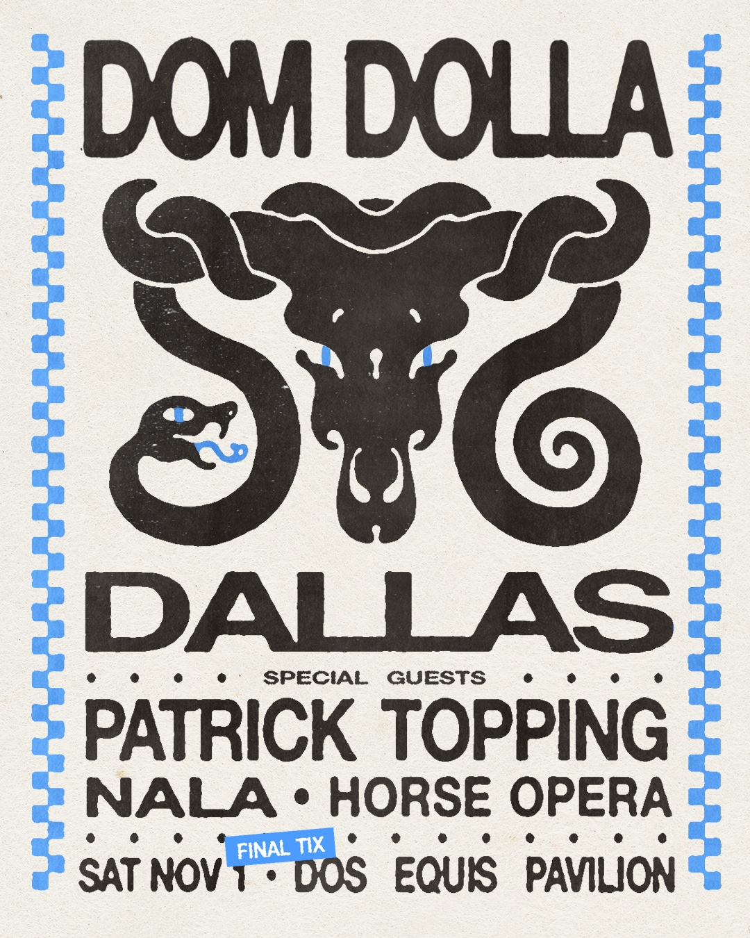
For Dom Dolla’s flyers and “KBYG” social content, I developed a series of region-specific visual systems designed to adapt the artist’s identity to different markets while maintaining a cohesive global brand. Each territory was approached with its own creative direction, informed by audience, culture, and context.
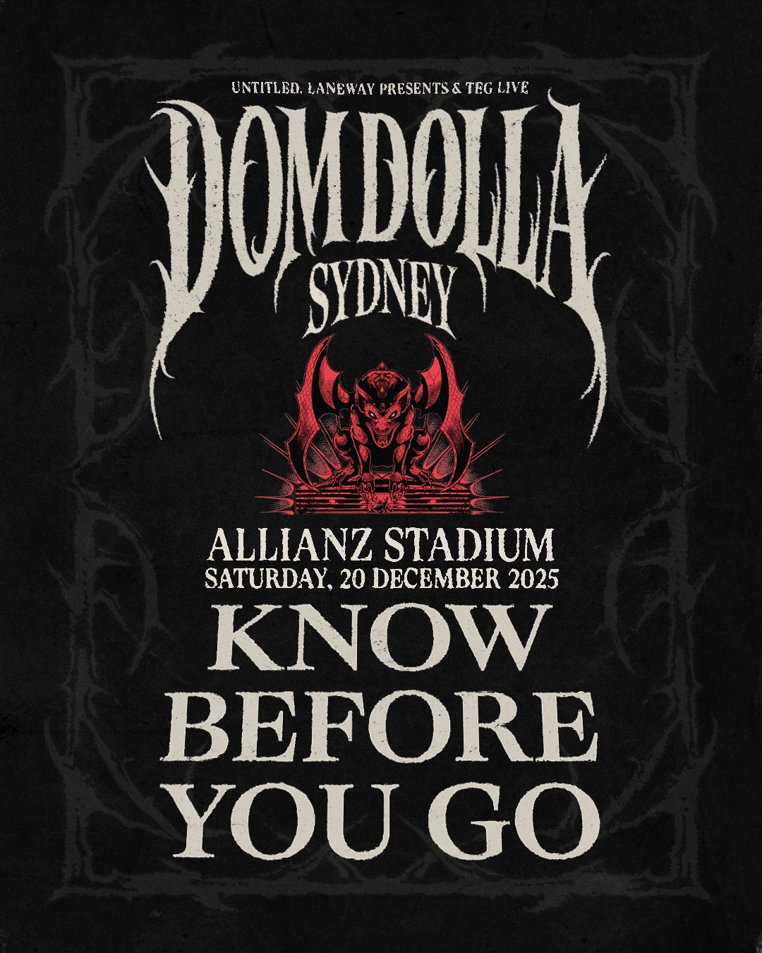
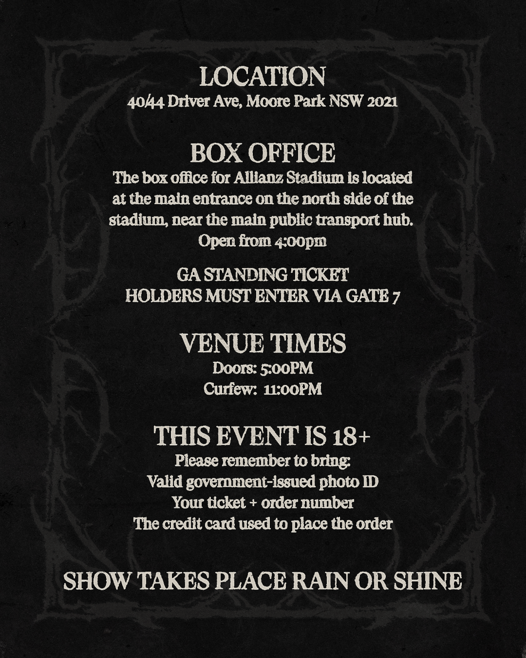
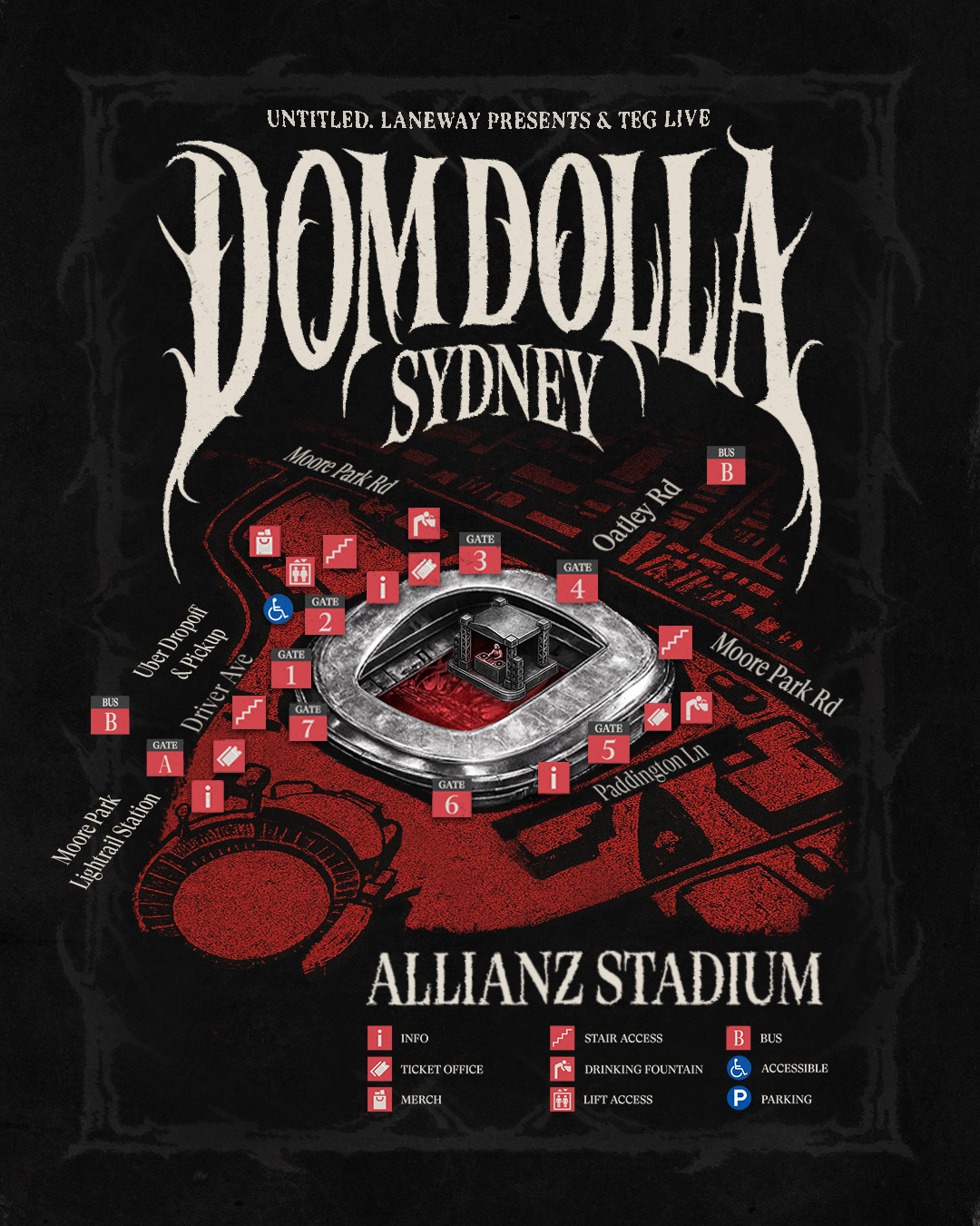
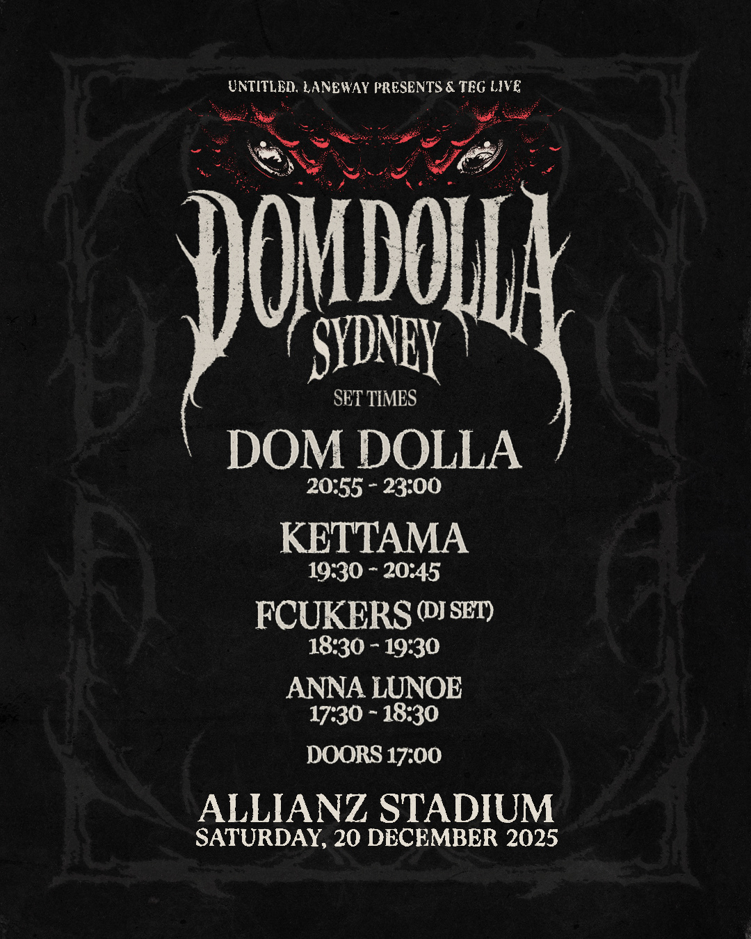
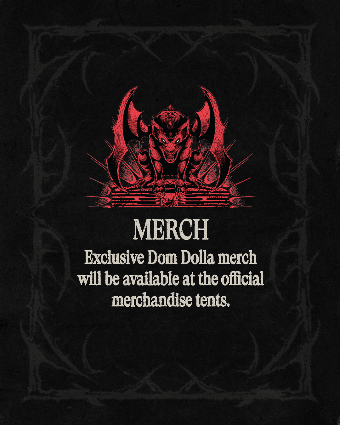
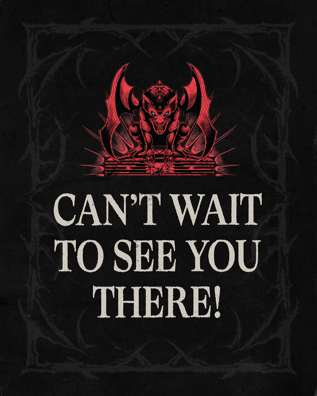
U.S. shows leaned into an organic, hand-drawn aesthetic—imperfect, expressive, and human—creating a raw visual language that felt intimate and energetic. Ibiza took a more tech-forward approach, built around bold orange accents, Y2K-inspired techno typography, and futuristic graphic treatments that aligned with the island’s club-forward, cutting-edge sound. Sydney pushed into a darker, more aggressive space, combining grunge, goth, and hardcore influences with distressed textures and Dom Dolla’s iconic monster illustration to create a heavier, high-impact visual tone.

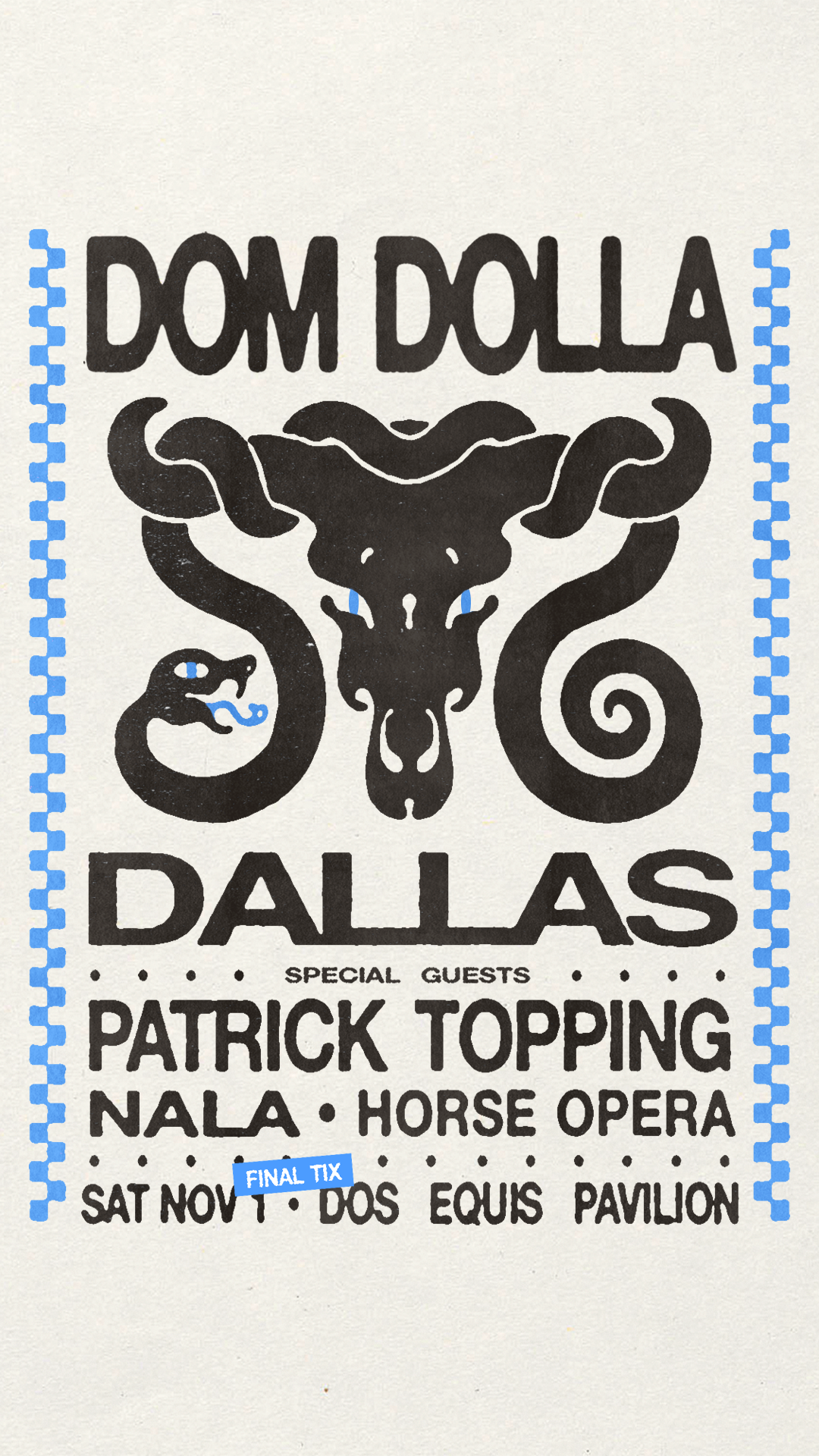
Across flyers and social assets, the work demonstrated how a single artist brand could remain recognizable while flexing stylistically across regions—balancing consistency with experimentation and allowing each market to feel distinct, intentional, and culturally tuned.