During my role as Art Director at Loud And Live, I had the exciting opportunity to develop tour art concepts for multiple artist pitches, including the creative pitch for Omar Courtz's tour. I was tasked with crafting the overall creative direction and key visuals for the campaign, with a focus on capturing the artist's bold, dynamic style and connecting it with his audience in a meaningful way.
After exploring several directions for the concept, we agreed that for a rising artist like Omar Courtz, we needed to take a bold, unconventional approach. This project presented the perfect opportunity to push creative boundaries, experiment with new design trends, and showcase fresh styles.
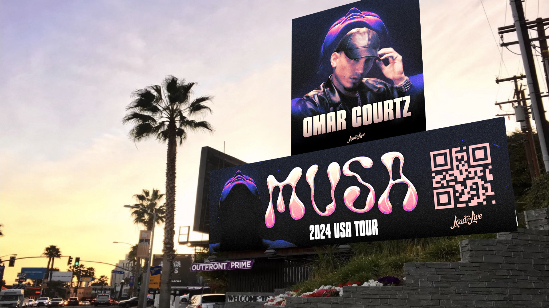
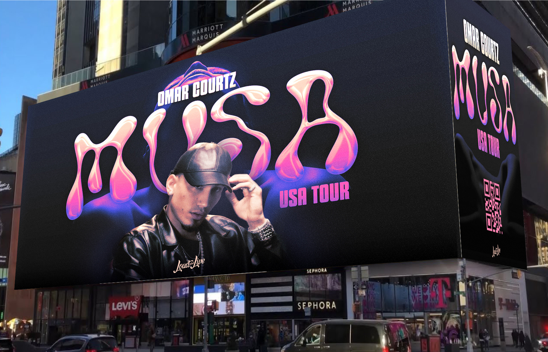
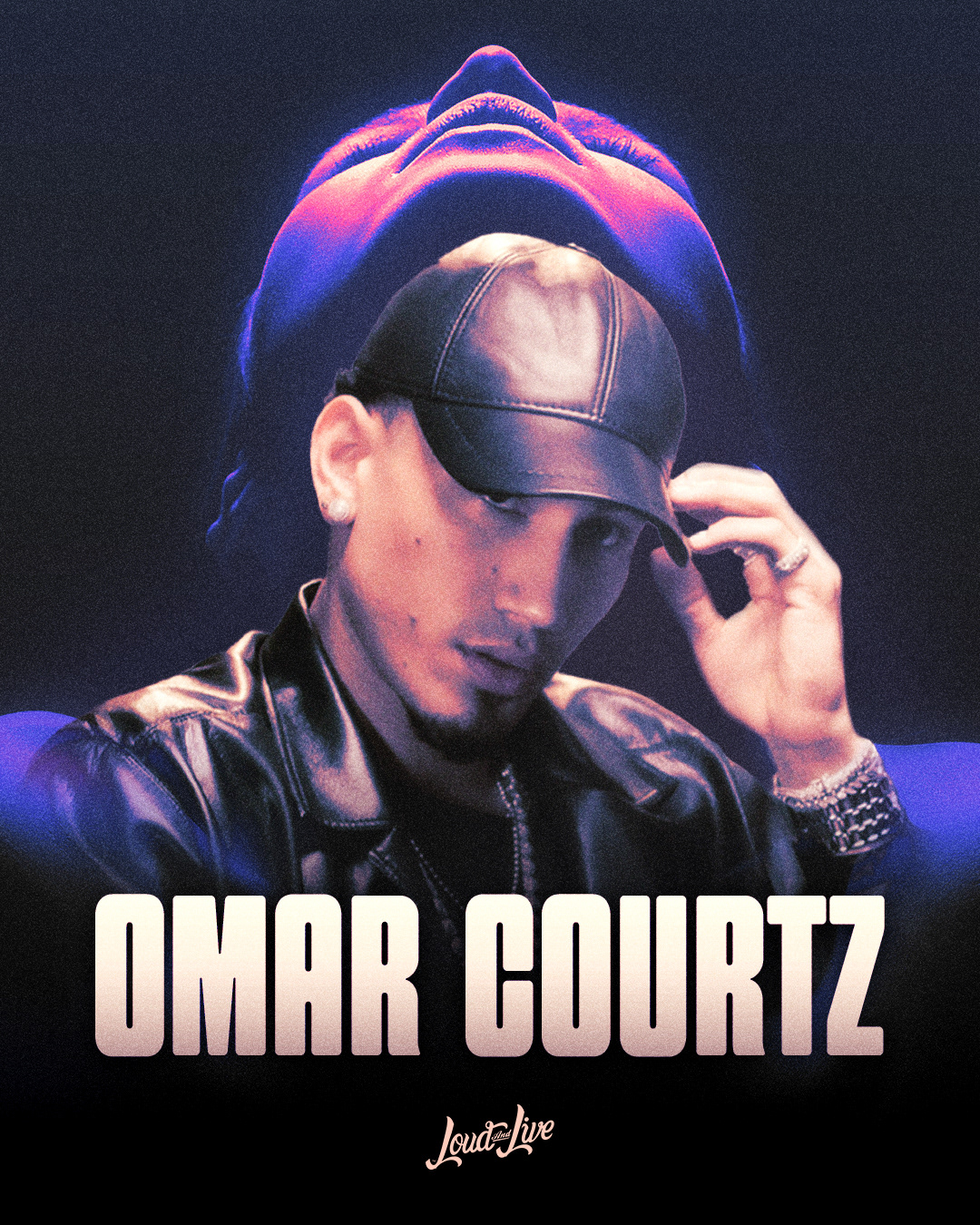
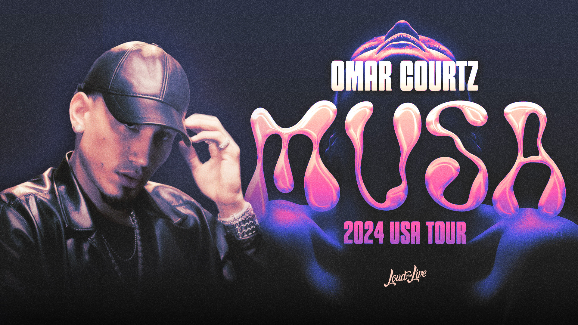
A key challenge for this project was to visually represent the concept of "Musa" (Muse) in a way that reflected Omar Courtz’s music, much of which revolves around the female form. The concept required integrating the silhouette of a woman into the background, symbolizing the muse who inspires his art. While the idea was straightforward, I wanted to push beyond the expected and bring an innovative edge by experimenting with abstract fonts, unconventional type arrangements, and non-traditional layouts. This approach helped infuse the artwork with a sense of modernity while maintaining an emotional connection to the music's themes.
As part of the campaign, I also developed billboard and street poster mockups to bring the tour art to life in real-world contexts. These mockups allowed us to visualize how the key art would translate on a large scale, maintaining the striking impact of the design while ensuring the details remained clear and compelling from a distance. The bold color schemes and dynamic layouts were designed to capture attention quickly in high-traffic areas, reinforcing the tour’s presence in a way that was impossible to miss.
The concept centered on blending the allure of the female silhouette with Omar Courtz’s energetic, bold image. The artwork combined dynamic typography, abstract forms, and a powerful color palette to evoke both sensuality and strength. By playing with unique fonts and layering the female figure subtly into the background, I aimed to create a visual that was as engaging as it was thought-provoking. The non-traditional layouts and type treatments allowed for a more artistic, avant-garde feel, which gave the overall campaign a fresh look.
