University of Miami Custom Typeface Design
Loud And Live
Project Type: Custom Typeface Design
Loud And Live
Project Type: Custom Typeface Design
During my time at Loud And Live, I had the exciting opportunity to work on a custom typeface project for the University of Miami. The university wanted to modernize their visual identity, particularly across their athletic teams and facilities, while staying true to their long-established brand. I was tasked with designing a series of typefaces that reflected the university’s dynamic spirit.
Concept & Direction
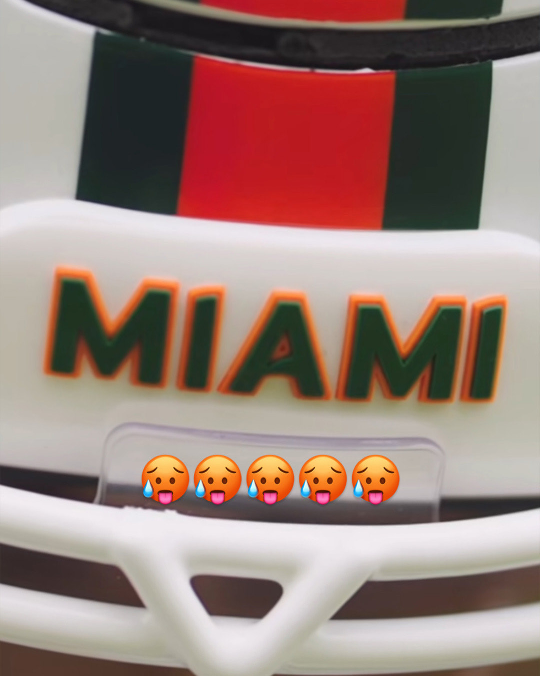
After completing the initial concept for the typefaces, I felt it needed something more—something that truly reflected the University of Miami’s identity. While watching the weather, inspiration struck: the hurricane symbol, synonymous with the university, could be incorporated into the type design. We used the swirling "fan" elements from the hurricane icon to replace the crossbars on the letters "A" and "I"—letters that feature prominently in "Miami" and "Hurricanes." The result was subtle yet tasteful: a design that was recognizable but still unique.
Visual Elements
In keeping with the hurricane theme, we decided to name the font 'Category'. Instead of the traditional weight names like Light, Regular, or Bold, we embraced the idea of categorizing the font weights as Category 1 through 5, playing off the hurricane scale. This clever twist added both a playful and meaningful connection to the university's storied brand.
The Complete Look
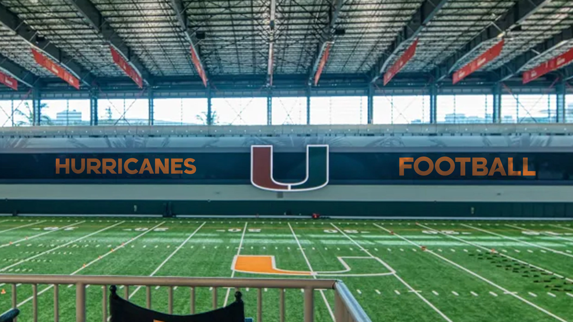
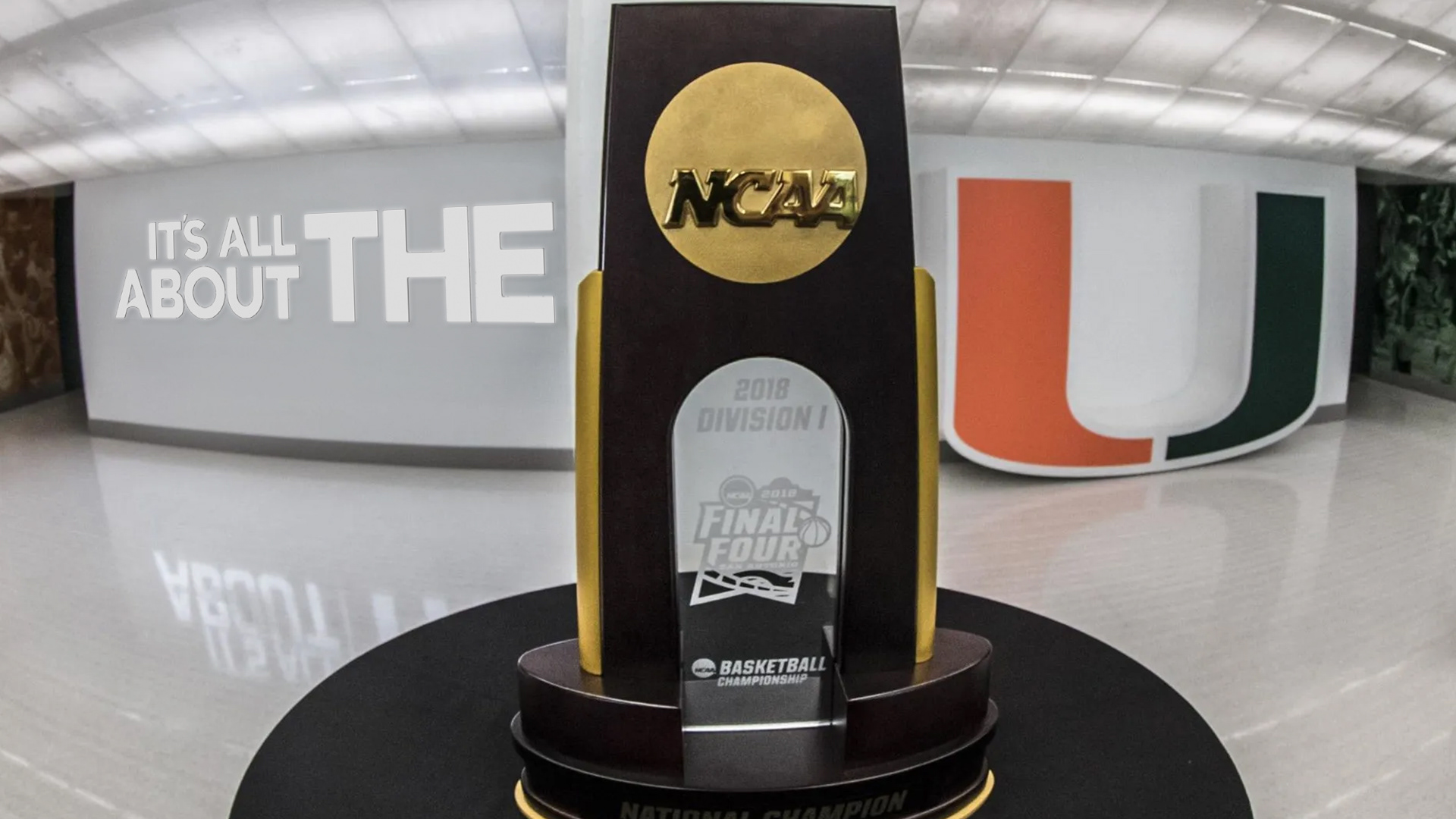
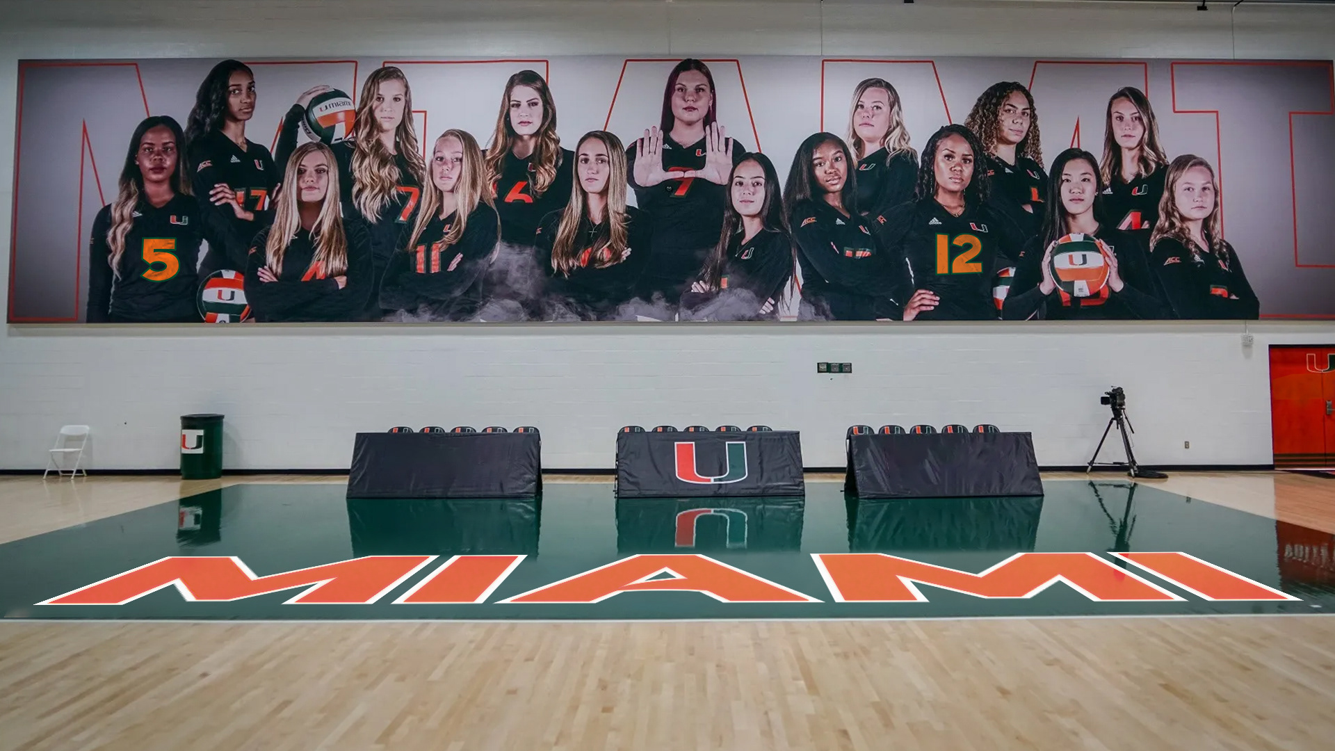
Putting it all together with the Miami colors and styling really brought the concept home. Upon mocking it up on the facilities and jerseys we immediately knew we had something special.
The final result is something classic and timeless. A clean, modern typeface, with simple forms and smooth geometry. Easily legible, from far away and up close. The anatomy of the letterforms, instantly attributable to the team they represent.
Results
The custom typefaces created a balance between modernity and tradition, breathing new life into the University of Miami’s branding. With bold, clean lines and hurricane-inspired touches, the typeface was implemented across the university’s teams, signage, and promotional materials. The Category font family offered a fresh, cohesive visual identity that was as strong as it was recognizable, aligning perfectly with the university’s powerful heritage.
In the wild!
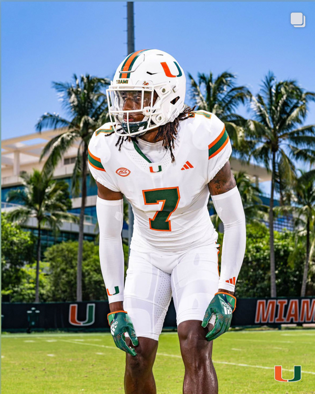
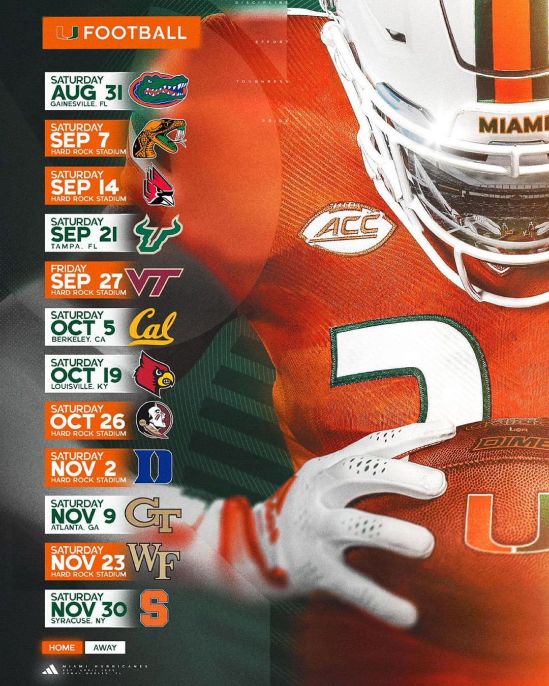
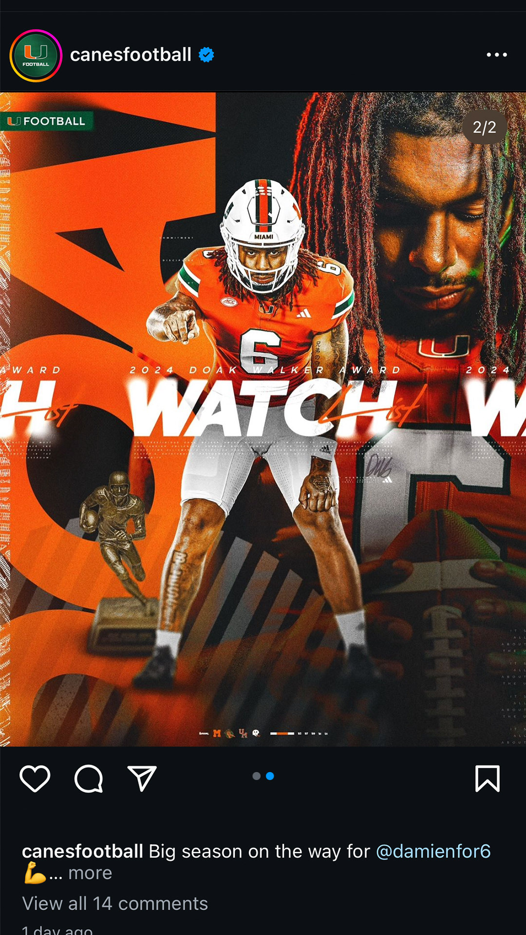
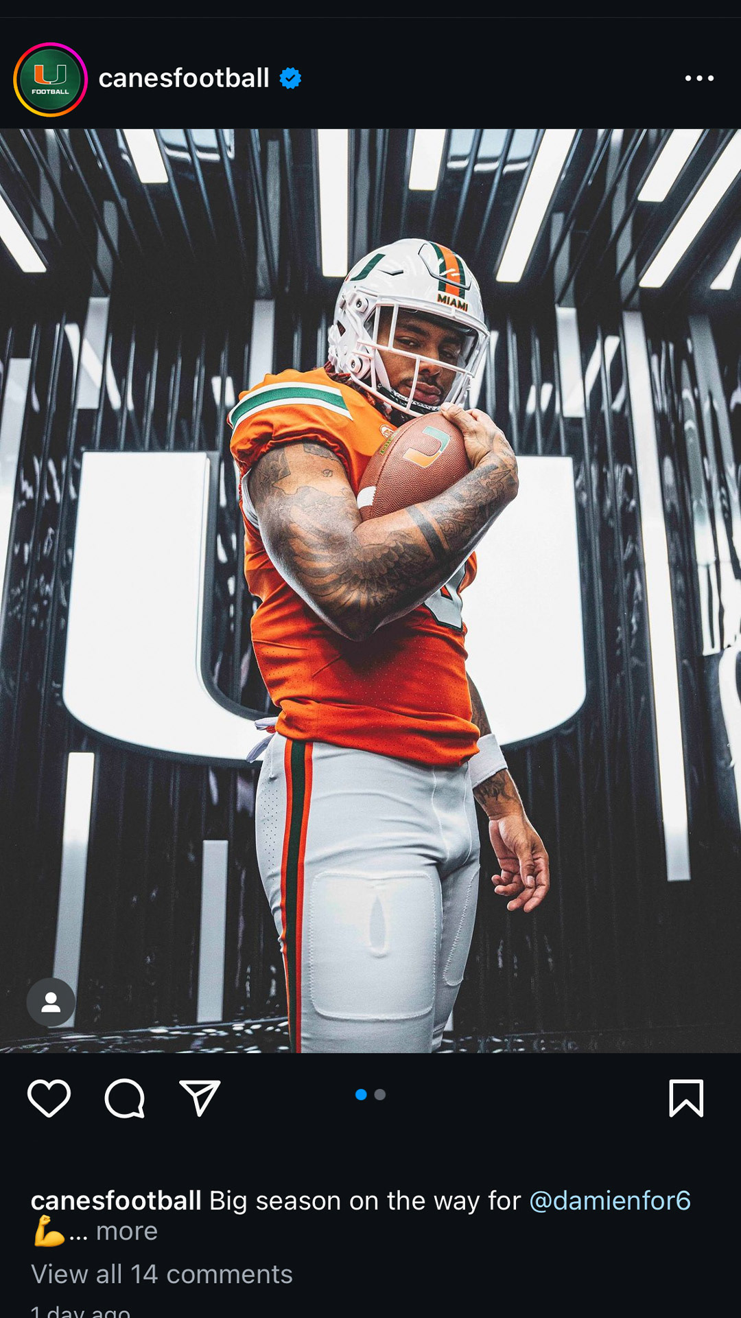
The following social posts are some recent examples of the type family used on jerseys and in social media.
*I did not design these graphics, they were created by UM, they are purely real life examples of my work in use.
