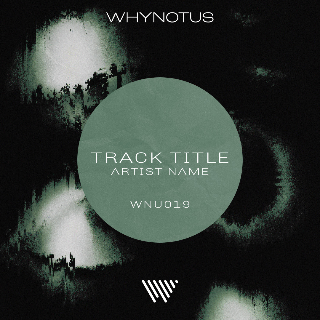
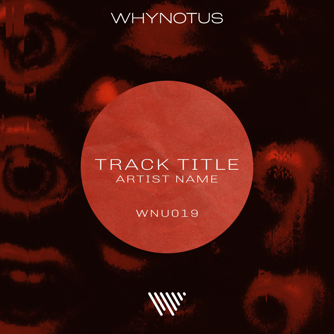
For Why Not Us, I created high-impact visual assets for individual track releases, exploring multiple creative directions to give each drop a distinct moment while helping define the label’s overall identity. The goal was to develop visuals that felt bold, dynamic, and confident—capable of standing out in crowded digital spaces while remaining cohesive as a body of work.
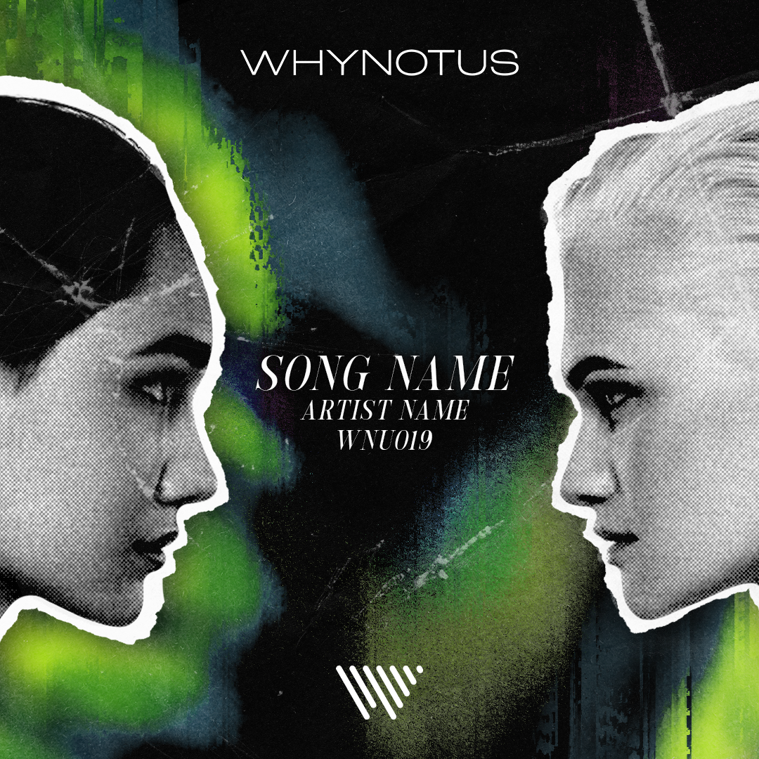
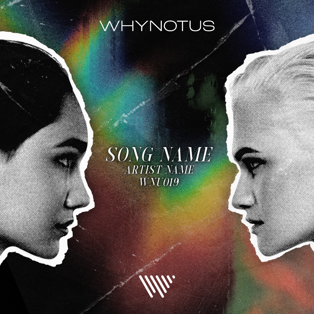
A moodier, photography-based approach that emphasized texture, lighting, and atmosphere. This direction brought a more sensual, editorial feel to the releases while maintaining a high-end aesthetic.
An experimental, illustrative approach that pushed abstraction and form. This direction explored movement, shape, and composition to create expressive visuals that felt unique, forward-thinking, and distinctly label-driven.
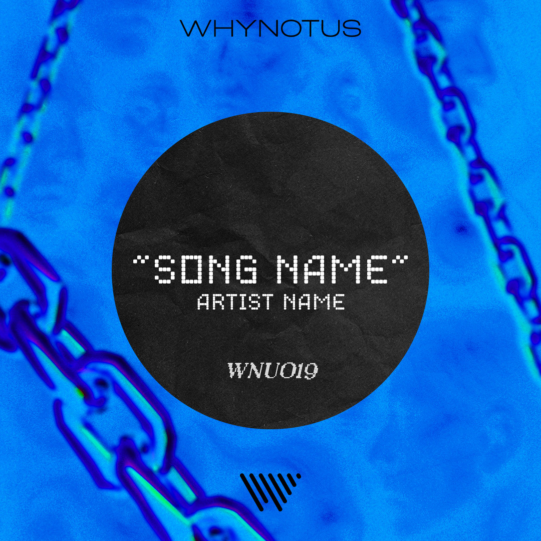
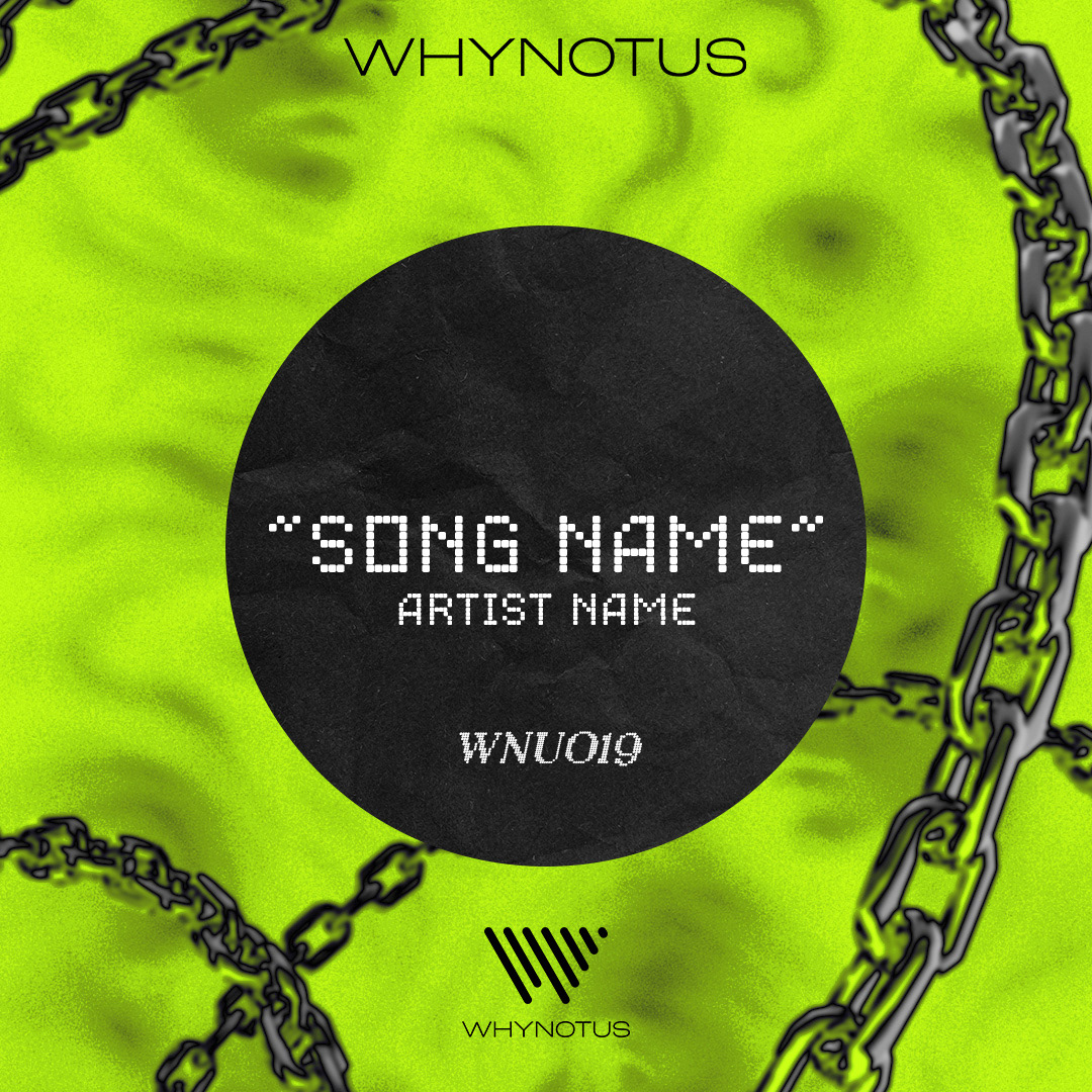
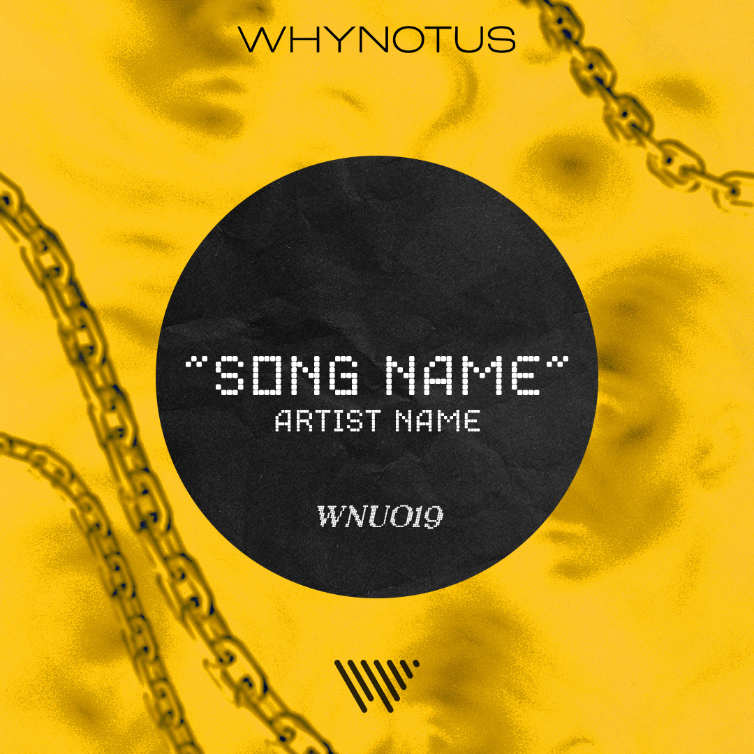
A bold, graphic-led approach built around strong color palettes and symbolic elements like chains. This direction focused on sharp composition and visual impact, creating a confident, statement-driven look.