WOH! Agency
Branding Design and Creative Direction
WOH!—short for "We Out Here!"—is a full-service agency specializing in marketing, creative, and production services. The idea behind WOH! is to create a company where each of these three branches can function independently with their own clients, or collaborate as a collective to offer fully integrated solutions. This flexibility allows WOH! to adapt to each client’s unique needs, whether it's a one-off project or a full-scale campaign.
A Logo!
When conceptualizing the visual identity for WOH!, the goal was to create a simple yet powerful design that conveyed both energy and motion. The name WOH! itself—a playful exclamation—needed to translate visually into something bold, dynamic, and memorable. The logo is purely type-based, driven by the question: "If you said the word 'Woh!' (woah), what would that look like?" The result was a playful yet clean typographic treatment with rounded, bold lettering that evokes a sense of motion.
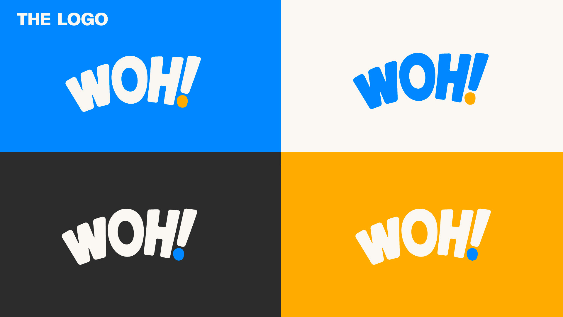
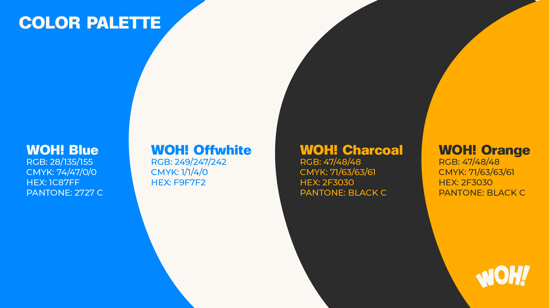
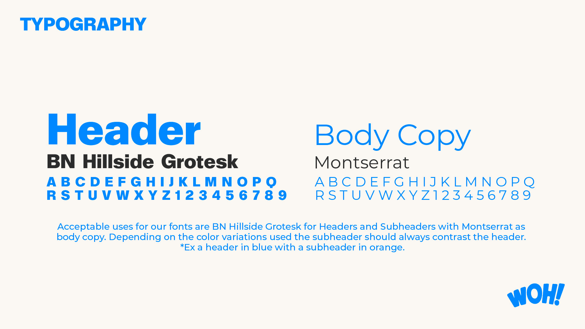
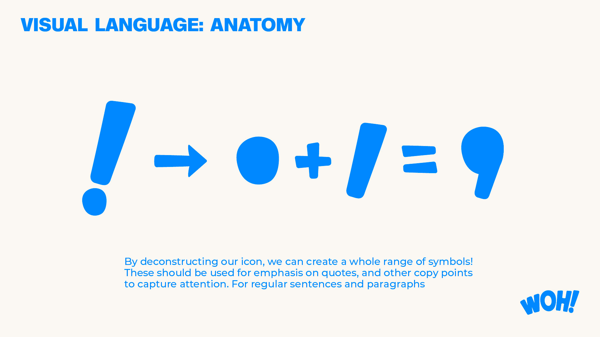
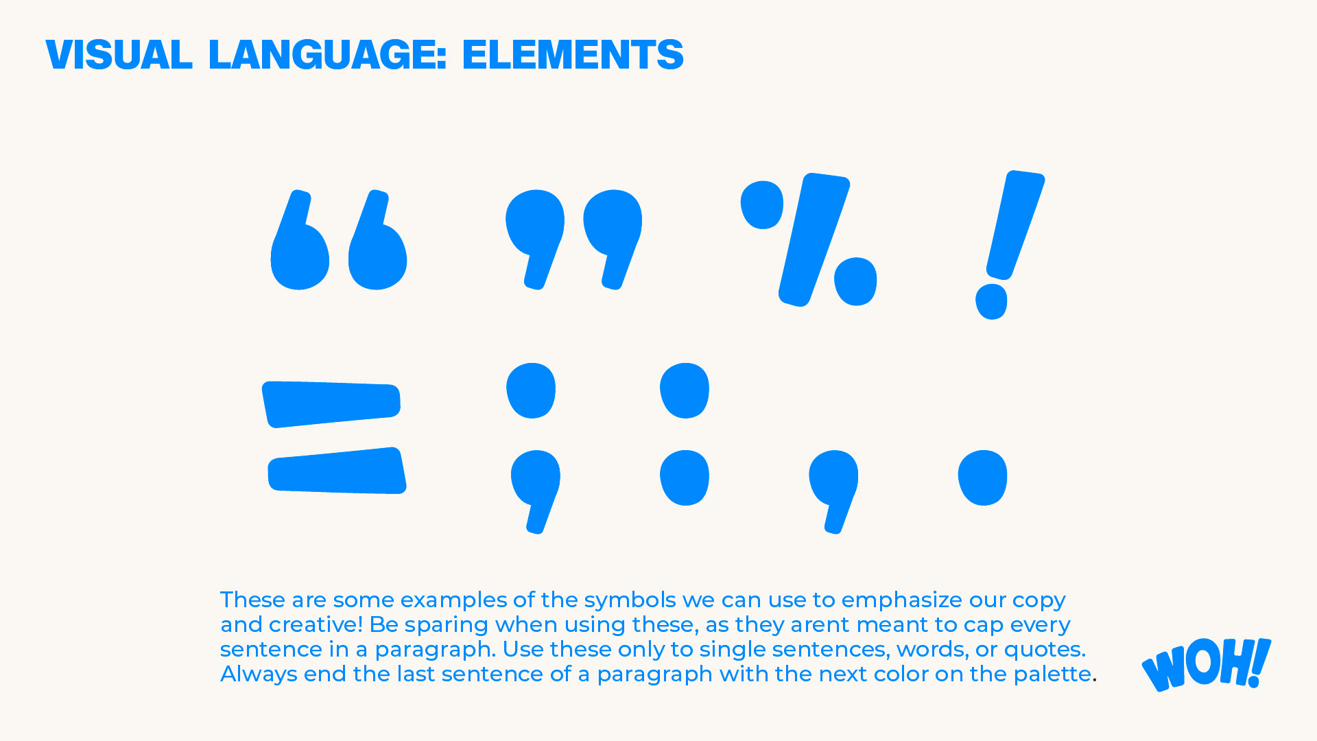
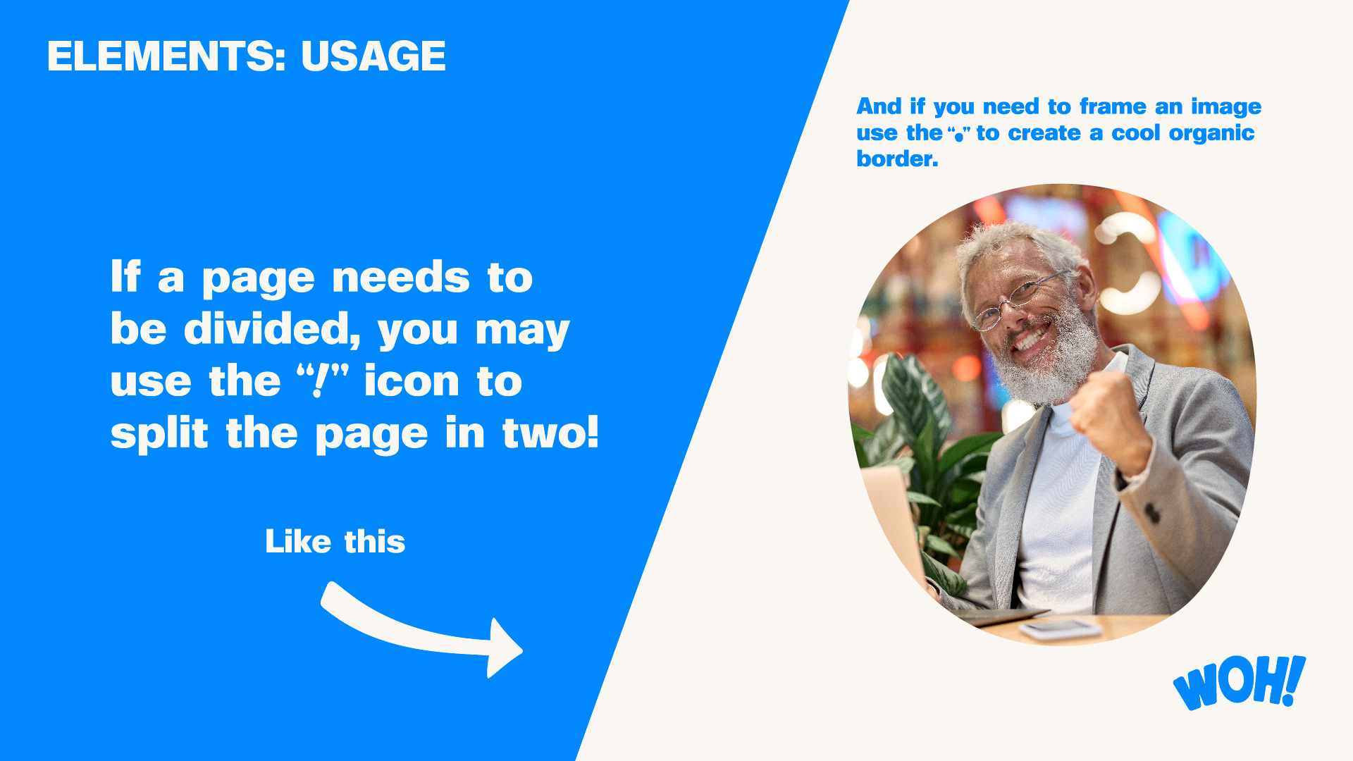
I used a four-color palette to give the brand versatility, ensuring high contrast between both the primary and secondary colors in light and dark environments. This allowed the brand to maintain a strong visual presence, no matter the context. The exclamation point became a key element in the logo design, doubling as an icon for brand recognition across different touchpoints.
Unique Voice
As part of WOH!'s branding, I also developed a series of marketing materials. These visuals play on humor and boldness, capturing the attention of potential clients by challenging their current marketing strategies in a lighthearted, direct way.
Both visuals reflect WOH!’s mission to revamp stale strategies with innovative, bold ideas. The color palette remains consistent with the brand's identity, while the playful, retro-style visuals and tongue-in-cheek copy show that WOH! isn’t afraid to shake things up. The combination of humor, directness, and visual impact helps to position the agency as both approachable and cutting-edge.
