Wynwood Pride 2021
Creative Direction & Concept Art
Creative Direction & Concept Art
A triumphant return.
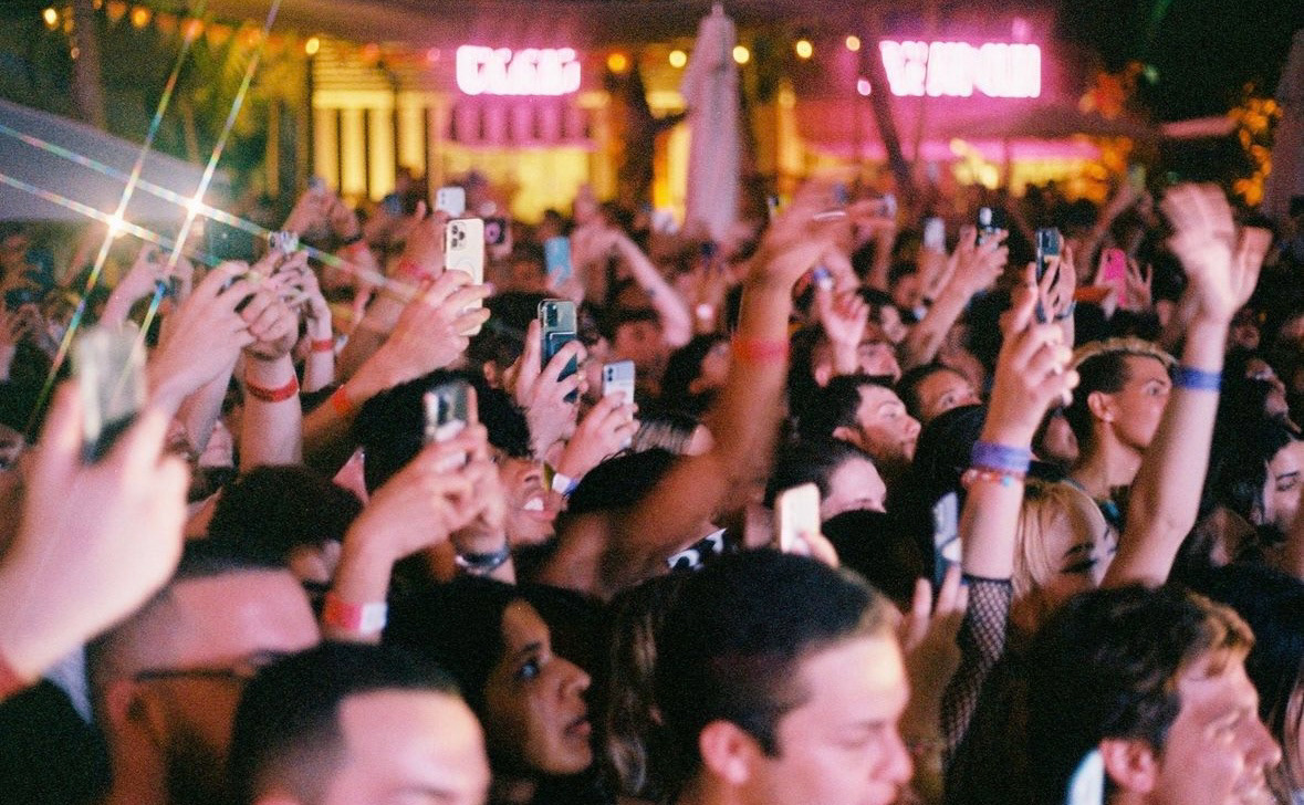
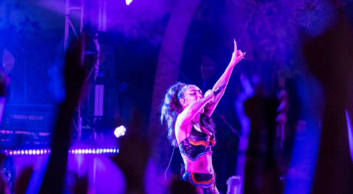
After the fully online edition of 2020, Wynwood Pride 2021 marked the return to in-person celebrations, bringing the energy of Pride back to Miami. I was brought in to lead the creative for the festival, which spanned a full weekend of events across 12 venues in Wynwood, including drag shows, parties, concerts, and a headlining concert featuring artists like Charli XCX, Honey Dijon, and Derrick Carter. This was our first live event since the pandemic, and the creative needed to reflect the excitement of coming back together.
Inspiration
Having leaned heavily on digital themes for the previous year’s online festival, I wanted to pivot for 2021 by embracing a more analog aesthetic. The concept was bright and white with splashes of bold color, paired with rich paper textures to mimic the layered, torn posters you’d see on telephone poles in the streets. This tactile approach symbolized the physical return to Wynwood, evoking a sense of being back out in the world, interacting in person.
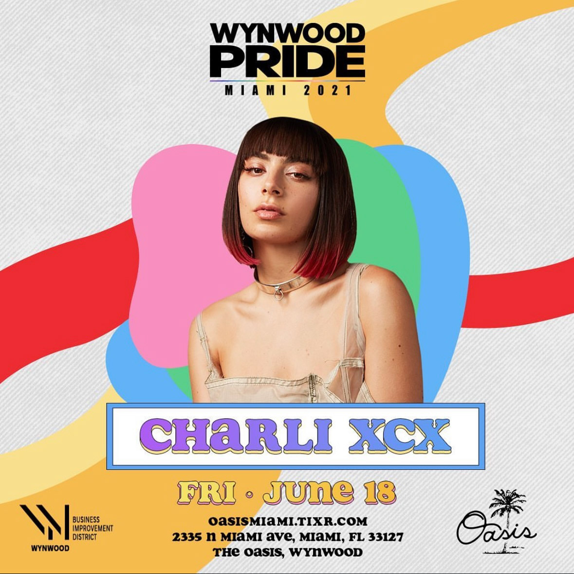
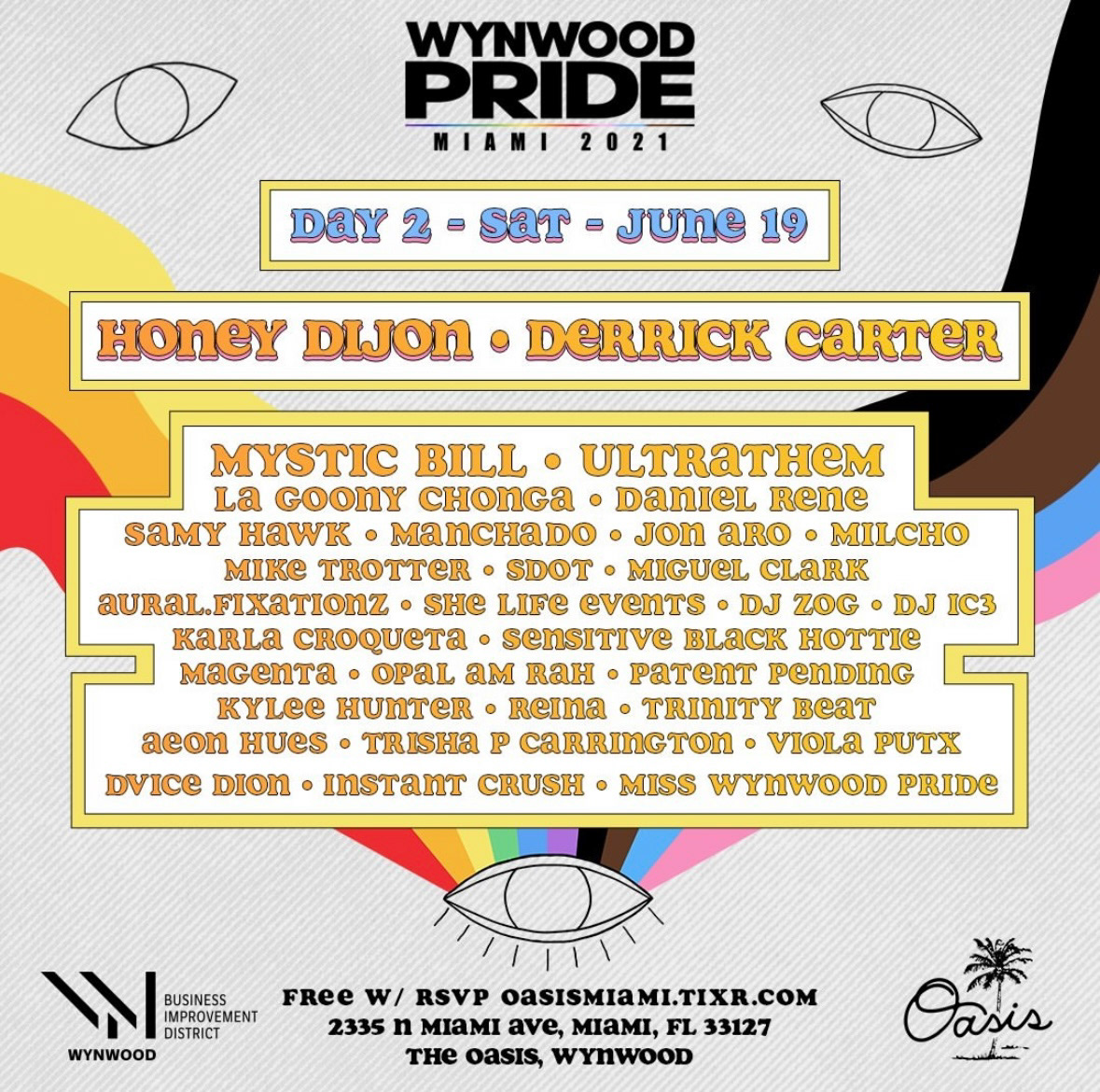
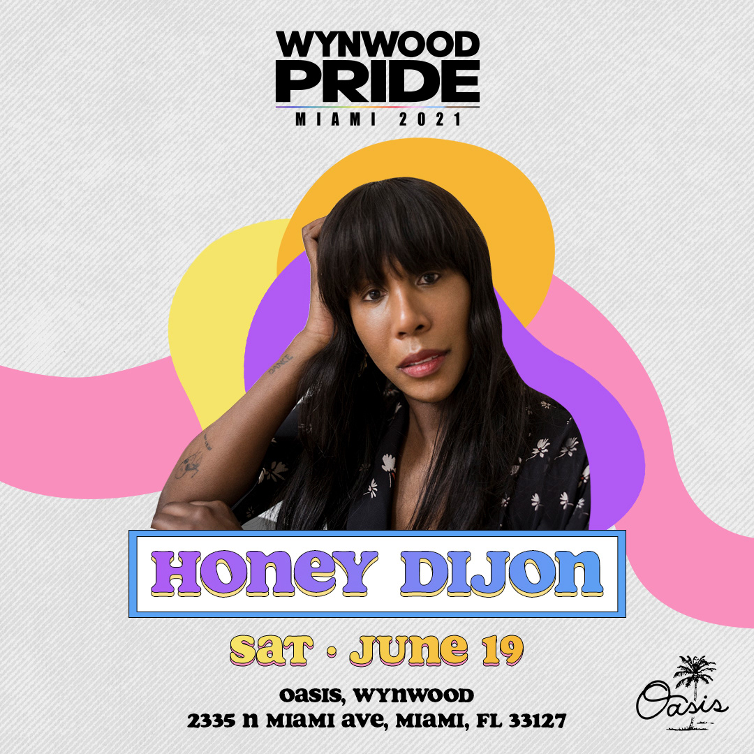
Return of Human Connection
A major focus of the creative direction was emphasizing the human element of the event—the joy of gathering together once more. The use of people in the branding highlighted the return of face-to-face interactions and the communal spirit that defines Pride. This was our opportunity to show the world that Wynwood Pride was back, bigger than ever, taking full advantage of Miami's lifted curfew and the excitement of large-scale live performances across multiple venues in the vibrant Wynwood neighborhood.
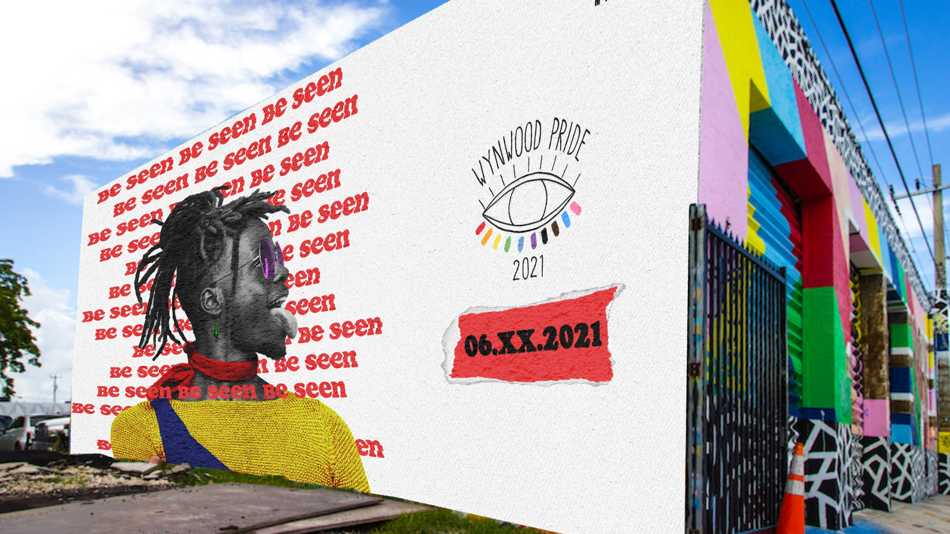
Creative Concept:
A key element of this year's branding was incorporating people into the design, emphasizing the return of human interaction and live events. This aligned perfectly with the festival’s aim to go BIG in 2021, taking full advantage of the end of curfew in Miami. The visuals reflected the festival’s larger-than-life atmosphere, highlighting the scale of the live performances and the diverse lineup of artists spread across multiple venues throughout the neighborhood.
Creative Elements
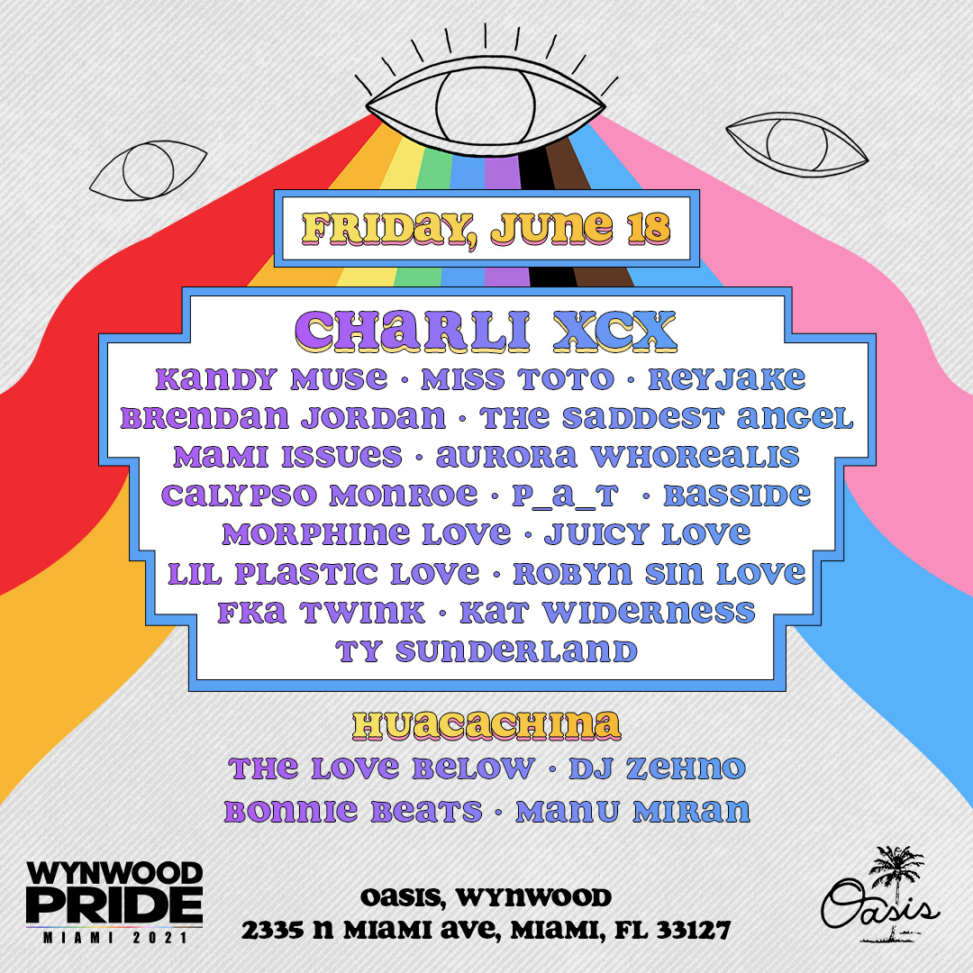
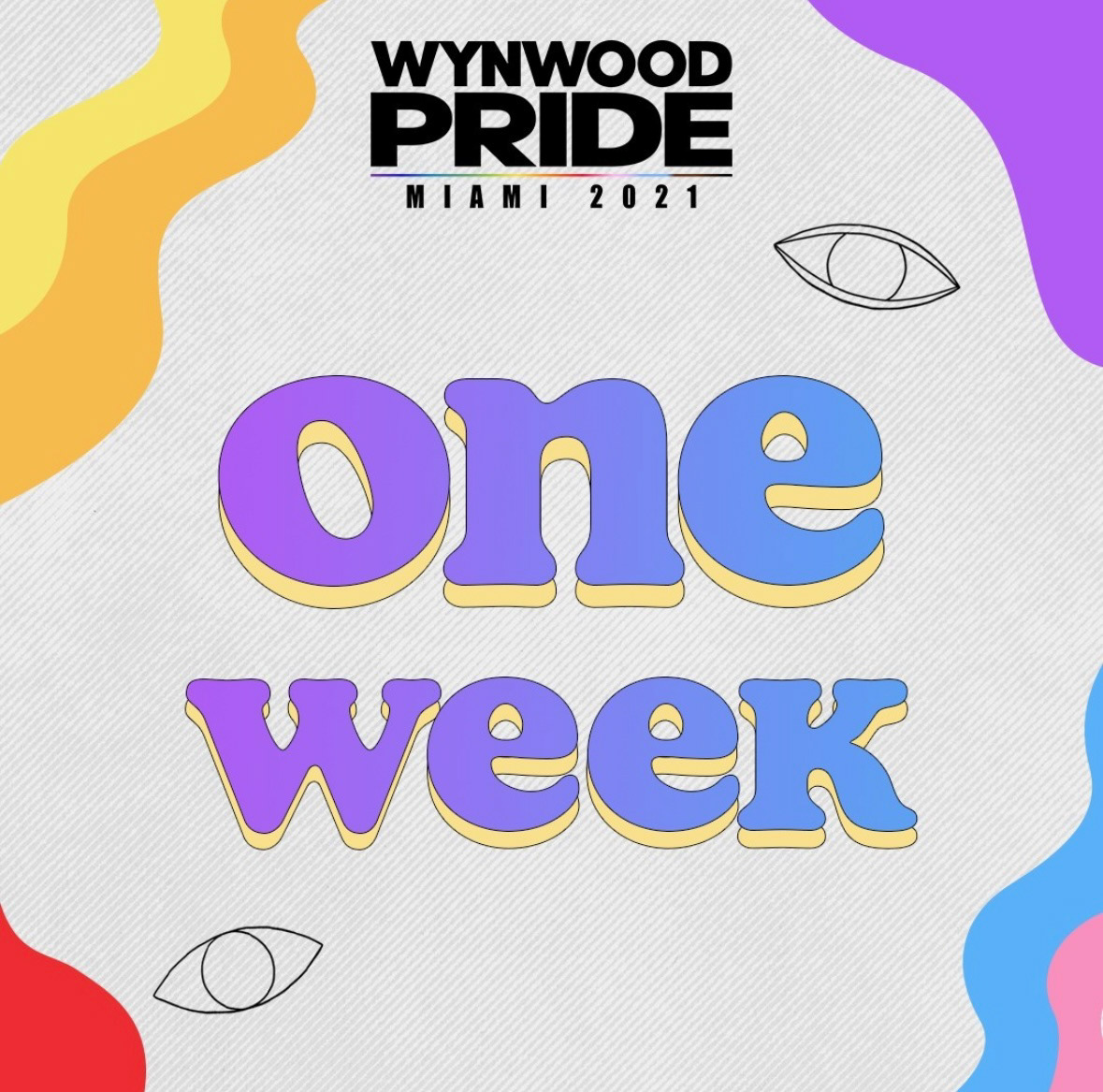
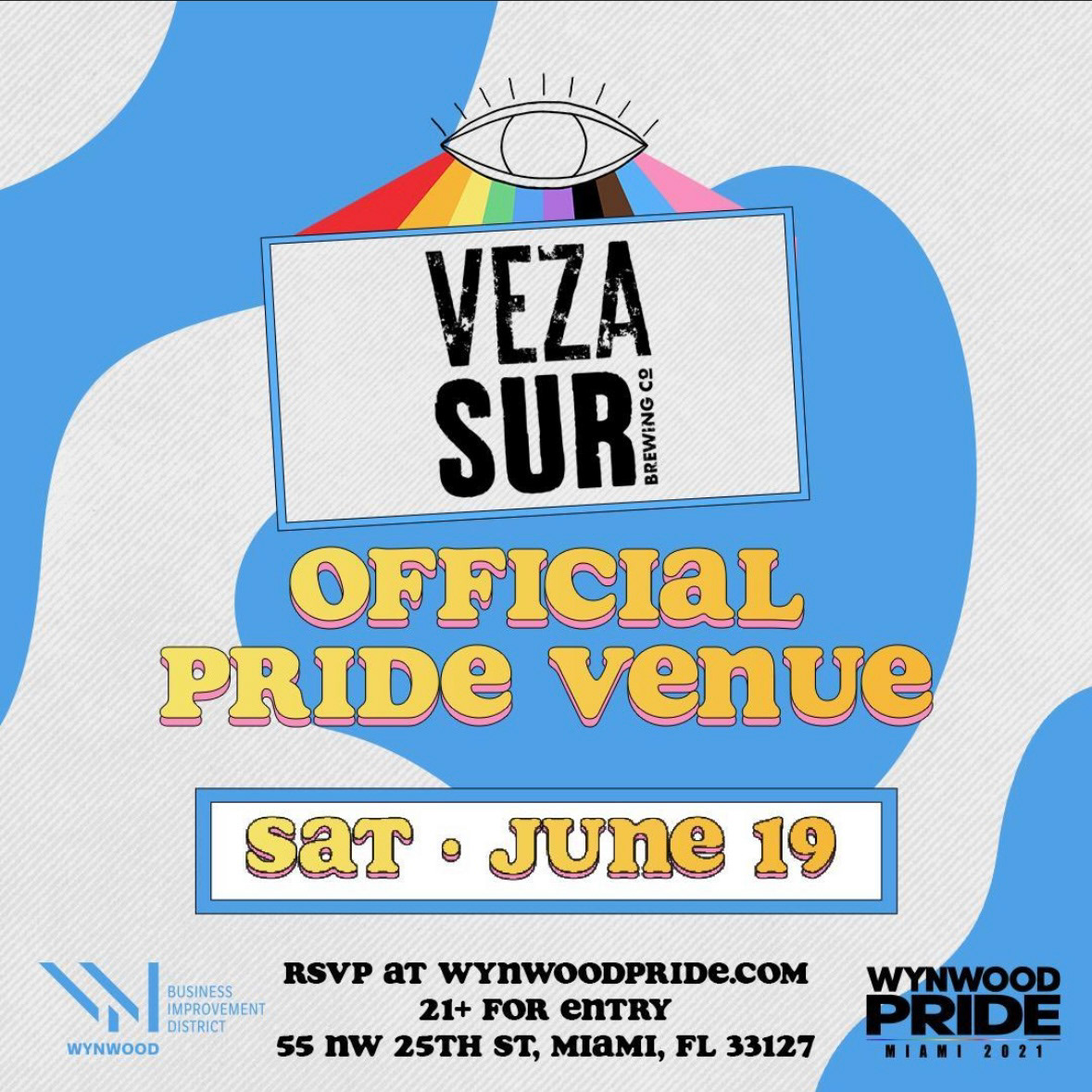
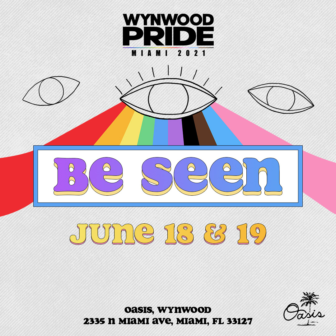
To further evoke this "in-person" aesthetic, I incorporated abstract shapes and vibrant color palettes as key visual elements. These shapes, fluid and dynamic, symbolized the diversity and freedom of expression that Pride represents. They gave the branding a sense of movement and energy, helping to create a playful yet sophisticated atmosphere that resonated with festival-goers.
Analog to the core
In addition to these design elements, I added hand-drawn cell frame animations, which reinforced the analog theme. These animations were crafted to feel organic and human, a contrast to the slick digital look of the previous year. The rough, hand-drawn quality of the frames added a personal touch, enhancing the feeling of authenticity and connection. It also played into the larger message of the festival—that we were all finally able to "be seen" in person again after months of virtual gatherings.
Results
The final creative blended abstract shapes, bold colors, hand-drawn animations, and rich textures to create a cohesive, analog aesthetic that felt personal and alive. It set the tone for a weekend of connection, celebration, and freedom, capturing the energy of Pride’s return to in-person events. The visuals brought the spirit of Wynwood to life, helping the festival make a bold comeback and signaling that the community was once again ready to celebrate together.

