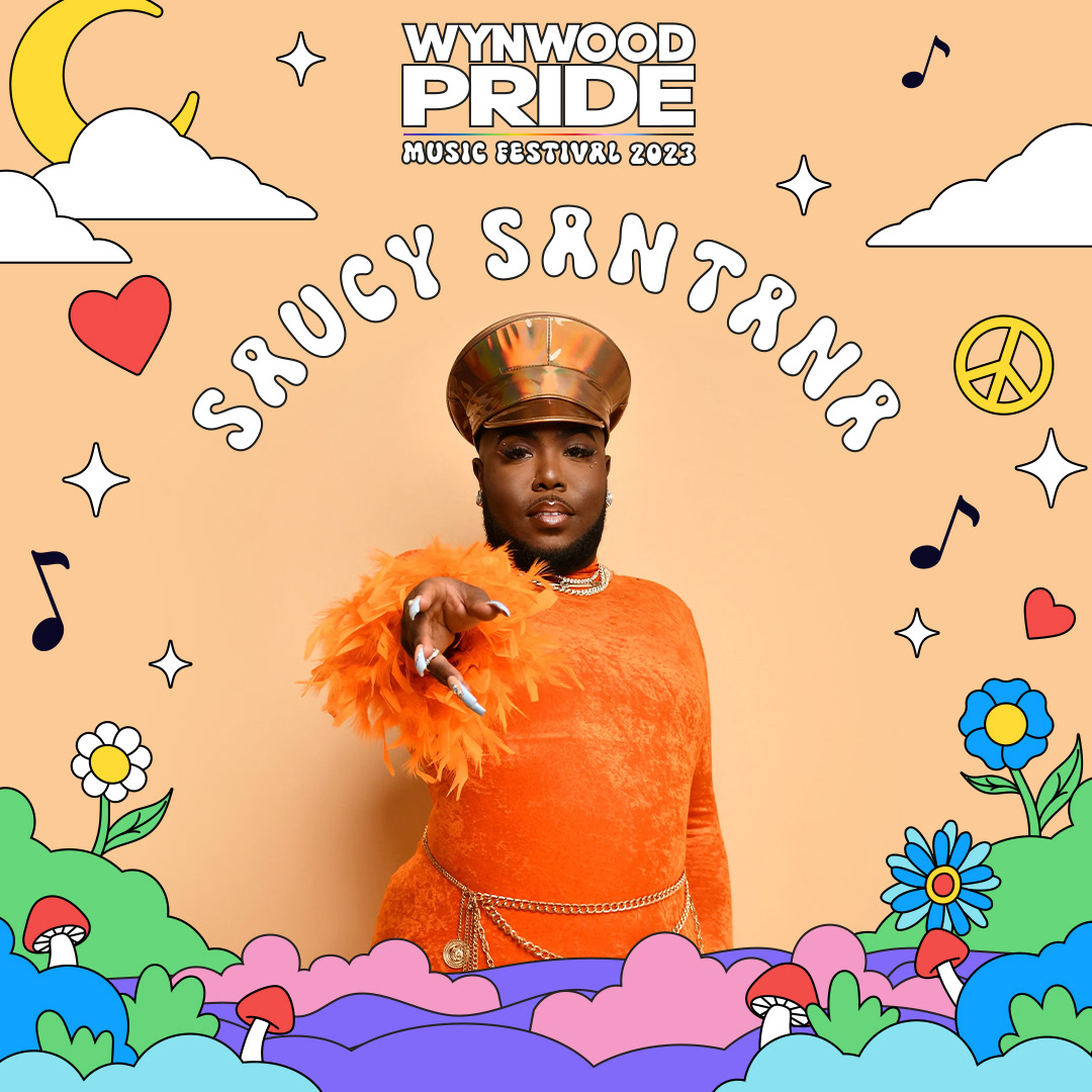
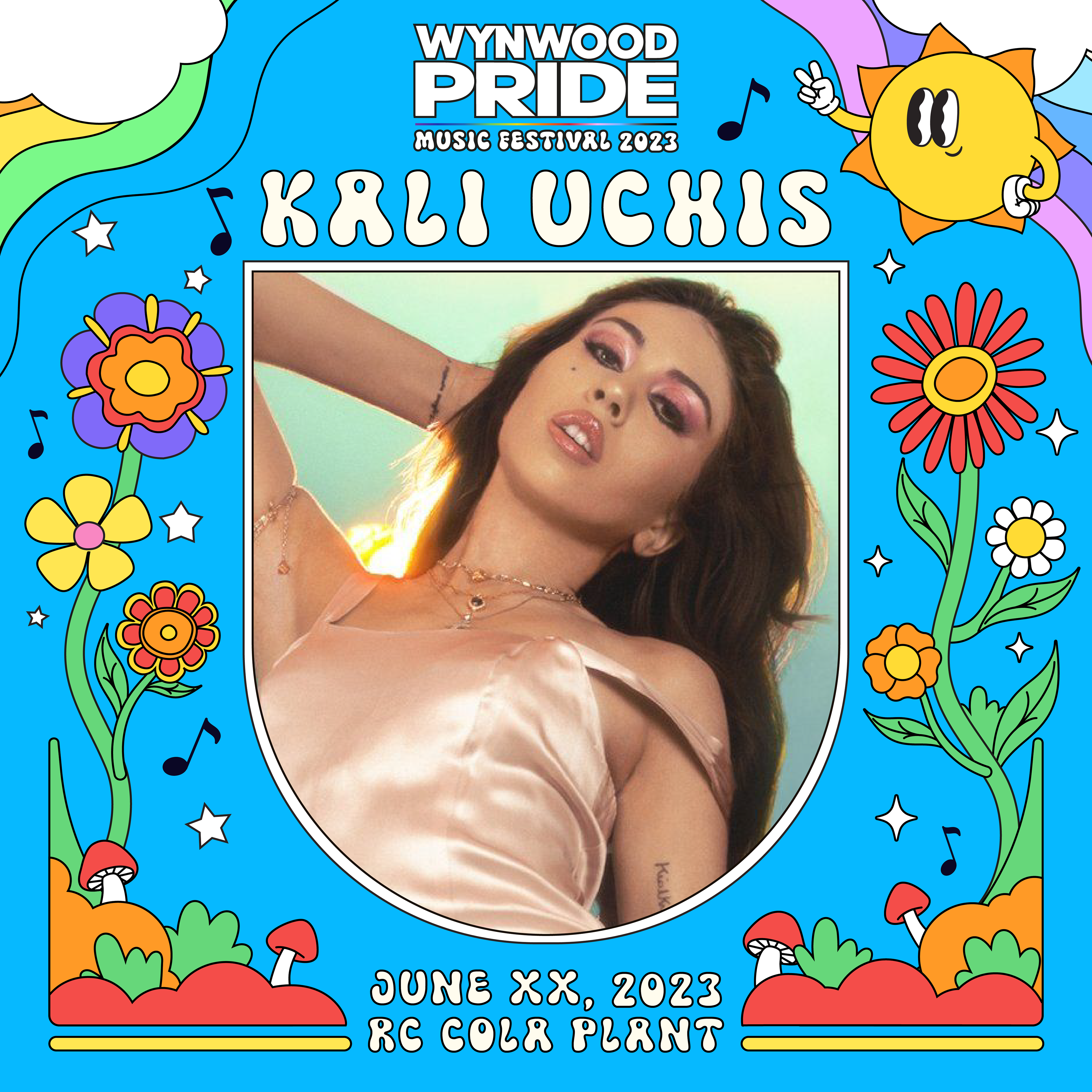
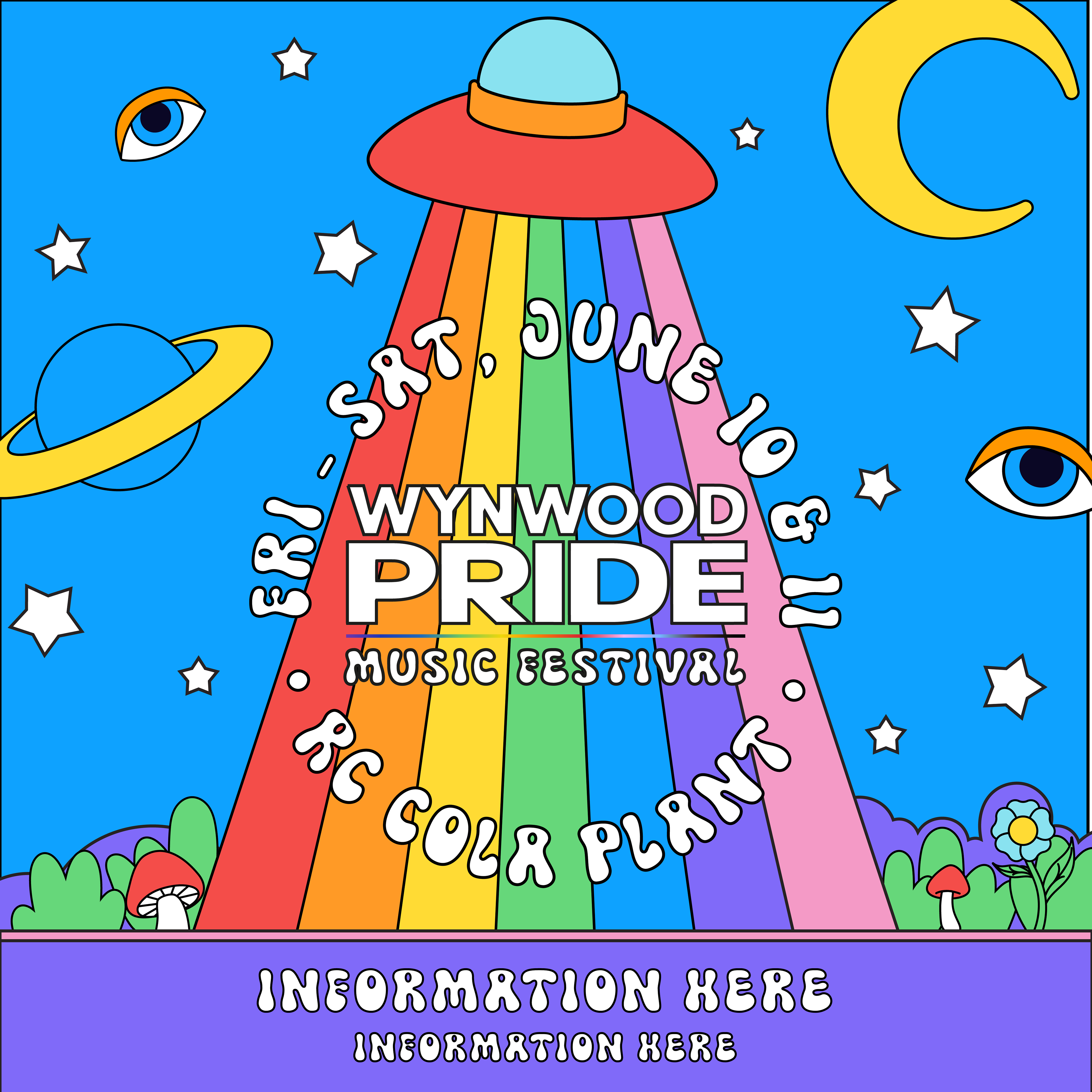
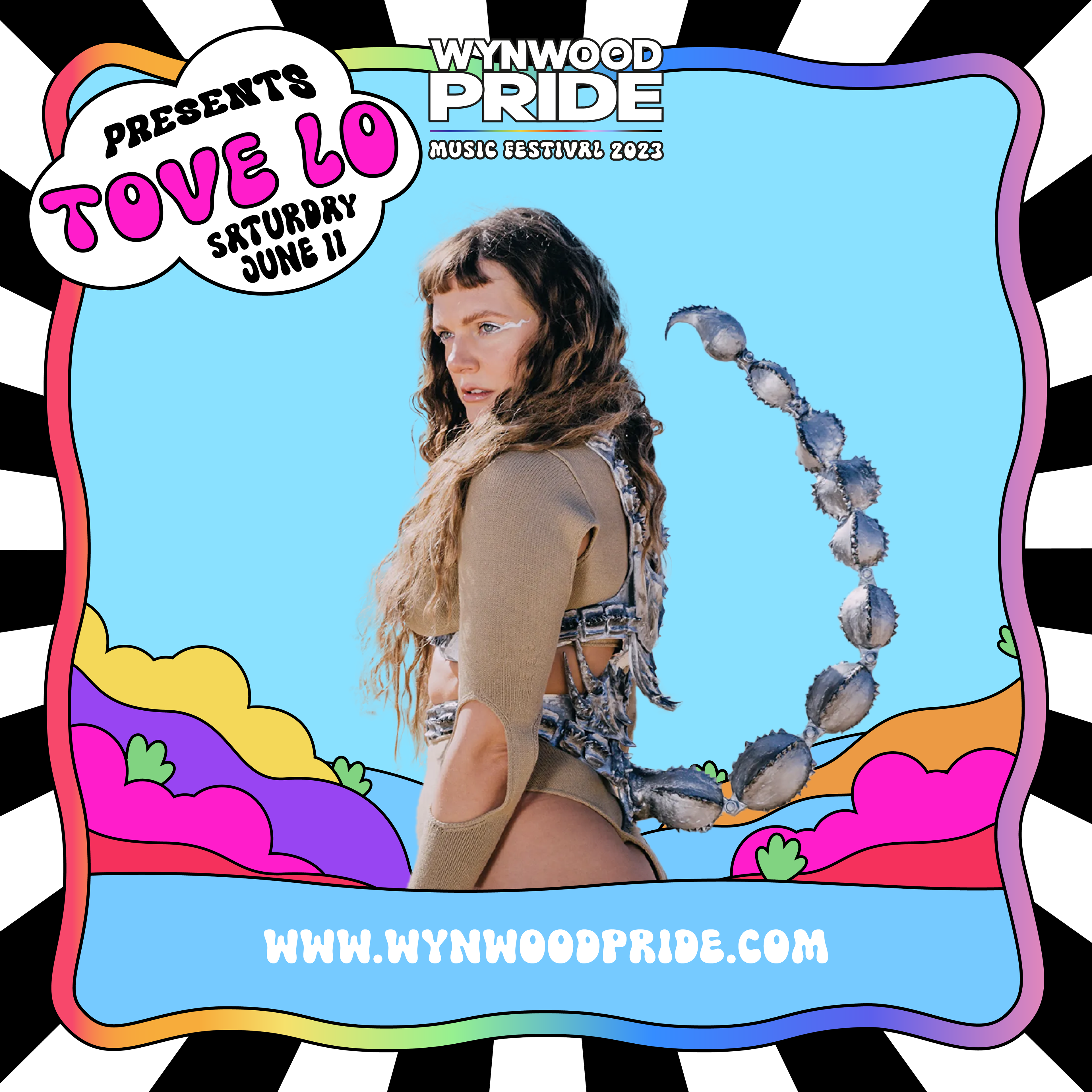
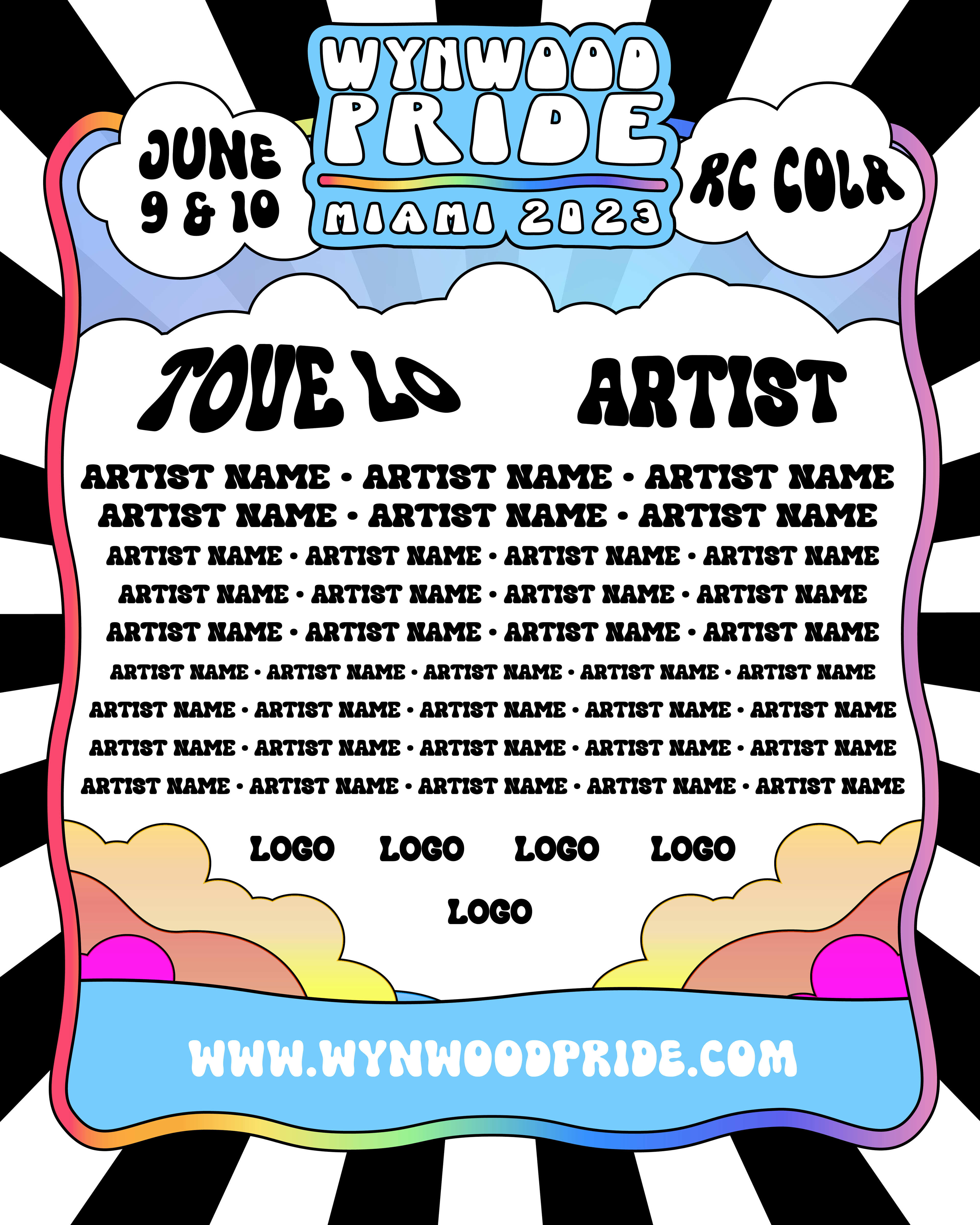
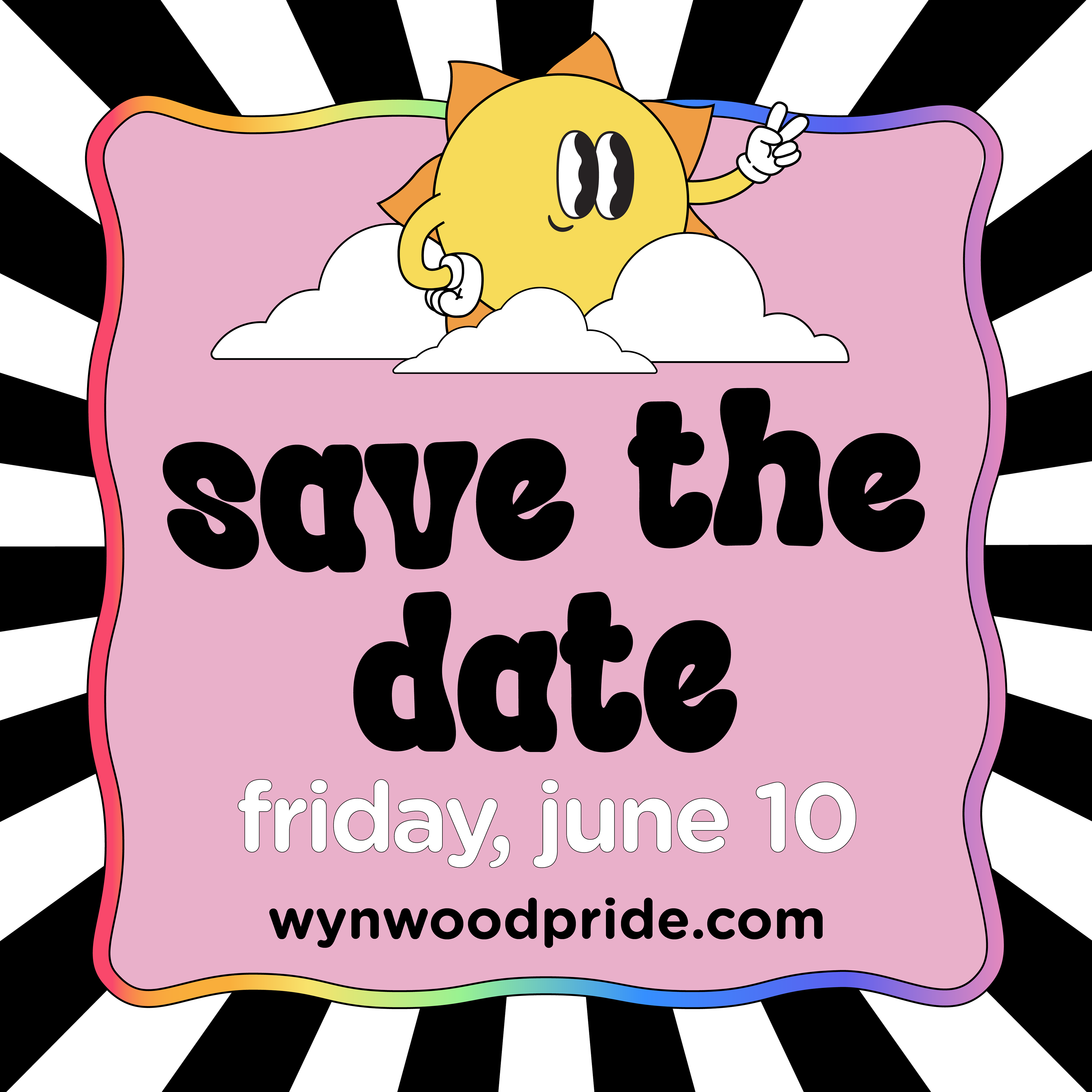
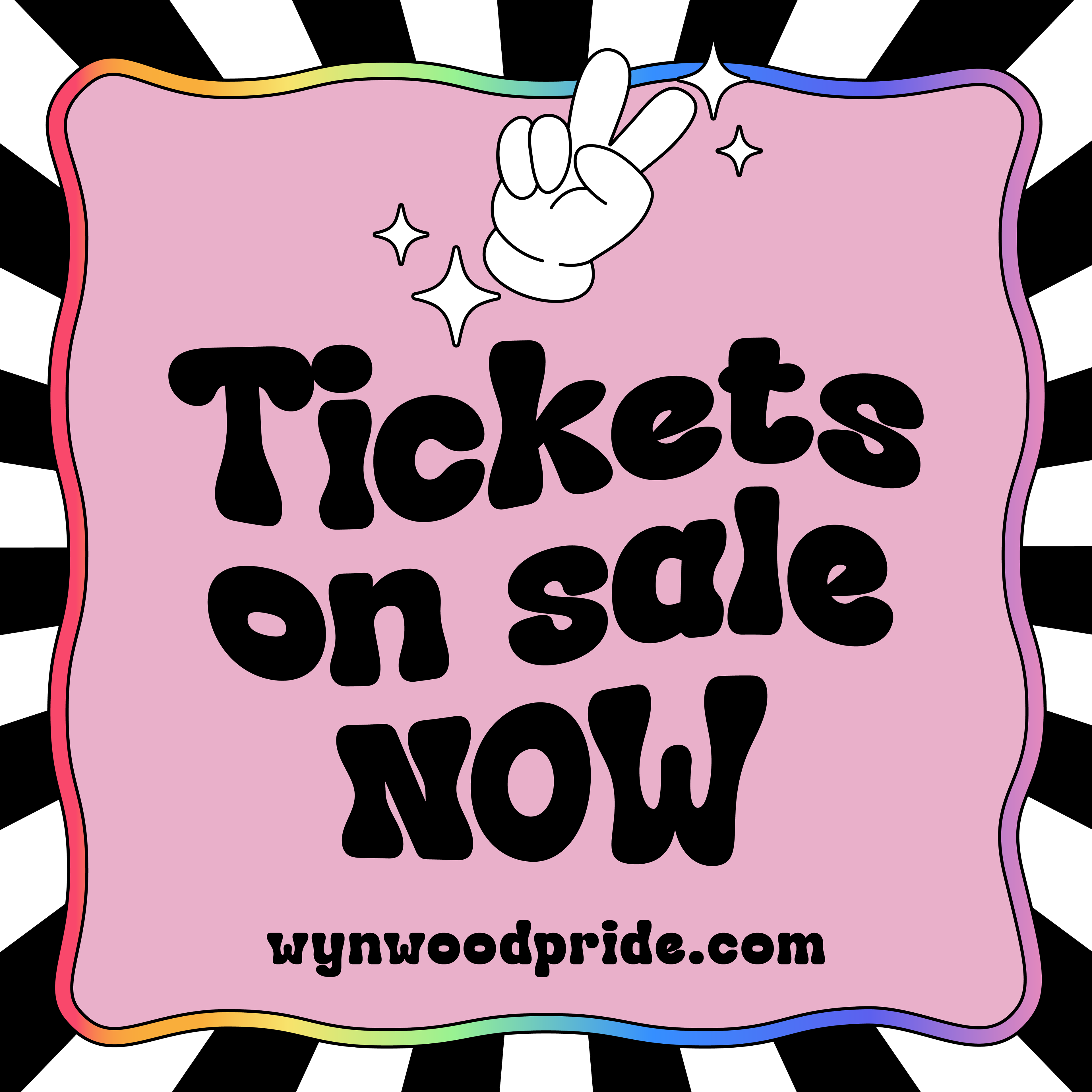
For the 3rd annual Wynwood Pride, I developed the creative concept for the festival’s promotional materials. Evolving from early brainstorming sessions with the Wynwood Pride team, the final design centered around a playful, vibrant aesthetic that captured the energy of the event and clearly communicated its “music festival” vibe.
Iconic Talent
With headliner Tove Lo and numerous other artists set to perform in celebration of the festival’s 5th year, the goal was to create something that felt fun, bold, and full of life—perfectly in sync with the spirit of Pride. The design incorporates colorful, cartoonish elements and flowing, retro-inspired shapes to create an energetic visual identity. The bright color palette and dynamic layout ensured the creative stood out, evoking a sense of excitement and inclusivity while appealing to a diverse audience.
Unique Characters
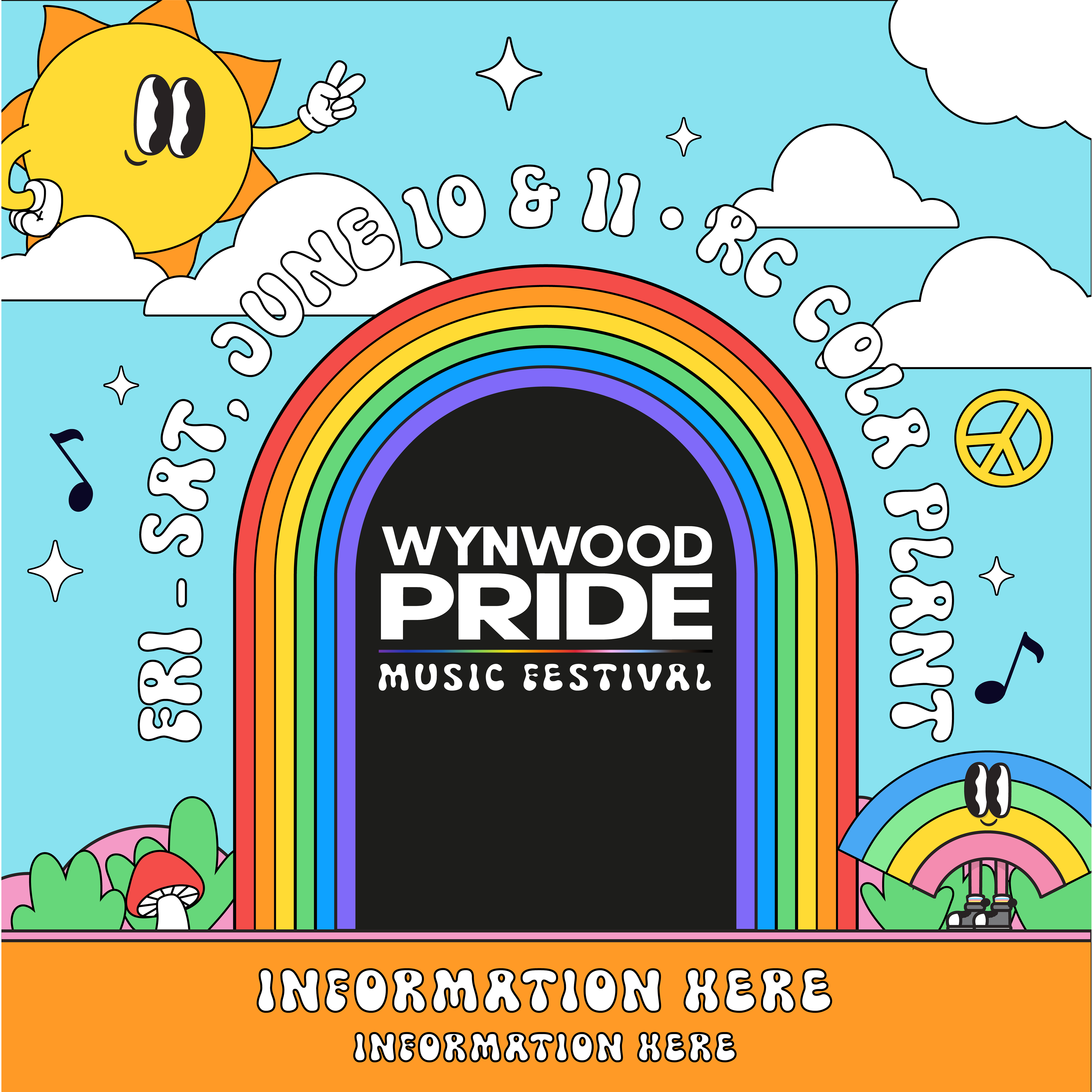
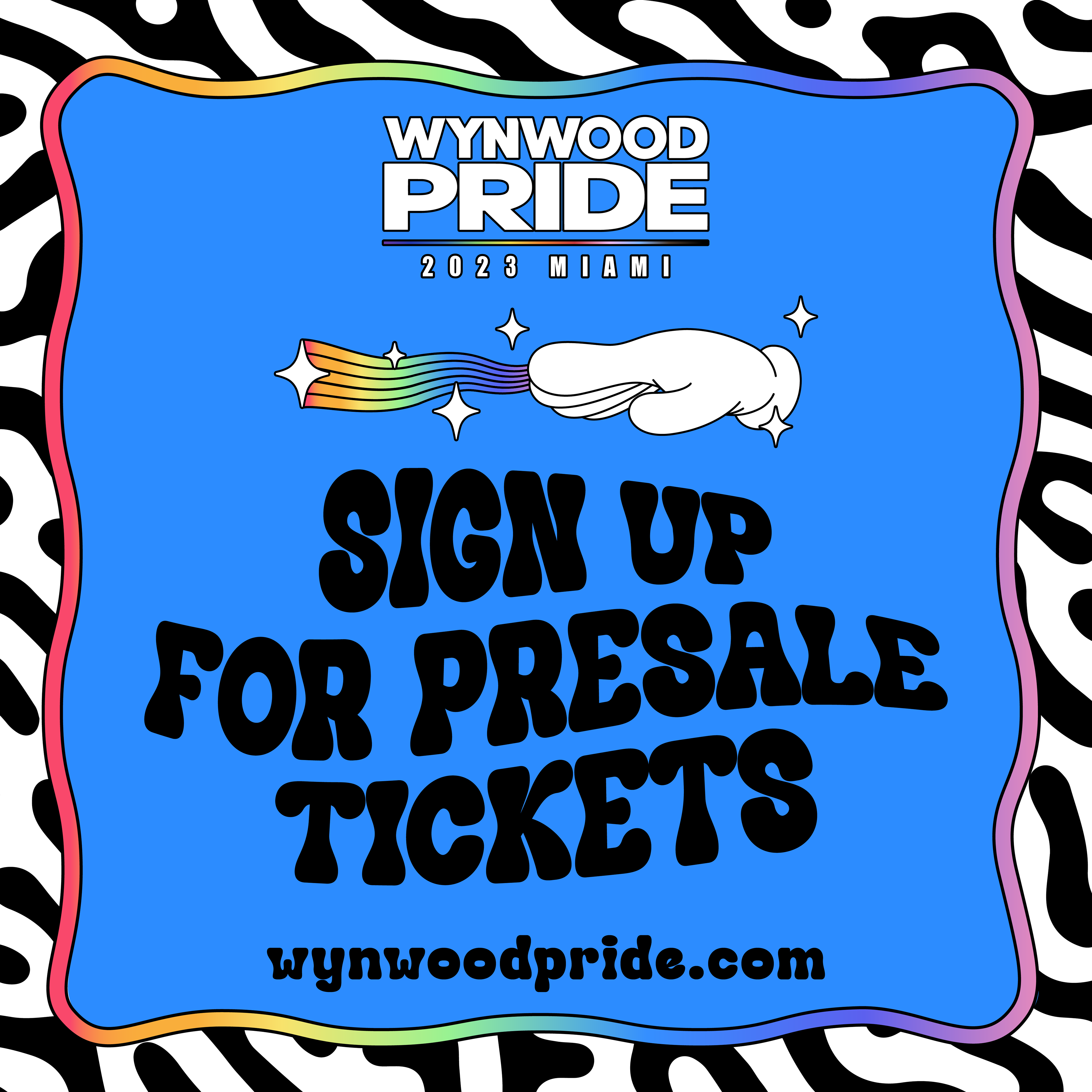
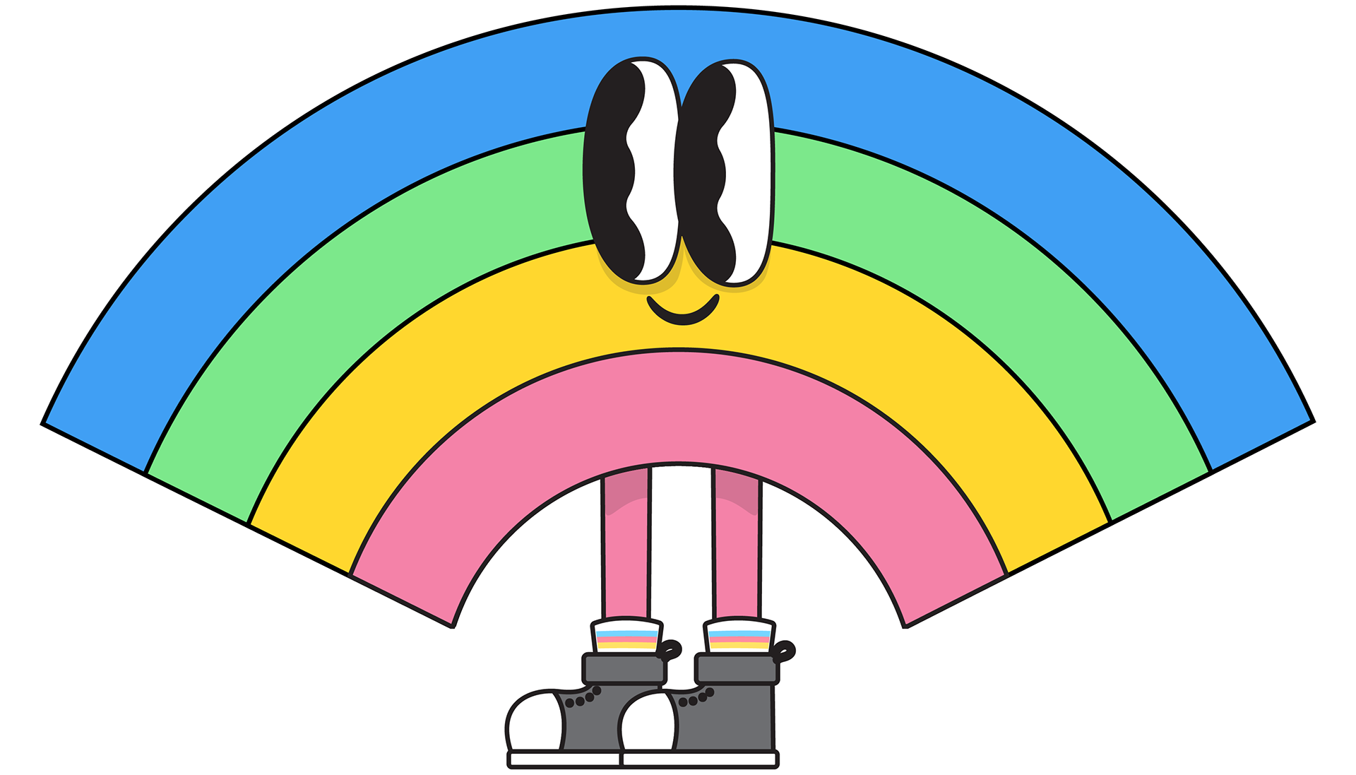
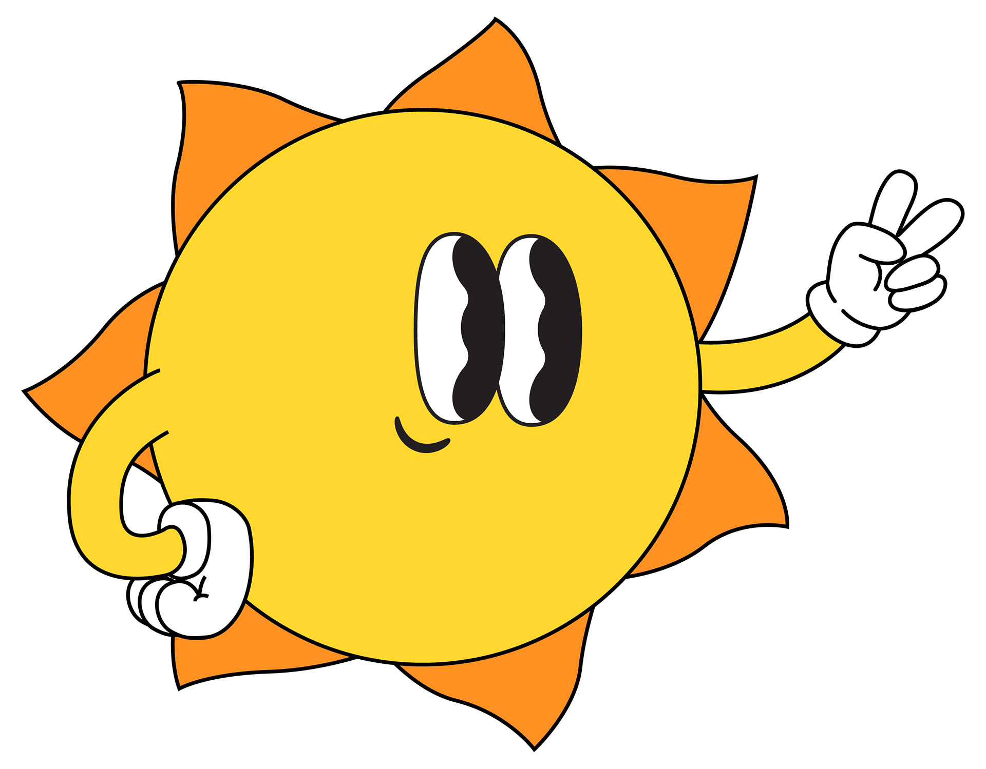
The design was filled with hand-drawn custom elements, like the sun and hands, giving it a personalized and artistic feel. These elements, combined with bright, flowing shapes, created a dynamic visual identity that felt fun and full of life. The retro-inspired typography and custom illustrations worked together to set a joyful tone, while the bold color palette ensured the design popped across digital and physical platforms.
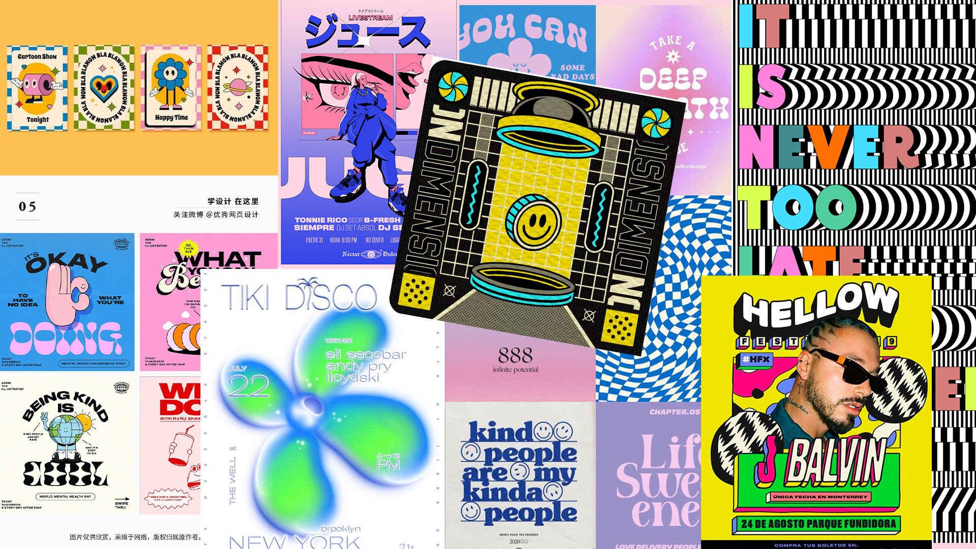
The Moodboard

This was the work for the original concept that was initially scrapped. This involved the use of custom illustrations including the sun and rainbow characters. The idea was to create a type of mascot for pride in the same vein as Bonnaroo and other festivals.
